Graphic Design: Image Experiment with Adobe Xd

This post is about a task I did for university. This was part of a visual design module and the objective for this task was to experiment with the Adobe Xd software, by using a selection of images to create a layout design. We had a 4×4 modular grid to help structure our designs.

I wanted to tell a story through my design, and so I chose a theme. The theme is about the different stages in our lives. There were numerous images to choose from but I decided to go with images that contained people. By doing this, I could vividly display the different stages of life.

Above: Modular Grid (4×4)

Once I selected the images, the next decision was to figure out how I was going to express the theme. Should it be in chronological order? Should it be sporadic? I decided to go with chronological order, which meant starting from the beginning of life to the end of a person’s life.

Above: Images that I selected.

The first thing I did was to create a 200px by 200px square and place it in the first grid area in the top right hand corner. Then I placed an image of the baby on top of it by copying it and then using the “paste appearance” option. This is a great feature which permits the user to paste an image to fit in a shape. I effectively repeated the same step for the other sections of the grid layout.

So, I effectively created a series of images from life to death. From youth to old age. I also wanted to add images that expressed certain emotions and feelings such as joy and great pleasure which can be seen in the image of a man and his guitar. Fear which can be seen in the image in the bottom left hand corner. I like the second to last image in particular. They are reaching towards the end of their lives, but instead of worrying or having fear, you can see a sense of joy and happiness as they look back to what they managed to do in their lives. Together, they have reached the end.

Above: Two layout designs. For the second layout design, I added coloured squares and placed them on top of the images. The colours go from warm temperatures to cold. This is another way of communicating changes or growth.

Book Cover Design Analysis: It’s Up to You New York by Tess Daly

I’ve been thinking a lot about New York recently. It all started with a podcast I listened to. It’s a French podcast I use to practice my listening skills. The title of the podcast is “Raconte-moi New York” which means “Tell me about New York” in French. The host tells the listener about his love, passion and adventures of New York. He is a French person who fell in love with the city by watching shows like Friends, movies by Stanley Kubrick, and following sports such as baseball. When I was listening to the podcast, it stirred up memories of my own. I went to New York several years ago and as the host was talking, it reminded me of my own experiences. I had also grown up watching shows and movies set in New York. After listening to an episode or two, it triggered my interest in the city once again.

So, I re-watched some of my favourite movies and series set in New York. I looked at some of the photos I took when I was there, and I even watched a few YouTube videos of people travelling to the city that never sleeps for the first time. It was all good fun. Then, I realised something. I’m doing a reading challenge (similar to popsugar‘s challenge of reading a variety of books for the year). I had never read a book set in New York before. Now was my chance.

I searched up books set in New York online, created a list and went to my local library to see if some of them were there. For the first read, I wanted something light-hearted and not so serious. A book that showed the magic of New York, a book that made me think of the city and perhaps want to visit again. Preferably in modern New York. Perhaps a romantic novel, or one with some humour I thought. So, I came across a few books and one of them was called “It’s Up to You New York” by Tess Daly. It fit the mood I was in. A good choice for a casual read. I just started it and I’m enjoying it so far.

The first thing I loved about the book was the book cover design. It really stood out from the crowd. It’s beautiful. This post is about the book cover from a graphic design perspective.

Above: Image of book (front and spine)

The first thing that stood out for me, was just how elegant and beautiful everything was. It really felt romantic and magical. I love the title. The decorative serif font used for the “It’s Up To You” part of the title, fits well with the theme of New York being a magical place. It’s as if the protagonist is saying this with a strong attachment to the city. In fact, there is an image of a woman staring at the skyline, perhaps romantically and in deep thought. It’s really clever because the viewer can also see what she sees, and assume her thoughts through the title. It’s mysterious. You want to know more.

The colours enchance the mystery. The colour purple can be associated with mysteriousness, and it is used to good effect in the design. The purple mixed with pink and then a darker purple from top to bottom of the cover, creates unity and communicates a sense of wonder and curiosity. It also creates elegance and romance. Purple can also be associated with luxury and royalty. The pink creates a slight contrast, but also creates unity because it is close to purple on the colour wheel; making it analagous. There is also unity with the image of the woman as she is dressed in a pink colour and her fashion also represents elegance.

The added effect of the fireworks in the sky surrounding the title fits well with the font-style. There is nice contrast between the words “New York” with the rest of the title. It is a sans-serif and is more modern. Perhaps communicating the time period of the novel or the well-structured modern city style. The title also stands out. It is light whilst the background is dark. The name of the author and what it is about (bottom) is synced with the background in pink, showing that the more important information is the title of the book and the image. It all works out for a great design. It makes me want to read it, and that is what I am doing.

Graphic Design: Photoshop Blend Textures Challenge

This post is about a challenge I did from a course on LinkedIn Learning. I am learning Photoshop, which is a powerful software that allows the user to manipulate images. In this challenge, I had to combine textures with a photo using blend modes and layer masks.

Above: LinkedIn Learning

Above: Screenshots of Original Images in separate layers.

Above: Screenshots of edited images. The first thing I did was change the Book_texture layer into a different blend mode. I changed the mode from Normal to Screen. This created a slightly transparent look, where the woman in the image was visible. Next, I made the Book_texture layer into a layer mask by clicking on the rectangle icon with the circle in the middle at the bottom of the layer panel. Then, I used the brush tool to remove parts of the texture. I wanted to reveal more of the woman’s face, hair and overall appearance. I used black paint to remove elements of the image and this created a focal point.

After this, I worked on the Paper_texture layer by changing the mode from Normal to the Linear Burn mode. I liked this as it created a sort of vintage look. I made the layer into a layer mask and removed parts of the image with the paint tool. This time, I lowered the opacity of the brush tool so that the colour was grey and not black. I wanted to do this so that when I used the brush tool to remove parts of the image, it would be subtle. I created a brighter effect around the woman by doing this.

Above: Final Outcome

Conclusion

It was great to learn about blend modes and layer masks. It was also great to put it into practice. I look forward to learning more things in Photoshop.

Graphic Design: Photoshop Selection Tool Challenge

This post is about a challenge I did from a course on LinkedIn Learning. I am learning Photoshop, which is a powerful software that allows the user to manipulate images. In this challenge, I had to manipulate an image using a variety of selection tools.

Above: LinkedIn Learning.

Above: Original Image

Image 1

Image 2

Above: Screenshots of edits in Photoshop and the final outcomes for Image 1 and Image 2. To create the 2 images, I used the Object Selection Tool to select elements. The Object Selection Tool can be used to automatically select something. You can click on a subject or drag a shape around the subject to select it. Firstly, I used this tool to select the hat. Then I created an adjustment layer and selected a solid colour. I chose the #1779bd (blue colour). I wanted a different feel to the original image, and chose a colder and calmer colour than the original colour for the hat. To make the hat visible, I changed the layer mode to Multiply. I repeated these steps for the lips.

I used the unity design principle to match the hat and lips by using the same colour. To make the elements further standout, I changed the background colour to a warmer colour. I did this by choosing Select in the top menu, and then Subject. This automatically selected the portrait image and then I inversed the selection by choosing SelectInverse. I used another adjustment layer to change the Hue to a warmer colour. For Image 2, I used the Hue adjustment layer to change the skin tone to purple. The colour purple can be associated with something mysterious so I thought it was a good colour to communicate this message.

Image 3

Above: Screenshots of edits in Photoshop and the final outcome for Image 3. I used the Quick Selection Tool to select the hat. The Quick Selection Tool is great for quickly selecting larger areas of an image. This can be done by dragging around the area you want to be selected. It is located in the toolbar right beside the Object Selection Tool via the drop down menu. Once the hat was selected, I created an adjustment layer. Adjustment layers are great because you can modify an image without damaging the original image underneath the adjustment layer. I chose the Solid Color of #ff0bb2 (pink) and changed the layer mode from Normal to Color, so that the hat is visible through the layer.

For the lips, I used the Object Selection Tool and then repeated the same steps as I did for the hat. The background was created via a Gradient adjustment layer and I used a Radial Gradient effect combining the colours #92bfd9 (light blue) and #0a8bd5 (medium blue). The cold blue background has contrast with the vibrant pink elements and the bright portrait. I really like this image because it is aesthetically pleasing and the contrasting elements work well together.

Funnily enough, during the process of this creation I had various thoughts running through my mind. Some of the thoughts were things like musicals, candy, Charlie and the Chocolate Factory, Mary Poppins and even Katy Perry’s California Girls. Perhaps it is because of the vibrant colours associated with them. After the first image, I wanted to design something more eye catching and a “feast for the eyes”. The colours pink and blue were the first colours to come to mind.

Image 4

Above: Screenshots of edits in Photoshop and the final outcome for Image 4. I wanted to do something a little different for the final image. I wanted to add extra elements to the original composition. The first thing I did was cut out the hat element and duplicate it a few times to create a repetition effect. I did this by using the Quick Selection Tool to select the hat and then I duplicated the selection unto a seperate layer using the keyboard shortcut: Ctrl + j on a windows computer. Then, I scaled the hat down to a smaller size and used the free transform tool (Ctrl + t) to rotate it slightly upwards. I wanted to match the colour of the hat with the colour of the lips so I used an adjustment layer and changed the hue to a similar colour to the lips. I also decreased the opacity for the hue from 100% to 90% to make it less intensive. I repeated the same steps for the other hats and rotated each hat slightly more clockwise and slightly increased the scale. This created a rhythm and a motion effect. I also repeated these same steps for the lips. Instead of clockwise, the lips were rotated anti-clockwise. This created contrast in terms of rotation compared to the hat elements, but also unity was formed because of the repetition, alignment and colour.

I used a Radial Gradient effect to create the background. I combined the two colours #ffffff (white) and #a96cdc (purple) to create a sense of mystery, and also to create a spotlight effect for the main subject. I created a #34144f (dark purple) Solid Color adjustment layer for the hat, and changed the layer mode from Normal to Hue. This allows the viewer to see through the layer. This also creates unity with the background but contrast because of the foreground (hat) texture.

To finish, I completed the design with a slightly daring question: “Do you like what you see?” This can refer to the design or the portrait. I thought the question perfectly matched the tone of the design. I chose the colour red to form unity, and I chose the font Century Gothic (Bold) because it reminds me of elegance and fashion which I feel matches the portrait.

During the process for Image 4, songs such as Santa Baby, Big Spender and films such as Who Framed Roger Rabbit came to mind. I guess it is because of the nature of the songs being slightly daring and the character Jessica Rabbits also fitting this description.

Conclusion

I enjoyed learning about the selection tools in Photoshop. I had the opportunity to experiment with the different tools and create interesting designs. The selection tools in Photoshop are really powerful and I was surprised how easy they were to learn. There are numerous ways to select elements in Photoshop so it was great to learn how to use them. This will certainly help me with my future projects in Photoshop.

Photoshop: Jazz Photo

This post is about Photoshop. I’m taking a course on LinkedIn Learning about how to use Photoshop.

Above: LinkedIn Learning is a resource for online courses. This is the tutorial I watched.

Above: This is the original image

Above: First edited image. I followed the tutorial and changed the position of the title “Jazz” and the circle shape from the right side of the design to the left. Next, I flipped the dancers by using the Flip Horizontal technique in the Edit menu. Lastly, I changed the colour of the lady’s dress to match the colour of the circle. I used the selection tool and then the brush tool to do this.

Above: Second edited image. I decided to play around a little bit. I kept the position of the dancers from the original image. For the foreground, I decided to change the colour for the title and the lady’s dress to purple. This creates unity. Purple was the first colour that came to mind when I thought of jazz. I also did some research and discovered that purple is associated with the word “creativity”, which is a good word for the music genre jazz. I used black and white to create contrast and dynamism. The grey colour for the circle is a mixture between white and black.

Above: Third edited image. I wanted to make a vibrant image. I used the repetition principle to create multiple circles and “jazz” titles above them. The repetition also created unity and the upward trajectory of the circles creates movement. They are also different sizes. In contrast, the bottom half of the design is full of energy via the colours, patterns and dancers. I used a special brush to create curvy lines. The line element can be used to create paths. It can be like taking a point or dot for a walk. So I had fun creating interesting patterns with the brush. I changed the scale and opacity for different effects. I used the orange colour to create energy. Similar to the circles in the top half of the design, I wanted to create movement via the curvy lines. Although the two halves are different, unity is created with the orange colour. The jacket and dress of the dancers are coloured blue to create contrast with the warm background colours. This allows the dancers to stand out.

To see other designs, feel free to check out my portfolio.

Ciao for now!

Graphic Design: Peter Pan Book Design

This post is about a book design cover I created for the Peter Pan story.

It was an exercise from a book titled Graphic Design School. The tasks were as follows:

  1. Select a classic novel that you have read and are fairly familiar with. Consider the story-line, the message and the overall tone of the writing. Make a list of the most influential elements in the novel such as characters, circumstances, defining events, time periods. Define the target audience for the novel. Select a key theme for an image that represents this novel, draw it, stage a photograph of it, research archival images, come up with as many creative means to visually represent this theme.
  2. Sketch 3-5 ideas from your list that best illustrates your concept for the book’s cover. Choose a final design idea.
  3. Develop and finalise the design by using traditional media or digital media

Why I chose the Peter Pan story

The Peter Pan story is about a boy who never grew up. He lives in a place called Neverland. He travels to London and takes Wendy and her brothers to Neverland. This is the start of an adventure that involves pirates, mermaids, flying and more! I chose the Peter Pan story because I loved it as a child. I have great memories watching the Disney Peter Pan film and being in awe of the characters, scenes and amazing animation. I also loved watching Hook, which is another version of the Peter Pan story. This time, Peter pan is an adult who forgets who he is, until he returns to Neverland. The 2003 Peter Pan film is the closest to the original book written by J.M.Barrie. I read the book as an adult. I love the book and film. It’s magical.

Research

The first thing I did, was to make a list of the characters and defining events of Peter Pan. I also wrote down the target audience which is children.

Above: Images of character list and defining events of Peter Pan

After much deliberation, the key themes selected were “flying” and “adventure”. I feel that these words represent Peter Pan really well. One of the first things I like to do during my research, is to come up with a list of words. This helps me generate ideas.

Above: Image of the first words that came into my head

After the research period, I like to start sketching. I created sketches based on the research gathered.

Above: Image of sketches

I really wanted the design to reflect the themes “flying” and “adventure”. The book cover is like the window to the book’s soul. It gives you an insight of the world you are about to enter. This is what I wanted to create through the design. A sense of flying, adventure…and freedom.

Final Design: Above is the design I chose

The next step was production. I decided to use the Photoshop software to make my design come to life.

The main element of the design is the image. So I browsed the internet to find the perfect image. The key words that were searched for were: “boy flying” and “boys jumping”. I managed to find a silhouette of a group of boys jumping from iStock. I really like this image.

Image of silhouettes

I used the magic wand tool to eliminate the white background. I wanted to created a focal point that grabbed the viewer’s attention immediately, so I placed one of the images in the centre, and increased the size so that it filled the majority of the design. I used the emphasis principle by creating an outer glow and an embossed effect. I also stylized the image by using a leafy texture. The contrast principle was used with a darker green colour and the bright outer glow. I chose the colour green because this is the colour that is most associated with the character. Calmer colours such as blue tend to be used for backgrounds because it appears to be further away from the viewer. I used a blue colour that is associated to the evening. It’s dark but not too dark. I remember watching the famous scene in the Disney animated Peter Pan film, where Peter Pan flies across London with Michael, John and Wendy, and the sky was a medium dark blue. That is what I was aiming for.

I chose four further images to surround the main image. I used the dominance principle to create volume and further enhance the main image. The four images are black with two of them being the same image. The colour black and the repetition creates unity. I also changed the scale of the images, so that they appear to be much smaller than the main image. I really like the images because they create a sense of flying and freedom.

I used a serif font because it symbolises an older and more classic period. Sans-serif fonts tend to feel modern but I wanted the typography to feel older or classic. I chose a very light blue colour which slightly matches the outer glow of the main image (which is white and yellow). I edited the angle of the fonts so that it matched the motion of the main image, steering it upwards. The letter “P” for “Peter” and “Pan” are closely linked but the rest of the letters slightly spread out. It’s as if the fonts are also flying.

Image of final design

To finish, feel free to listen to a wonderful soundtrack below from the 2003 Peter Pan film. It is one of my favourite film soundtracks. It really represents the feeling of wanting to fly. So what are you waiting for? Fly!

Conclusion

I had fun creating this design. It took me back to my childhood and made me think of all the wonderful memories I had with this story. I had the opportunity to work on design principles such as balance, unity, dominance and contrast. I used Photoshop to bring my designs to life. I used inspiration from the Peter Pan films and music. Overall, it was a great experience.

Lastly, wherever you are in the world. Remember that “to live would be an awfully big adventure“.

To see other designs, feel free to check out my portfolio.

Ciao for now!

UI Design for a TV App

This post is about a UI (User Interface) design I created for a TV app.

The project was generated using the design brief generator. The brief description is as follows:

I am Karen, I am looking for a UI designer. I need a design of a TV app.

Although the description is very short, it gave me the opportunity to practice my design skills.

The first thing I did was browse through my phone and look for TV and streaming apps I had installed. I found four apps: Netflix, Amazon Prime, BBC iPlayer and ITVX. The next step was to analyse the UI designs and decide which screen I wanted to design. I decided to choose the home/main screen that a user sees when the app is opened, then I sketched the four apps I found on my phone and took some notes.

When I was analysing the different TV apps, I started to notice some similarities and differences. For instance, all four apps had a dark background and light foreground which helped create contrast and make elements standout. Three out of the four apps had a bottom menu to allow the user to navigate to other parts of the app. The logo and profile/account icons were placed at the top. Some of the differences were the size of the images, content information and visual elements such as buttons with only two of the apps having an image slider. What I found really interesting is that all of the apps used a main image that connected with the user. The main image has a character looking at the user; this is inviting and creates an instant emotional connection with the viewer.

Good artists copy. Great artists steal.“, I remember reading this quote from somewhere, and what I got from it is that nothing is really original. We find inspiration from what we see around us and what has already been done. So redesigning is a great way to practice design skills. I took screenshots of the UI designs and imported them into Adobe Xd, and copied the designs. This was a great thing to do because it made me think about the elements that are placed on the UI. I started to see certain patterns and icons being used. It made me think of principles such as alignment and repetition.

By the way, if you know where the quote is from, feel free to leave a comment on this post!

The original UI’s are on the left, and the redesigns are on the right. I found images that were already downloaded on my computer and used for other design practices. I created titles to match the images and make it look like movie posters. It was fun experimenting with the typography, layout and images.

After these exercises, it was time for me to come up with ideas for my own TV UI app design. I started off by making a list of things I wanted to include such as: a main image, bottom menu and simple, easy to understand icons. Following the list, I created a few thumbnail sketches.

Then it was time to get practical, I opened up Adobe Xd and used the sketches to guide me. I did not choose a colour whlist sketching but I decided to choose the colour purple. Purple can represent royalty or luxury and I wanted the viewer to feel like they were in a creative soothing and perhaps calm environment. I chose dark purple to cover the majority of the background and a lighter shade of purple to cause a division for different sections.

Image of my UI design

At the top left-hand corner I placed the logo. This is considered a standard for TV UI app designs. To make the logo standout, I made sure to choose colours different from the majority of the design. I chose warm and energetic colours like yellow and orange with the sans-serif font Montserrat. In fact, all of the fonts in the design are sans-serif. The body text is Arial and the title texts are Impact for the main image and Montserrat for the smaller images. I chose to have 3 icons in the top right-hand corner because I could not get the balance right to have 5 icons for the bottom menu. It was too crowded for the size I wanted the icons to be for the bottom menu, therefore it was best to position 4 at the bottom and 3 at the top. I chose the search function to be placed at the top as that is one of the main functions the user looks for, and I also used YouTube as an inspiration for the icon’s position. The connect and profile icons are also there. I chose bright colours to create contrast between the icons and the background.

For the main image, I wanted a striking image that immediately caught the attention of the viewer. I also wanted an image that had a character or human being looking directly at the user to create an instant connection. I chose the image taken by the photographer David Kuko. I chose the Impact font to do what it says on the tin, and chose the title “Speak Clearly” to enchance the image and overall design. The description allows the user to know more about the content.

The button is directly below the image and uses the rectangle shape with rounded corners. I took inspiration from the ITVX app for the button. It really made me want to press it. I also used contrast to create greater visibility and made it 50% the width of the screen. The words “WATCH NOW” are simple, effective and urgent. The placement of the button is also important as I realised it made sense to make it closer to the bottom than the top in order to make it more comfortable for the user to press the button. Having to reach for a big button nearer the top of the screen could cause a little frustration.

The bottom section comprises some smaller images that represent more content. Again, I tried to choose images that look like film posters but are also captivating. The titles are both light and dark and relate to the other colours in each image. To emphasise the section I made the word “New” standout with yellow, and highlighted the “Home” icon in the same colour. The rest of the bottom menu options are in white. This helps the user understand where they are in the app. The images formed at the bottom were from Andrea Piacquadio, Yuri Manei and Spencer Davis. All of the images were taken from the website pexels. I downloaded a plugin in Adobe Xd to implement the icons.

Conclusion

This was a great experience. I was a little nervous at the start because I did not know how I was going to create the UI. But it really helped to analyse real life apps and then gain inspiration from them. More to follow.

Ciao for now!

Graphic Design for Architecture Company

This post is about a graphic design I created for an architecture company.

I used a design brief generator to find a project to work on. The brief description is as follows:

I am Tillie, the creator of Sion. I’m looking for someone that can design something for my architectural firm. I would like a simple flyer for an event. We primarily use the colour blue #42cfff.

Although the description is very short and, is not a real life creative brief, it gave me the opportunity to continue working on the principles of design.

The first step was to note down my thoughts. Any thought that came to mind was noted down immediately. and this helped me generate ideas which you can see below.

The next step was to do some research and look at architecture flyers. I searched online for different types of architecture flyers and this gave me inspiration and ideas of how to design a layout for a flyer and also what details to implement. After this, I sketched out a few ideas in the form of thumbnails which you can see in the images above. I tried to incorporate the principles of design for each idea.

You can see the final design above. One of the words I noted down during the first step was cold colours and the other was buildings. So I made sure to incorporate the blue colour the client requested in some of the elements such as the text and logo design. I also chose a picture from pexels which had buildings. I thought that the image was really interesting and I liked the perspective it gave to the viewer. The logo design was created in Illustrator and is a combination of different size rectangles replicating the shape of a building. The black slanted thick lines were used for an added dimension and I chose a font style which was light and thin.

I placed the logo at the top in the centre because that is where the poster image provides a focal point. The contrast design principle was used to seperate the logo, text and icons through the use of colour i.e. light and dark colours. The placement of the text at the bottom also allows the logo and buildings to stand out further and instantly grabs the viewer’s attention. The principle of unity was used to create a strong relationship between the logo and the company information in the slanted box in the bottom right of the design. This was used by having the same colour. The text is wrapped around the rectangle to divide the information; one was the address and information about the schedule, the other was the purpose of the event. They are all linked by using the same font which I wanted to represent corporate modern architecture, straight clean lines in sans-serif form. The rectangle is slanted to make it interesting and also to replicate a building shape. The slightly transparent effect adds more dimension.

The largest word in the design is “Event” and this is to emphasis to the viewer what the flyer is about (perhaps I could have also emphasised the words “Architecture Industry” for specificity). I placed additional information about the company including the website underneath the event title and the social icons underneath the company information. Both sets of additional information are the smallest in terms of scale indicating to the viewer the lower level of importance compared to the other elements.

Conclusion

I created graphic designs responding to the creative brief for an architecture firm. It took a while to get going but I really enjoyed the journey. I also like creating these posts about my designs because it allows me to go through my thought processes and analyse the works.

To see other designs, feel free to check out my portfolio.

Ciao for now!

Graphic Design for a Pizza Company

This post is about a graphic design I created for a pizza company.

I used a design brief generator to find a project to work on. The brief description is as follows:

We are a new business in the Houston, Texas area called “The Finest Houston Pizzas”. We need a simple flyer for an event.

Although the description is very short and, is not a real life creative brief, it gave me the opportunity to continue working on the principles of design.

The first step was to do some research and look at pizza flyers. I searched online for different types of pizza flyers and I also managed to look at several printed pizza flyers that I had received by post. This gave me inspiration and ideas of how to design a layout for a flyer and also what details to implement.

The next step was to sketch. I sketched out several design ideas as thumbnails and I took notes. The main aim was to keep the design simple and input the necessary elements.

Once the design was chosen, I had to figure out how I was going to make it come to life. I decided to use Photoshop as the software because of its’ variety compared to Illustrator. It is a great tool for designing posters and combining photos and graphic elements. You can see the designs below.

The Design

Because of the limited amount of information from the creative brief, I inputted some pseudo information. I came up with an address in Houston and created the flyer for a Launch party for the company’s business. Inspired from my research, I collected free stock images from sites like pexels that were related to pizza. There is a saying that “a picture is worth a 1000 words” which means it is often easier to show something with a picture than to describe it in words. This is especially important in graphic design as there is often not much time to communicate a message to an audience. This is why I decided to choose real photos as the main image rather than illustrations. The image of the pizza in the foreground and the table as the background sends an enticing message and also communicates an invitation to eat. The text enhances the meaning with event information.

For the first design on the left, I put the image at the bottom and I used the Gestalt closure principle which means I gave the viewer enough information to communicate that it is a pizza on a table, and it is as if they are sitting down on a chair with the pizza. It was important for the pizza image to stand out, so I got a background image which was blurred. The blurred image indicates an active busy environment (like a hall) where the event would be taking place.

I used contrast and solid colours for the company logo in the top left. In fact, I did not really create a logo but for the sake of the design, I simply put down the title of the company and surrounded it in the square element. I used a playful fun font to match the theme of an outdoor or fun daytime event. I also made sure that the colours matched the colours of a typical pizza (yellow and red for cheese and tomato). The unity principle was used to combine the image and the logo by using the same colours and the emphasis and contrast principles were used by placing the elements at the top and bottom, and making them stand out with solid bright colours.

The rest of the text were in neutral colours black and white because the level of importance was less than the logo and image. For the white text on the right, I used the circle elements as a background and coloured it black to make it legible. The circle was also used as the shape is similar to the pizza and this creates unity. The circle with the date information is more important than the one below it hence it is slightly bigger. Finally, for the text on the left I related the Launch Party information with the text on the right by using the same neutral colour: black. I used the line element to divide the title information and the rest of the event information and this made it stand out. All information text also had the same font style. The social media text is linked to the logo by using the same text colour and is aligned on top of the table, keeping the pizza image fully visible. The second design is exactly the same except I tried placing the pizza in the bottom right corner to make it dynamic. This creates a slightly different viewing experience. There’s a sense of motion and continuity on the right-hand side of the design, with the circle elements.

Conclusion

I created graphic designs responding to the creative brief for a pizza company. It was a great exercise and I got to put my design theory knowledge into practice, and experiment with design tools. It has been a great experience and I look forward to creating more posts about my designs.

To see other designs, feel free to check out my portfolio.

Ciao for now!

Graphic Design & Travel

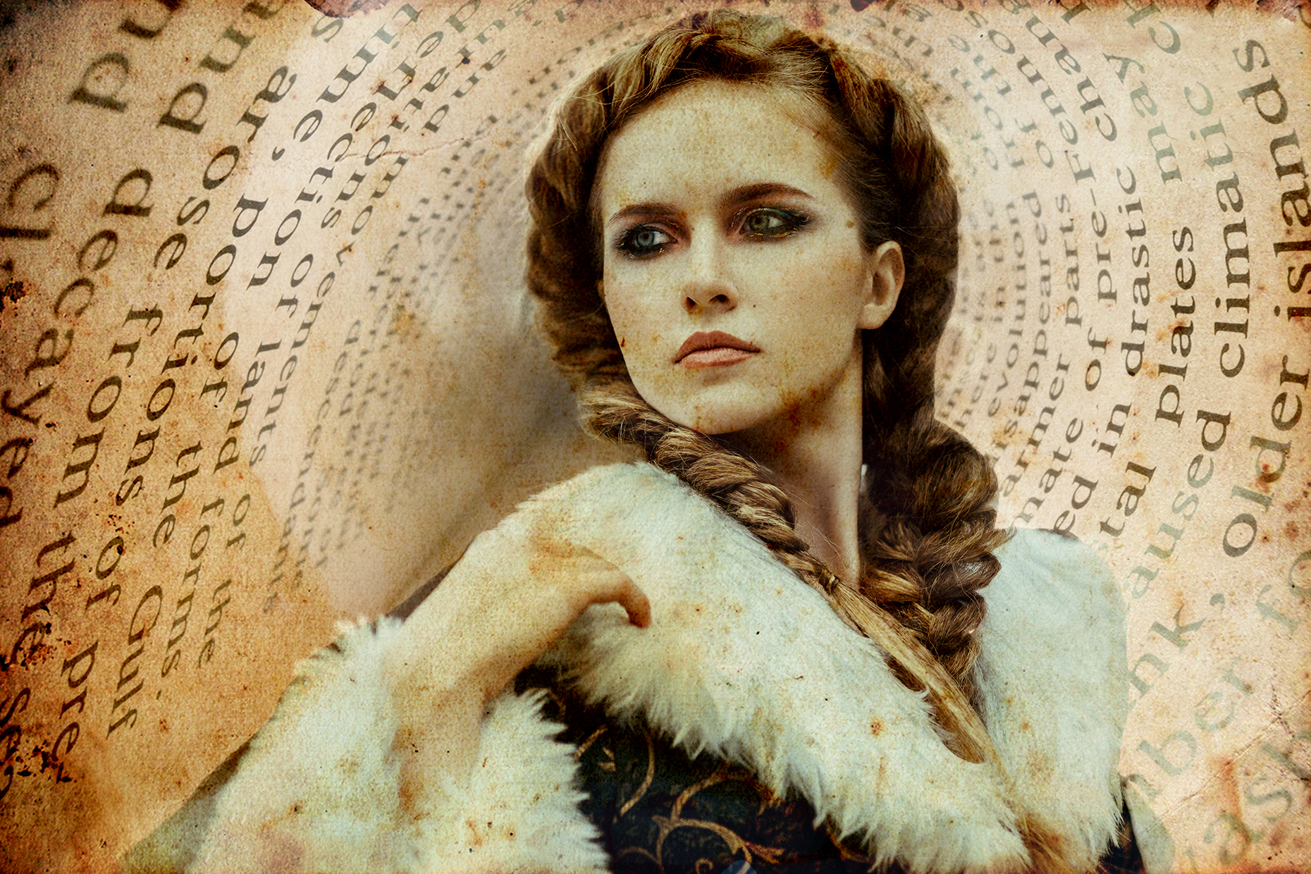
This post is about graphic designs I created about my trip to France.

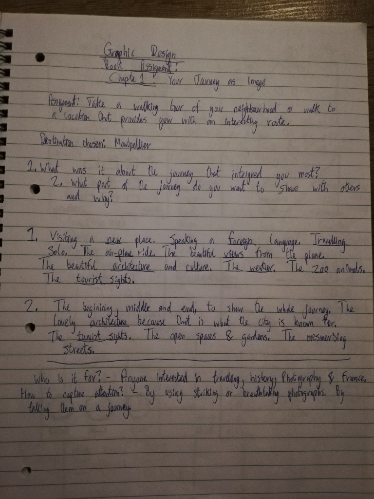
It was an exercise from a book titled Graphic Design School. The task was to choose a walking tour or location that provides me with an interesting route. I decided to choose a city in the south of France called Montpellier. I travelled to the city a couple of times and it is a lovely city. I wrote a post about my time there which you can read by clicking here. But in a nutshell, Montpellier is one of my favourite cities!

The first step was to do some research. I started off by exploring the city on foot and public transportation, and then took photos of streets, buildings, open spaces, sights, people and more. Once I gathered the first batch of primary research and analysed the findings, I started asking questions such as:

  • What was it about the journey that intrigued you most?
  • What part of the journey do you want to share with others and why?
  • Graphic design research
  • Graphic design brainstorms
  • Graphic design skectches
  • Graphic design thumbnails
  • Graphic design other sketches

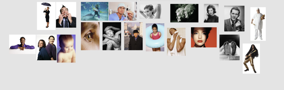
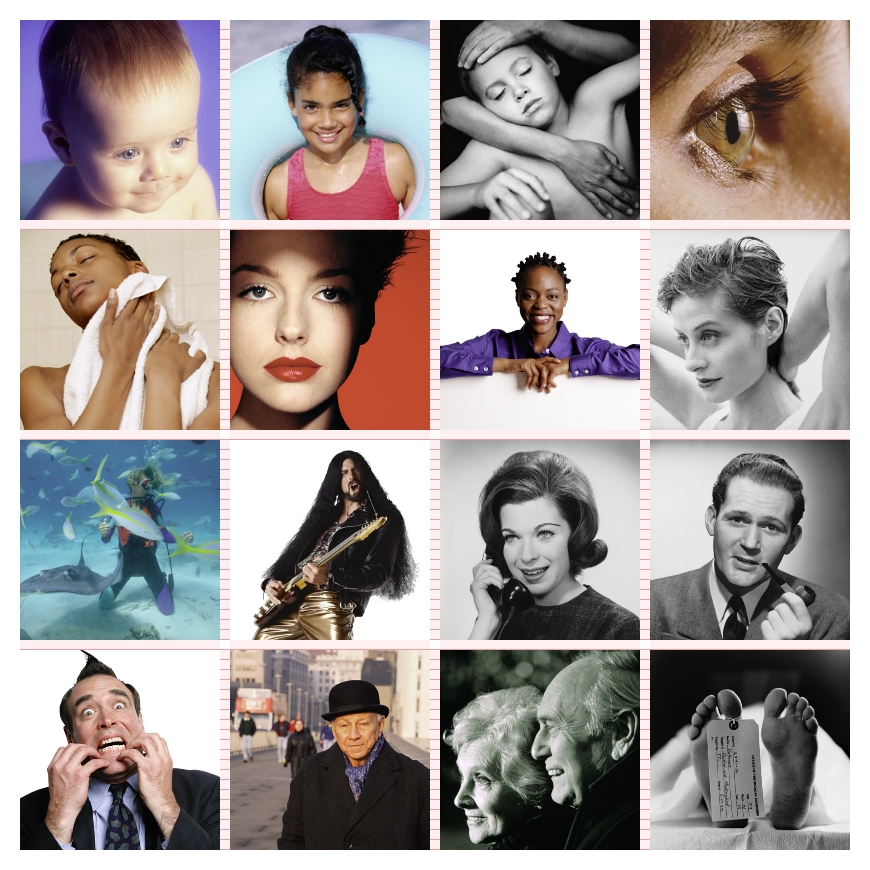
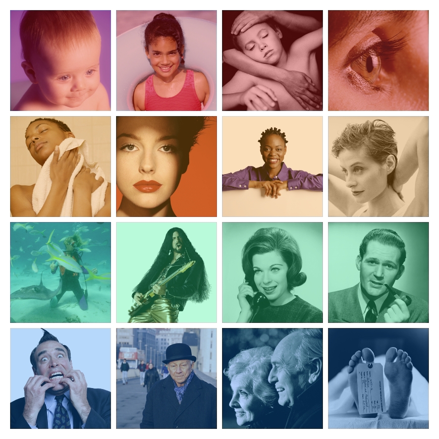
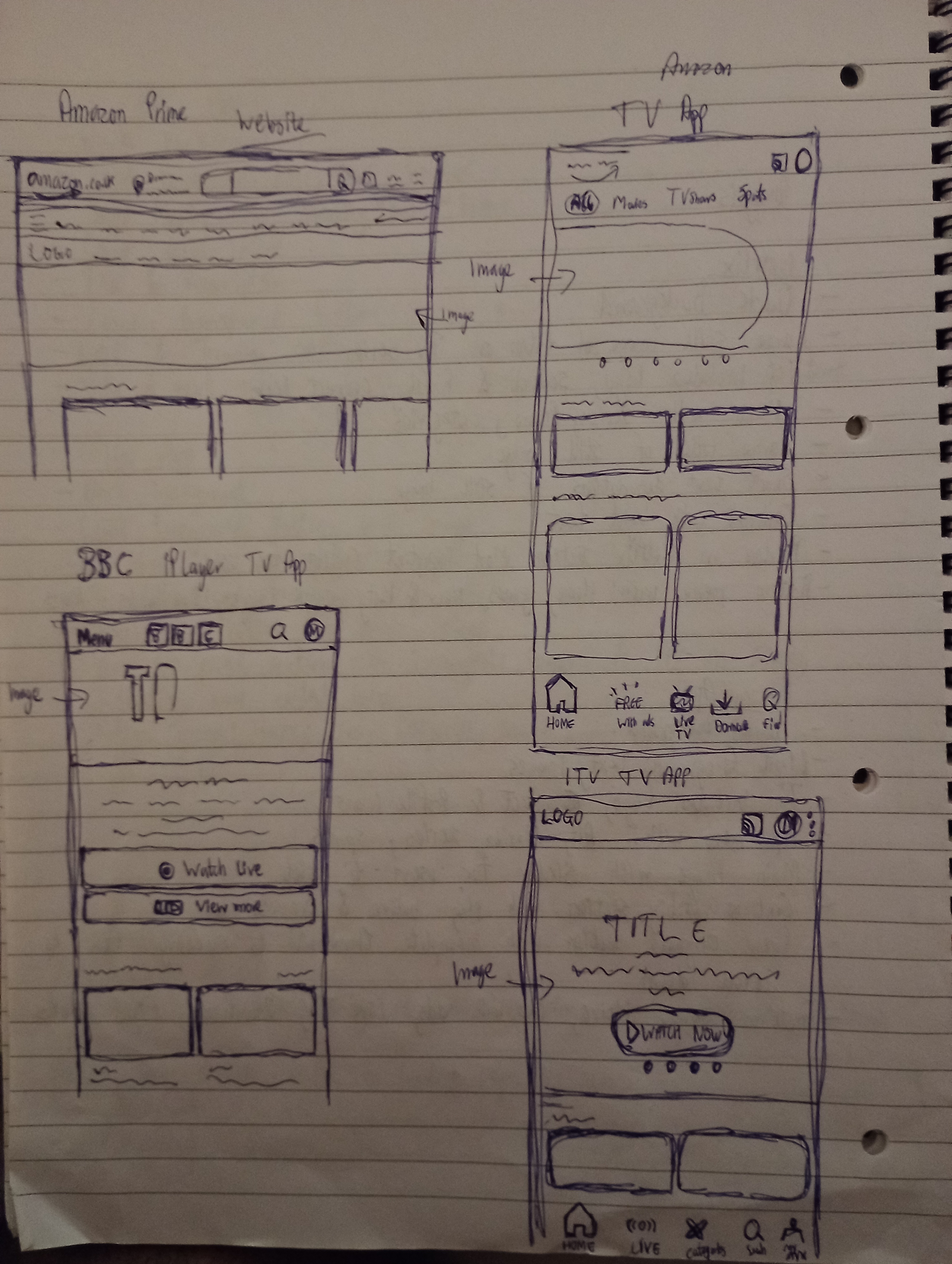
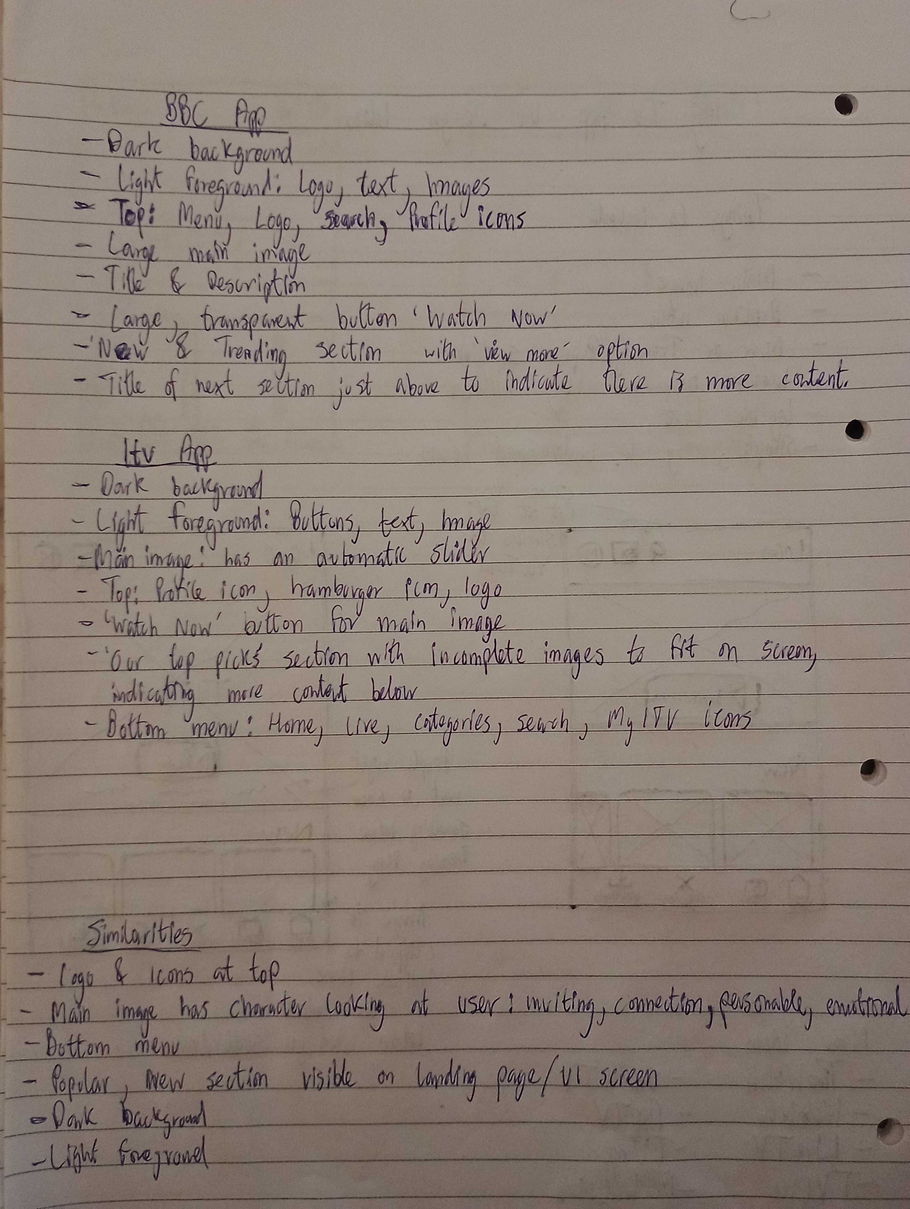
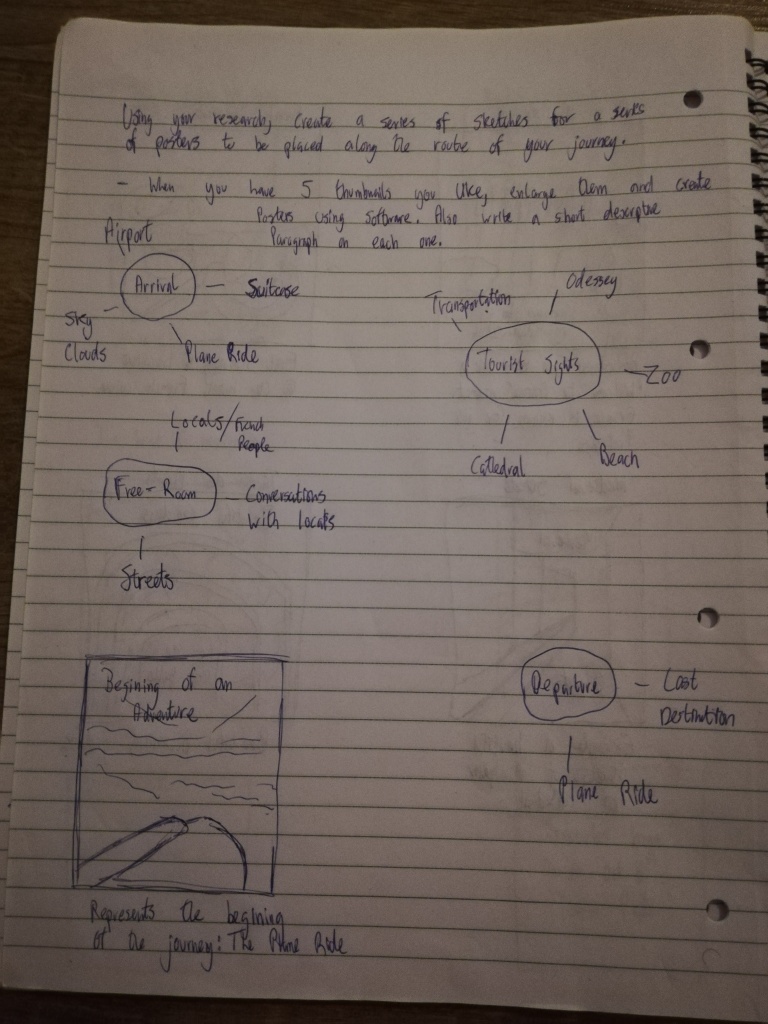
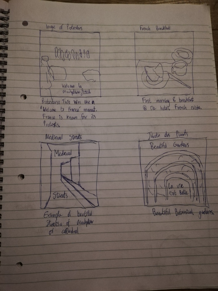
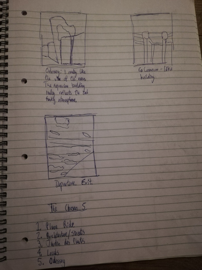
After this, I brainstormed ideas with words associated with my travelling experience, and then I created several sketches in the form of thumbnails (which can be seen above). These sketches were to represent my journey as images. The task was to create posters based on my chosen location which showcases my journey through images.

I had to choose 5 final thumbnails that I would turn into posters. I decided to go with the sketches that demonstrated:

  1. An Arrival
  2. Examples of Architecture/The Streets
  3. Tourist Sights
  4. The Locals
  5. My Favourite Spot

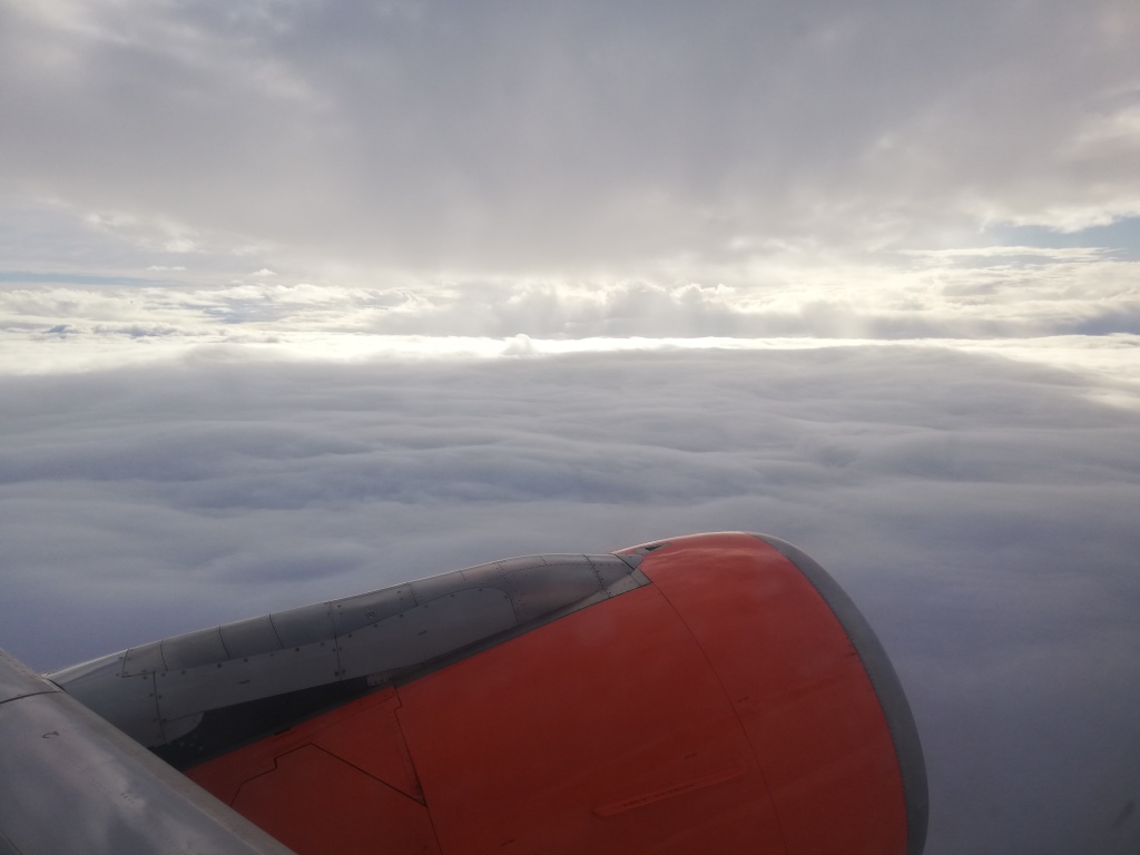
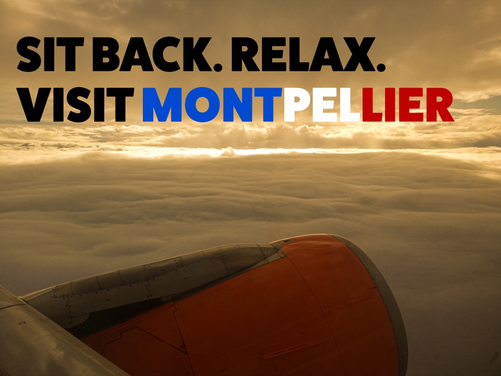
Image 1: The Plane Ride

The first image represents my arrival to the destination. It is a photo I took when I was on the window side of the plane and it brings back great memories. I love travelling by plane and seeing the world from the perspective of a bird. It is absolutely stunning and gets me every time! The views from above makes me think about how much more there is to earth than what we experience in our normal day to day lives. The picture in question is actually quite cloudy, but it opened up later on during the day to a wonderful sunshine. I went to Montpellier in February which is considered cold and part of the winter season, however for me it was warm. I’m from the UK after all!

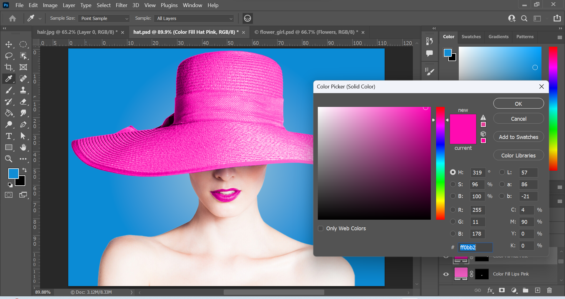
The original photo and the edited photos can be seen in the slideshow above. I used Photoshop to edit and design the posters. I thought the original photo was good but I wanted to alter the mood a bit, and so I played around with the settings in Camera Raw. I created a warmer temperature by adjusting the temperature option to a more orange yellowish colour. This represents Montpellier really well, as it has a very warm climate for most of the year. I also decreased the exposure a little, to create contrast between the dark and light elements and this created a more awe-inspiring look.

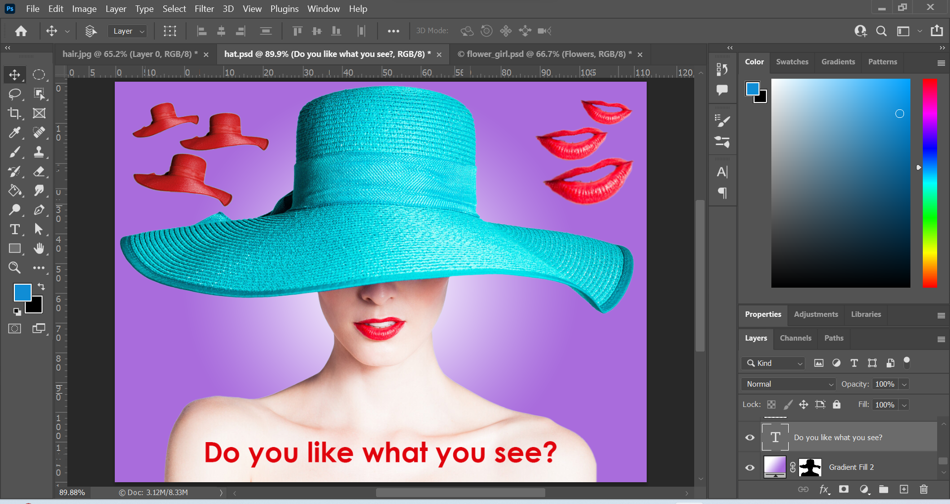
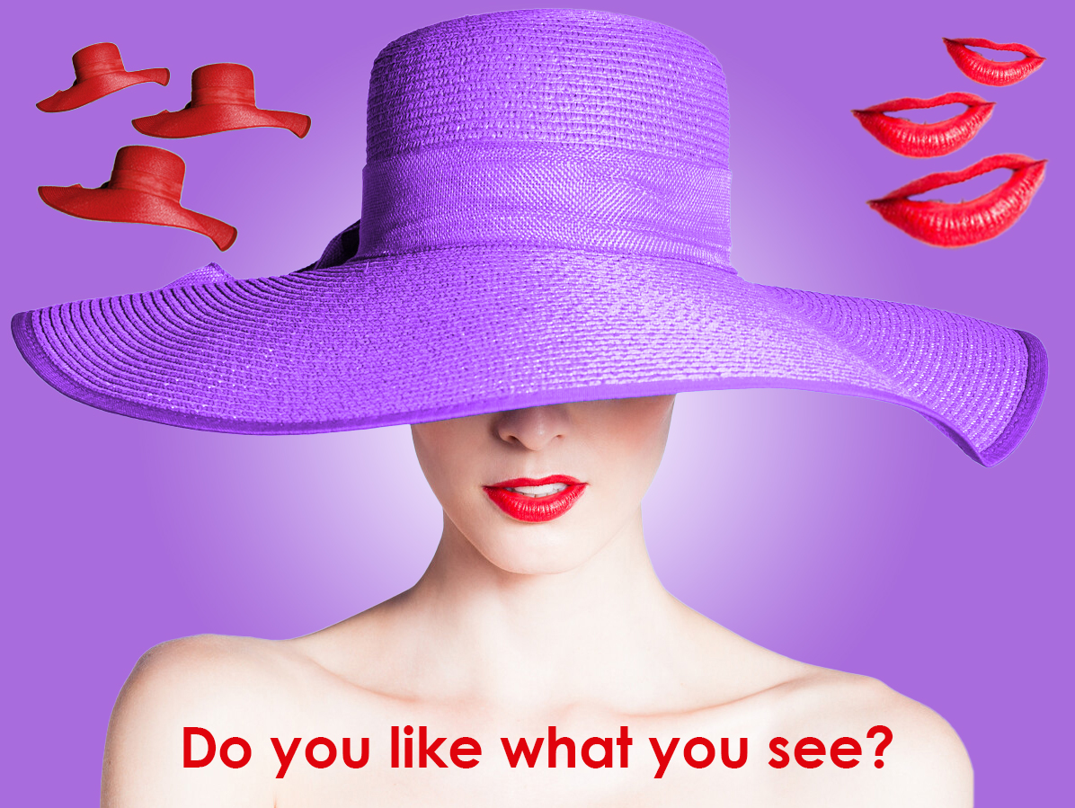
I remember watching a video about images and text in graphic design. The video was part of a LinkedIn Learning course and the instructor stated that when you combine images and text, the words should never simply repeat what the image is saying. So I took that in mind when choosing the text for the images. For the first edited image, my thinking process was to create a relaxed mood to represent the words and therefore I chose a font-style that had round corners rather than sharp ones. It was also thin to create a light sense of feeling. The second edited image, I went with the opposite. I used the Fat Frank font to create a bold and slightly playful impression on the viewer. I went with black for contrast and readability. I went with the French flag colours for the word Montpellier. This made the word stand out more and gave a clue to the viewer that the city was located in France.

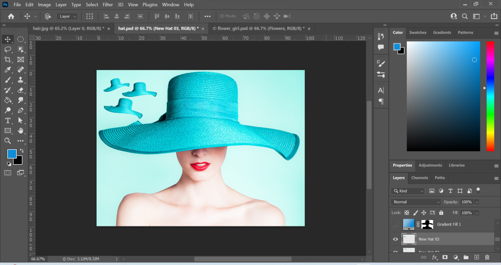
Image 2: Architecture

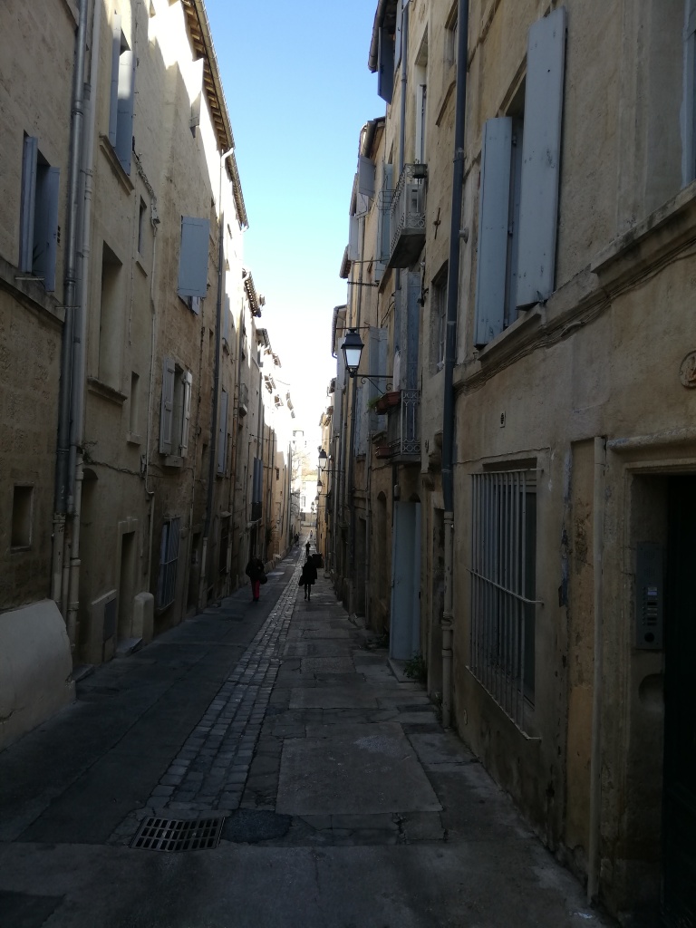
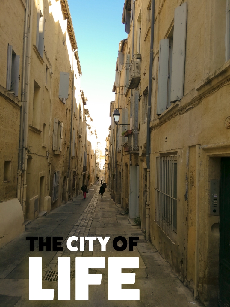
The second image was my first full day in the city. I was staying in the city centre and decided to have a walk around. I ended up getting a little lost but then I came across beautiful streets and architecture. I noticed that the narrow winding streets were a thing of beauty. I loved it! I felt free and happy. I felt alive.

The original image has great contrast and very little exposure for the buildings. This allows the focus to be at the end of the street. I wanted the photo to come to life, and so I edited the photo with the intention of making it brighter and warmer. I increased the temperature by using the Camera Raw settings in Photoshop and I also increased the exposure to give it a brighter effect. This combination created a pleasant and warm appearance. I gave this design the title “The City of Life” to further enhance the meaning of the image. The Fat Frank font was used once again and I combined the colours black and white for contrast, emphasis and unity. The emphasis is on the words “city” and “life” because this is what I wanted to communicate to the viewer first. I wanted to send a message that this city is full of life and adventure, and I communicated through design elements such as size and colour.

You can see that the size of the word “Life” is larger than any other word. It also has a glow effect around it emphasing its’ meaning. The words in black are less important and so are almost in the shadows. The focal point is centred with the words in white, which also creates contrast with the background image.

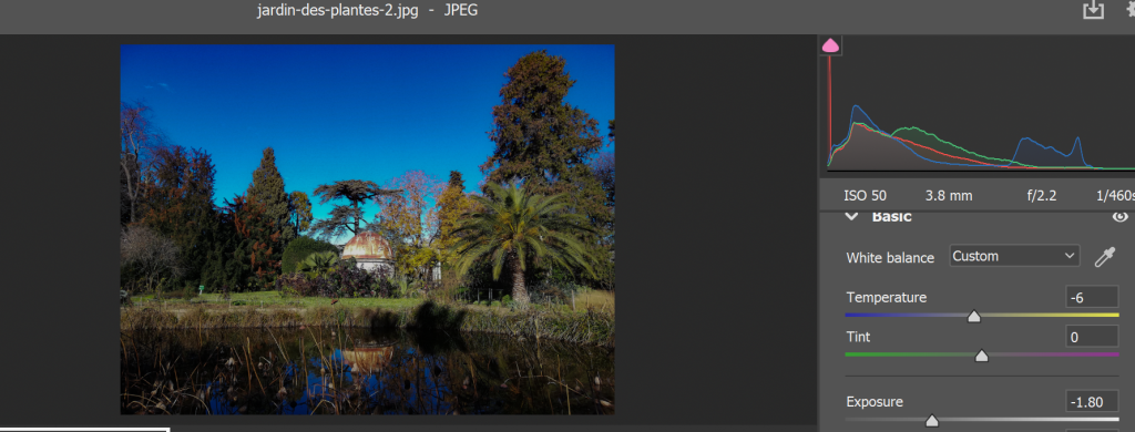
Image 3: Jardin des Plantes

Jardin des Plantes translates as the garden of plants and it is a botanical garden. It is one of the tourist sights of Montpellier and it consists of a variety of plants and beautiful flowers. The photo I took was at the heart of the garden. I really like it because it showcases the richness and beauty of the sight.

The original image shown in the slideshow above, has a lot of exposure so the first thing I did was decrease the exposure for the edited image. I also made it more crisper and sharper by slightly experimenting with the clarity and dehaze sliders in the Camera Raw settings in Photoshop (below). For the text, I used Fat Frank and placed it at the top. The colours are white and orange, and they stand out from the background dark blue. The word “paradise” is slightly bigger and has a different colour for emphasis. It is also slightly shifted to the right making the overall title dynamic. The chosen title of “Welcome to Paradise” best represents my feeling when exploring this beautiful botanical garden.
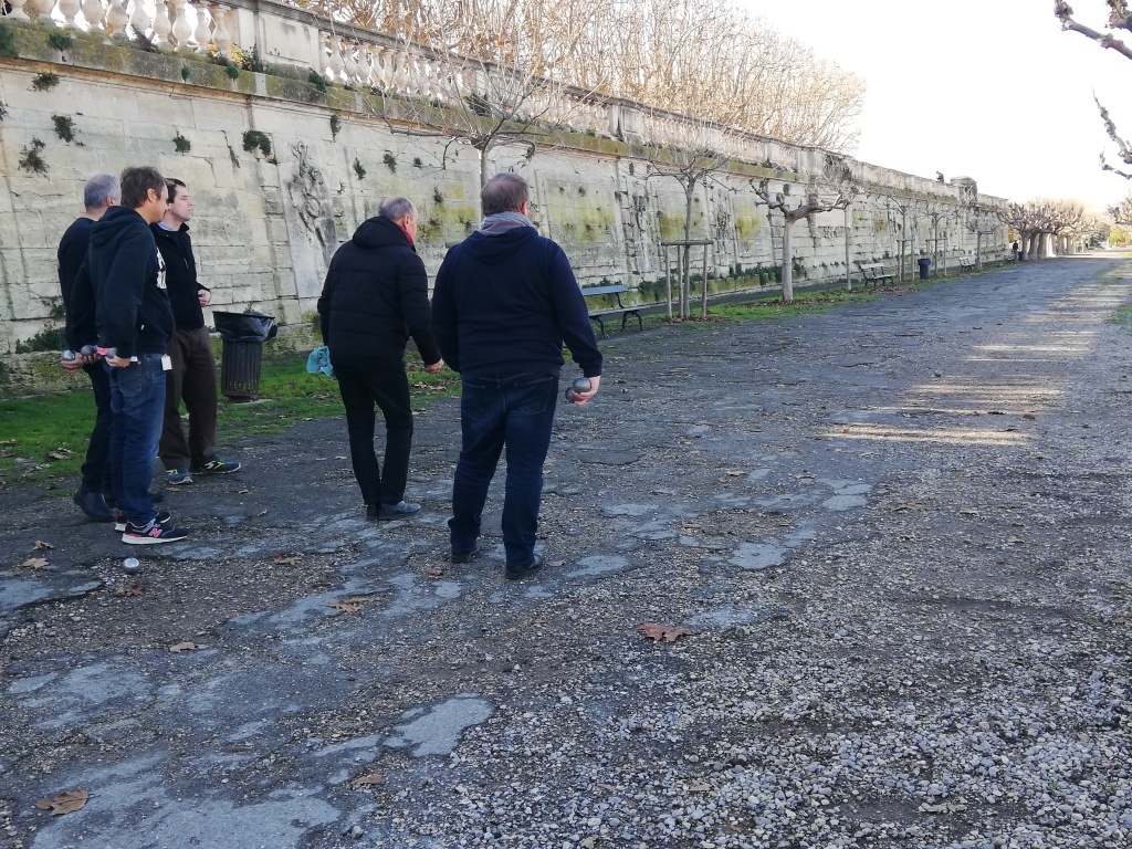
Image 4: The Locals

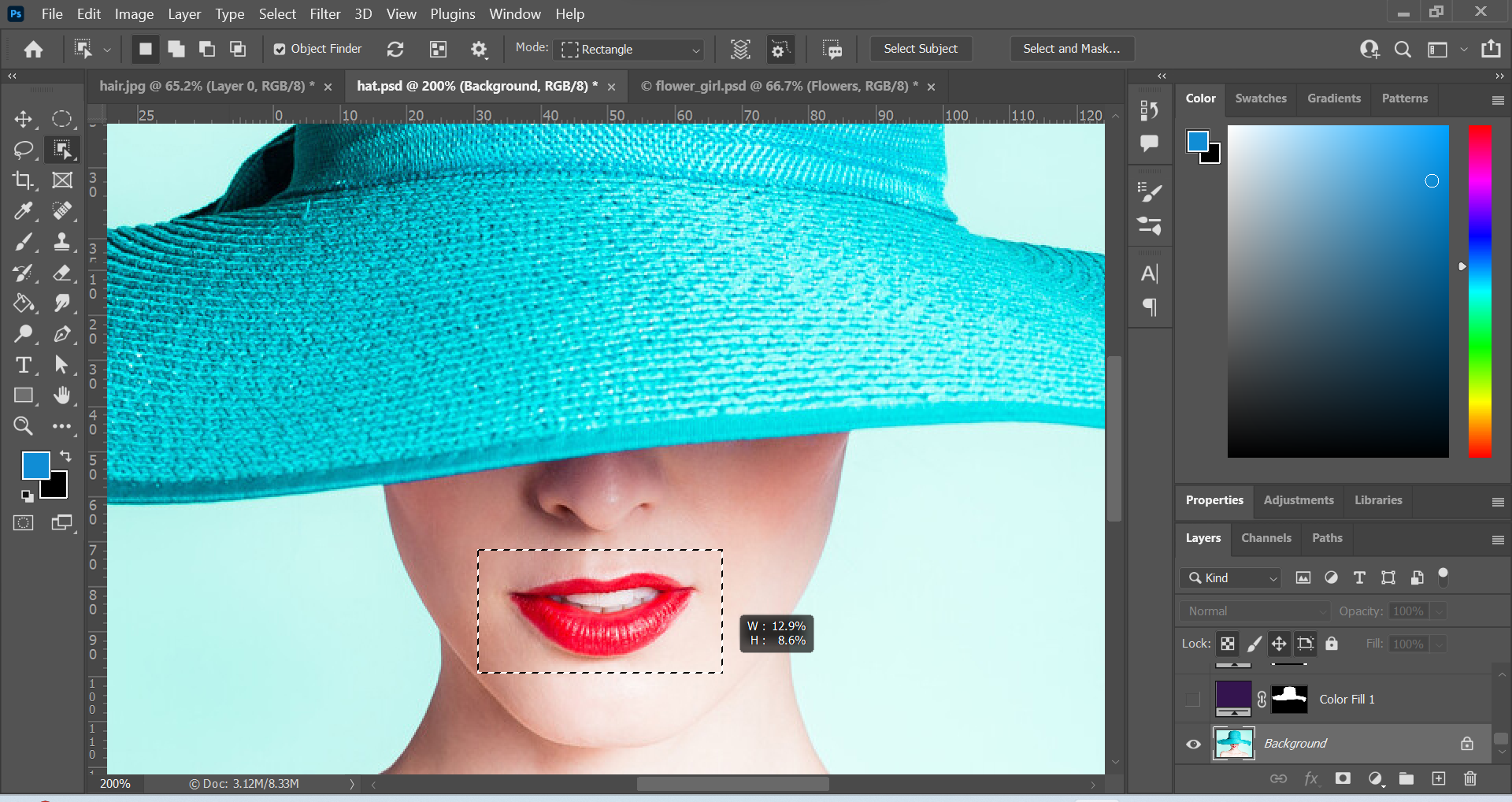
Whilst walking to a tourist sight, I saw a group of locals playing a national sports game called Pétanque. So I snapped a photo of them.

The main differences between the original and edited versions are the exposure and temperatures. I changed the mood into something more…personal? I really wanted to create harmony and focus on the path and direction the group was looking in. I did this by decreasing the exposure and uniting the elements through the use of similar colours. The text is placed at the bottom and is big and bold. It’s in stark contrast to the subjects (people). The word “Locals” is slightly bigger in size for emphasis. The elements are all placed on the left, creating a balance and space for the right side.
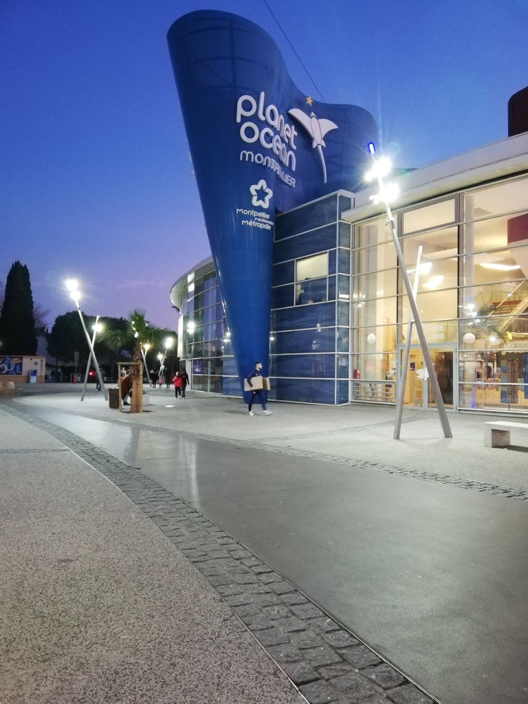
Image 5: Odysseum

The last photo is located in my last stop in Montpellier. I stayed in the city centre and went outside the centre to a place called Odysseum. It’s really a vast shopping centre but it’s a really cool place to walk around and explore with cinemas and cool buildings about. I even spotted cool architecture which looked like something out of the roman empire. My favourite building was the aquarium because it looked really interesting and represented the waves of the ocean really well. It truly made me smile!

I liked the original photo that I took. It is a cool angle showing the aquarium building in all its’ glory. I gave the photo a cooler look by sliding the temperature option to the left, making it more blue. I also moved the clarity slider to the right making the image clearer and more precise. The text is white to create contrast to the darker background. It is also slightly tilted to the right and coloured in white to create a sense of unity with the text on the building.

Conclusion

So there you have it! Graphic design exercises inspired from a book. I enjoyed the exercises because it gave me the opportunity to get my creative juices flowing, it allowed me to practice working with Photoshop and think about the principles of design.

To see other designs, feel free to check out my portfolio.

Ciao for now!