This post is about a task I did for university. This was part of a visual design module and the objective for this task was to experiment with the Adobe Xd software, by using a selection of images to create a layout design. We had a 4×4 modular grid to help structure our designs.
I wanted to tell a story through my design, and so I chose a theme. The theme is about the different stages in our lives. There were numerous images to choose from but I decided to go with images that contained people. By doing this, I could vividly display the different stages of life.
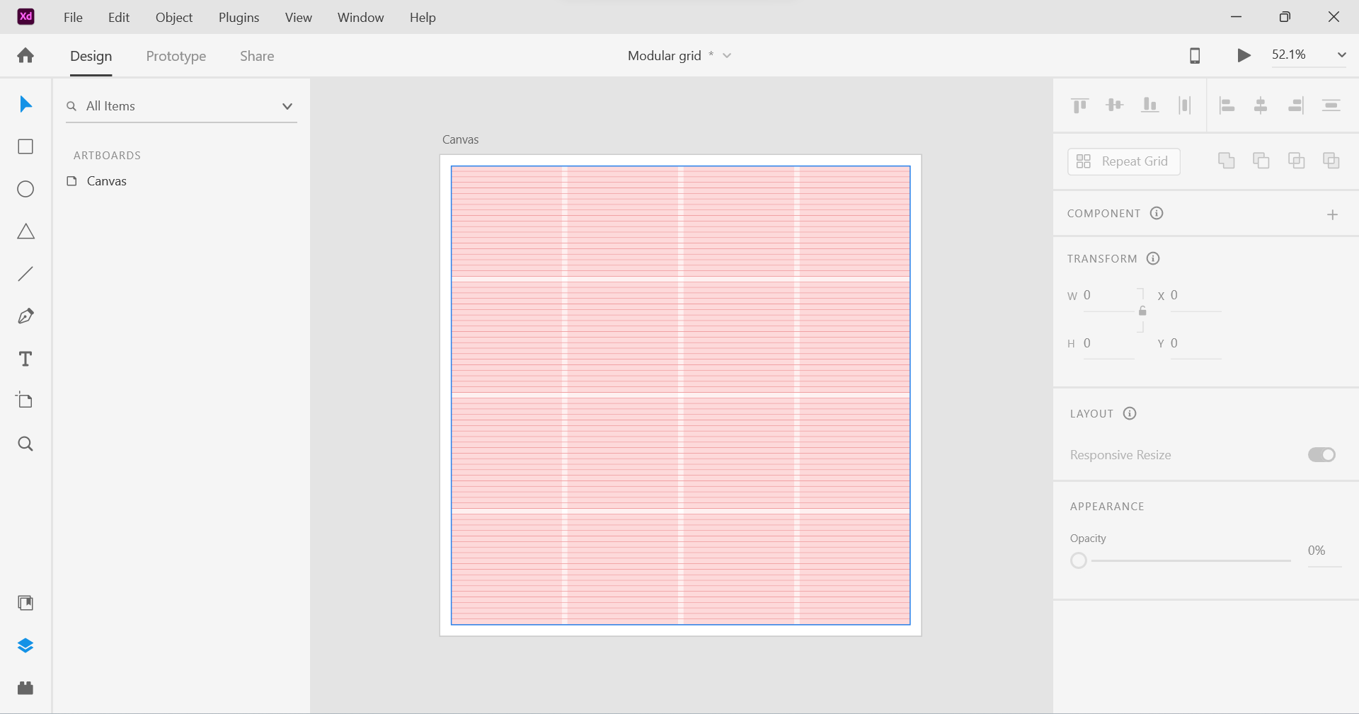
Above: Modular Grid (4×4)
Once I selected the images, the next decision was to figure out how I was going to express the theme. Should it be in chronological order? Should it be sporadic? I decided to go with chronological order, which meant starting from the beginning of life to the end of a person’s life.
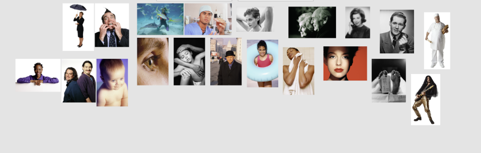
Above: Images that I selected.
The first thing I did was to create a 200px by 200px square and place it in the first grid area in the top right hand corner. Then I placed an image of the baby on top of it by copying it and then using the “paste appearance” option. This is a great feature which permits the user to paste an image to fit in a shape. I effectively repeated the same step for the other sections of the grid layout.
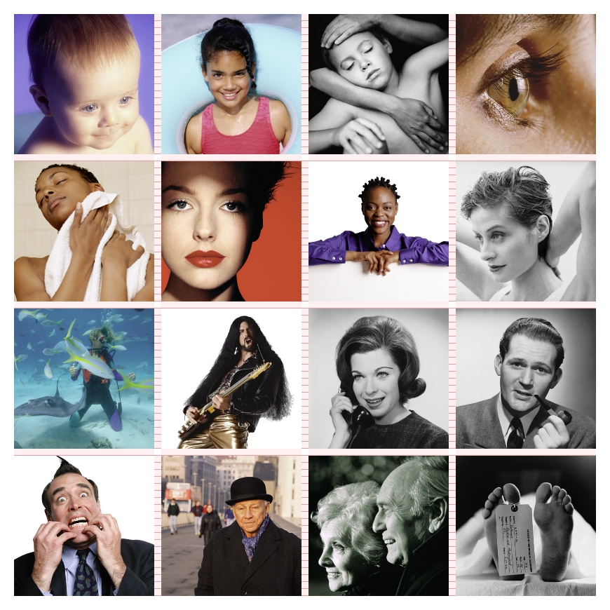
So, I effectively created a series of images from life to death. From youth to old age. I also wanted to add images that expressed certain emotions and feelings such as joy and great pleasure which can be seen in the image of a man and his guitar. Fear which can be seen in the image in the bottom left hand corner. I like the second to last image in particular. They are reaching towards the end of their lives, but instead of worrying or having fear, you can see a sense of joy and happiness as they look back to what they managed to do in their lives. Together, they have reached the end.
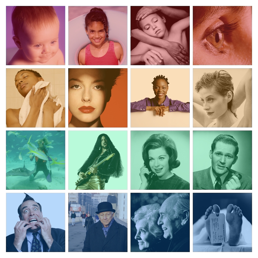
Above: Two layout designs. For the second layout design, I added coloured squares and placed them on top of the images. The colours go from warm temperatures to cold. This is another way of communicating changes or growth.
This post is about a challenge I did from a course on LinkedIn Learning. I am learning Photoshop, which is a powerful software that allows the user to manipulate images. In this challenge, I had to combine textures with a photo using blend modes and layer masks.
Above: LinkedIn Learning
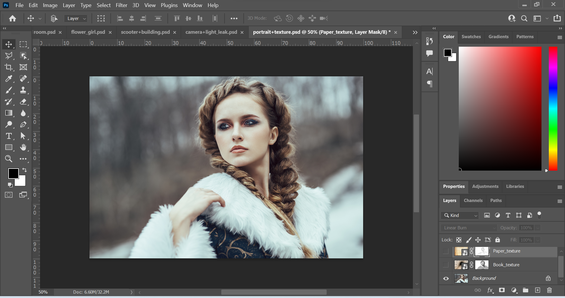
Above: Screenshots of Original Images in separate layers.
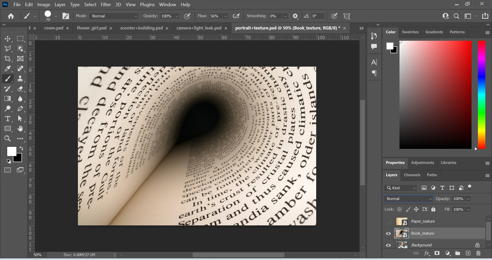
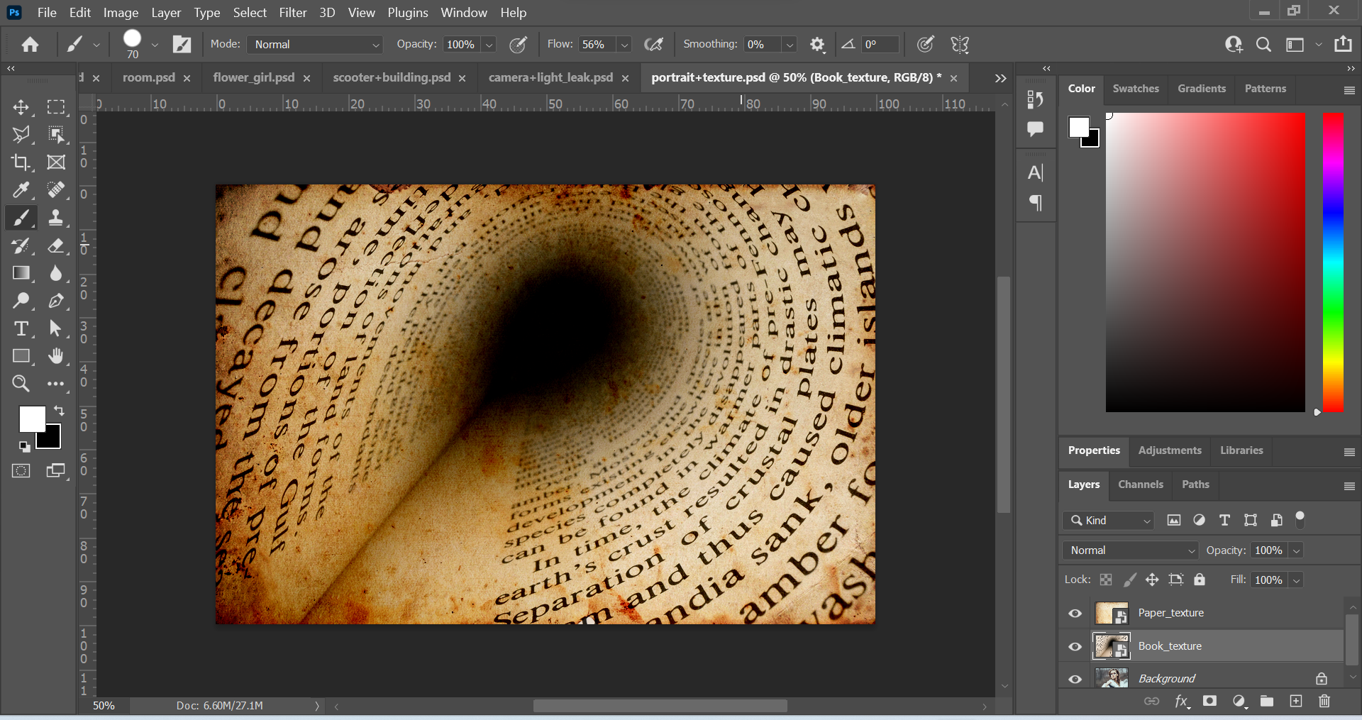
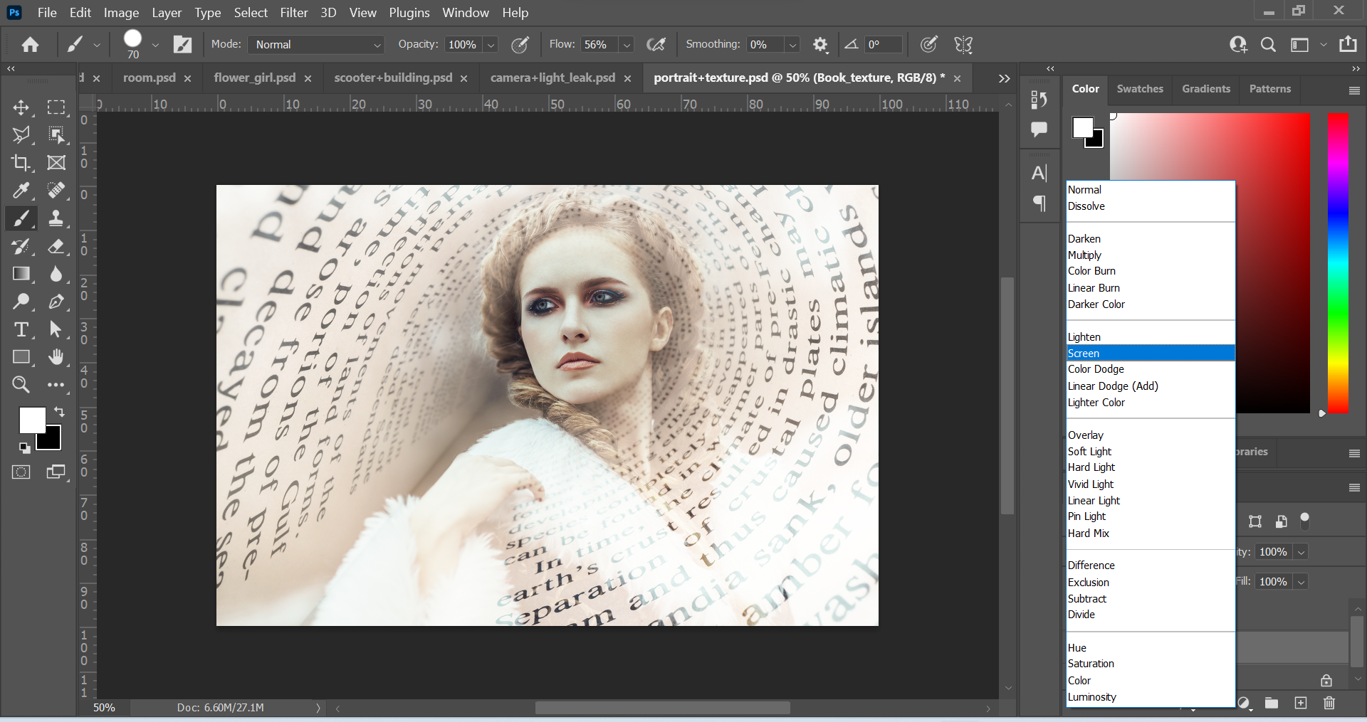
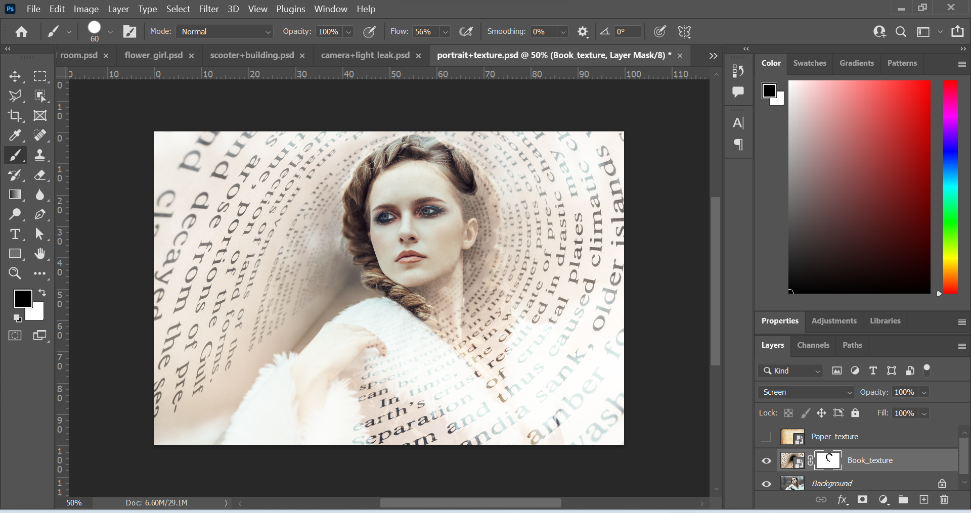
Above: Screenshots of edited images. The first thing I did was change the Book_texture layer into a different blend mode. I changed the mode from Normal to Screen. This created a slightly transparent look, where the woman in the image was visible. Next, I made the Book_texture layer into a layer mask by clicking on the rectangle icon with the circle in the middle at the bottom of the layer panel. Then, I used the brush tool to remove parts of the texture. I wanted to reveal more of the woman’s face, hair and overall appearance. I used black paint to remove elements of the image and this created a focal point.
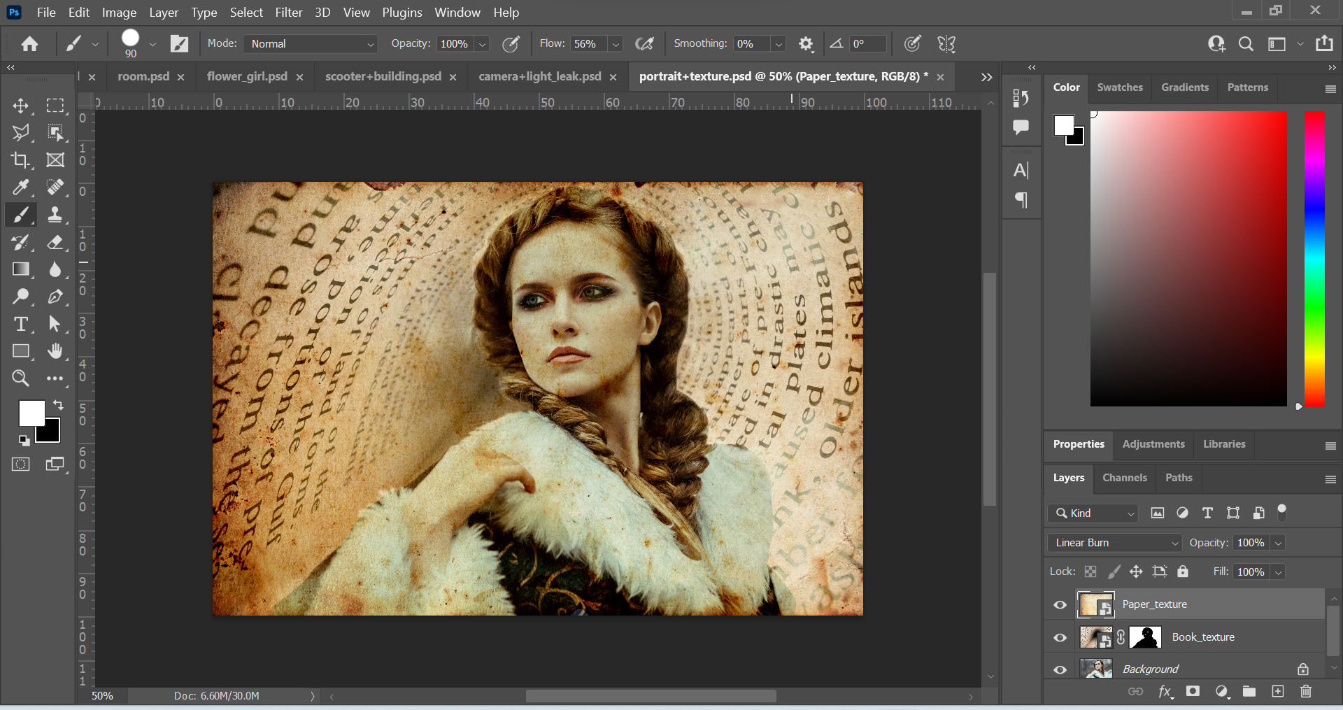
After this, I worked on the Paper_texture layer by changing the mode from Normal to the Linear Burn mode. I liked this as it created a sort of vintage look. I made the layer into a layer mask and removed parts of the image with the paint tool. This time, I lowered the opacity of the brush tool so that the colour was grey and not black. I wanted to do this so that when I used the brush tool to remove parts of the image, it would be subtle. I created a brighter effect around the woman by doing this.
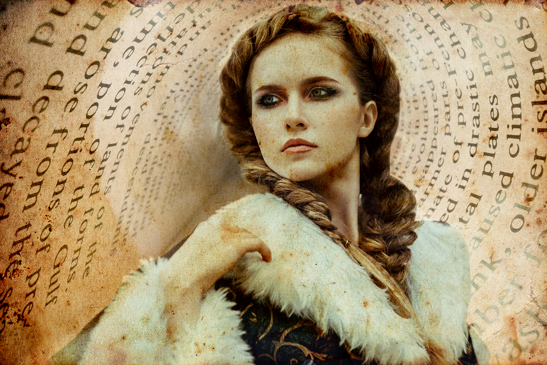
Above: Final Outcome
Conclusion
It was great to learn about blend modes and layer masks. It was also great to put it into practice. I look forward to learning more things in Photoshop.
This post is about a challenge I did from a course on LinkedIn Learning. I am learning Photoshop, which is a powerful software that allows the user to manipulate images. In this challenge, I had to manipulate an image using a variety of selection tools.
Above: LinkedIn Learning.
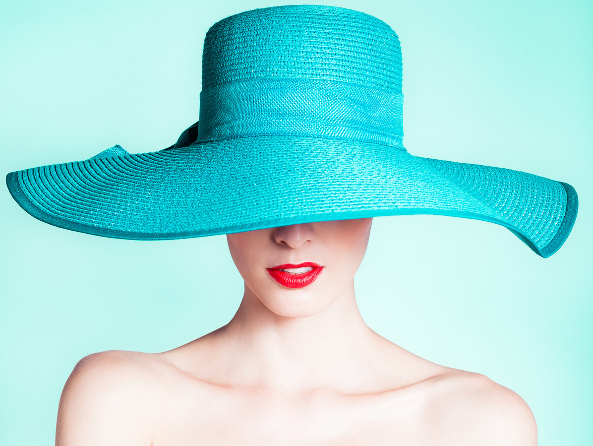
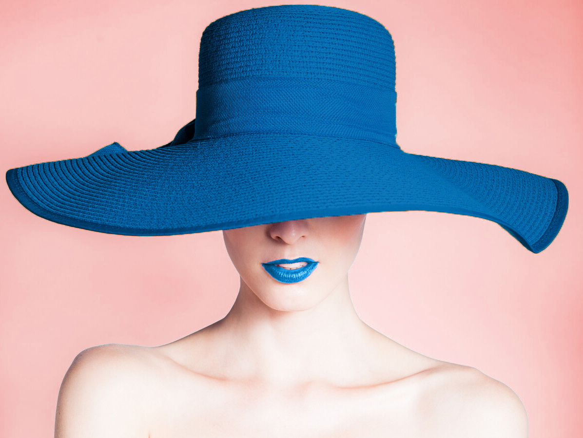
Above: Original Image
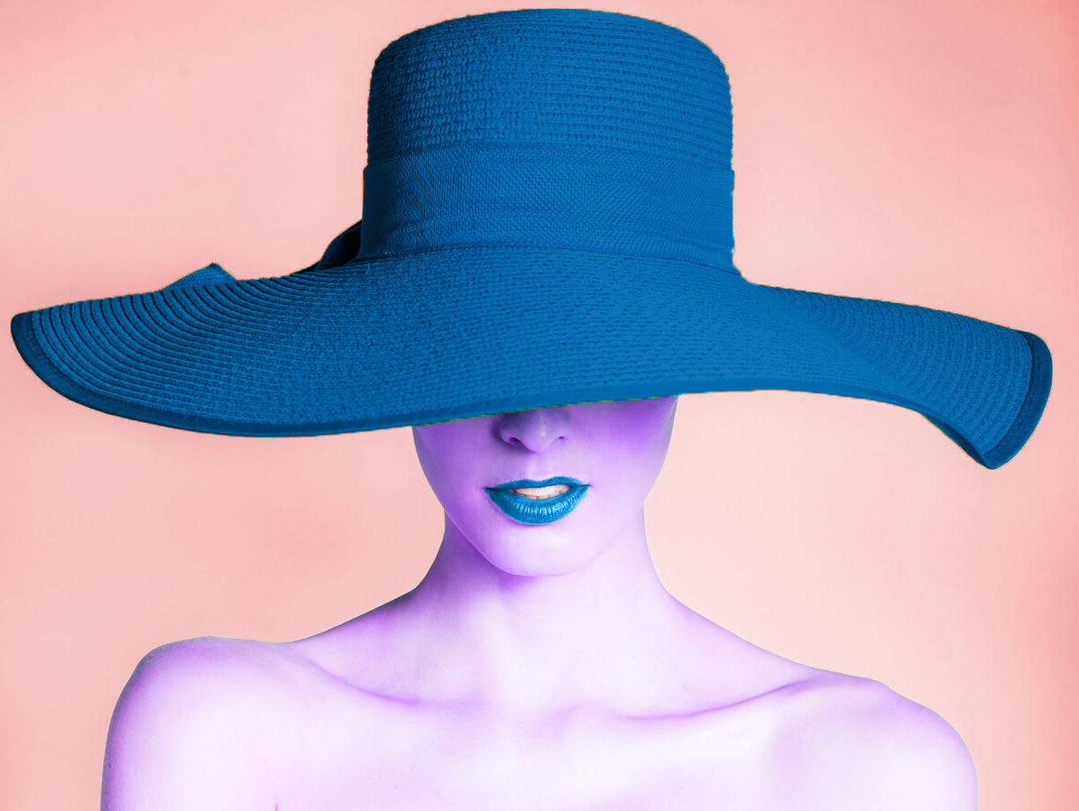
Image 1
Image 2
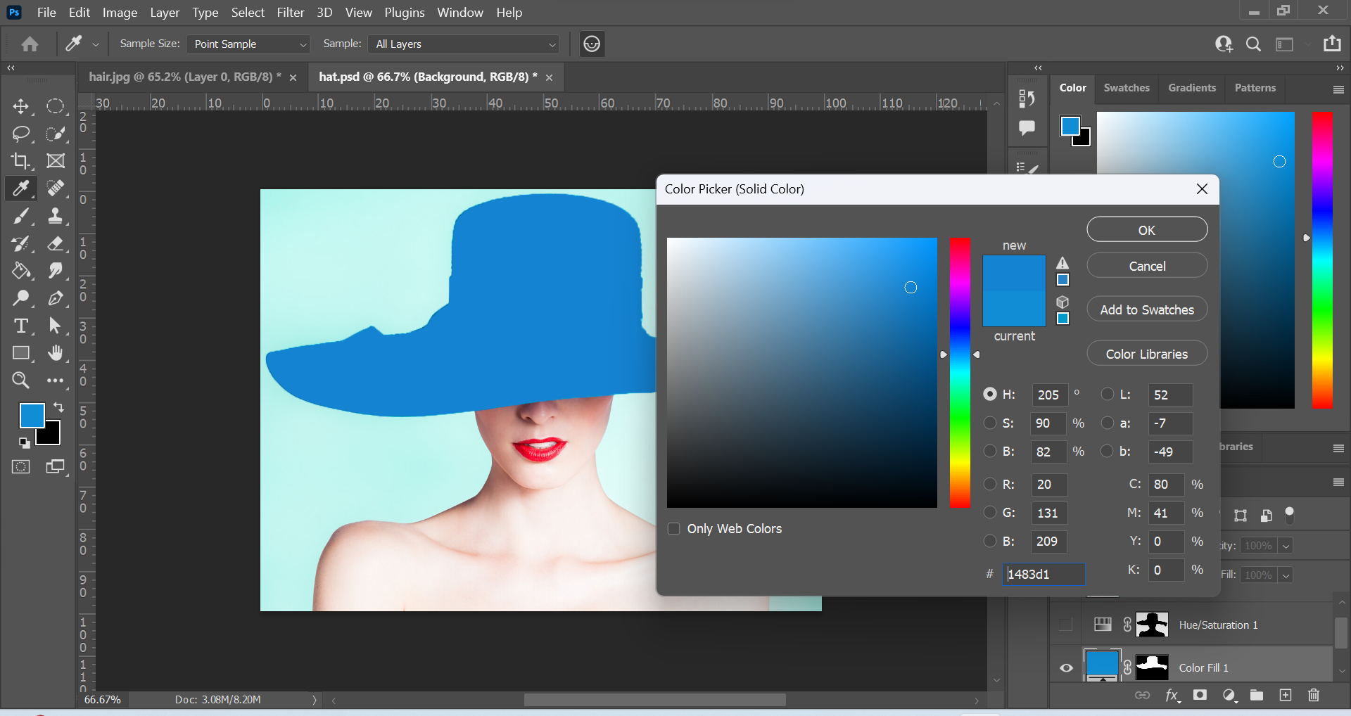
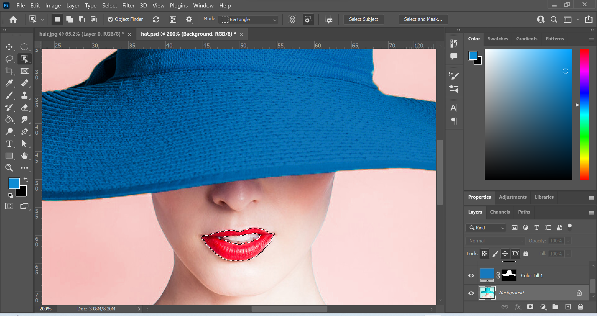
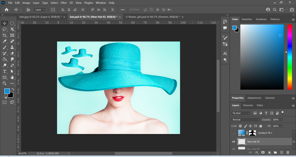
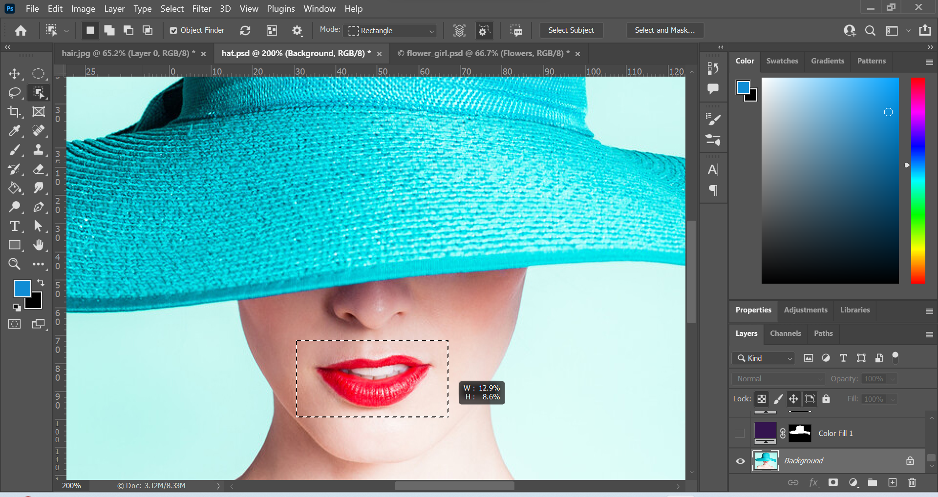
Above: Screenshots of edits in Photoshop and the final outcomes for Image 1 and Image 2. To create the 2 images, I used the Object Selection Tool to select elements. The Object Selection Tool can be used to automatically select something. You can click on a subject or drag a shape around the subject to select it. Firstly, I used this tool to select the hat. Then I created an adjustment layer and selected a solid colour. I chose the #1779bd (blue colour). I wanted a different feel to the original image, and chose a colder and calmer colour than the original colour for the hat. To make the hat visible, I changed the layer mode to Multiply. I repeated these steps for the lips.
I used the unity design principle to match the hat and lips by using the same colour. To make the elements further standout, I changed the background colour to a warmer colour. I did this by choosing Select in the top menu, and then Subject. This automatically selected the portrait image and then I inversed the selection by choosing Select – Inverse. I used another adjustment layer to change the Hue to a warmer colour. For Image 2, I used the Hue adjustment layer to change the skin tone to purple. The colour purple can be associated with something mysterious so I thought it was a good colour to communicate this message.
Image 3
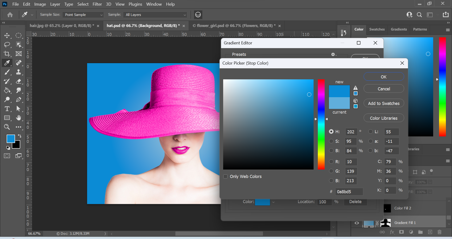
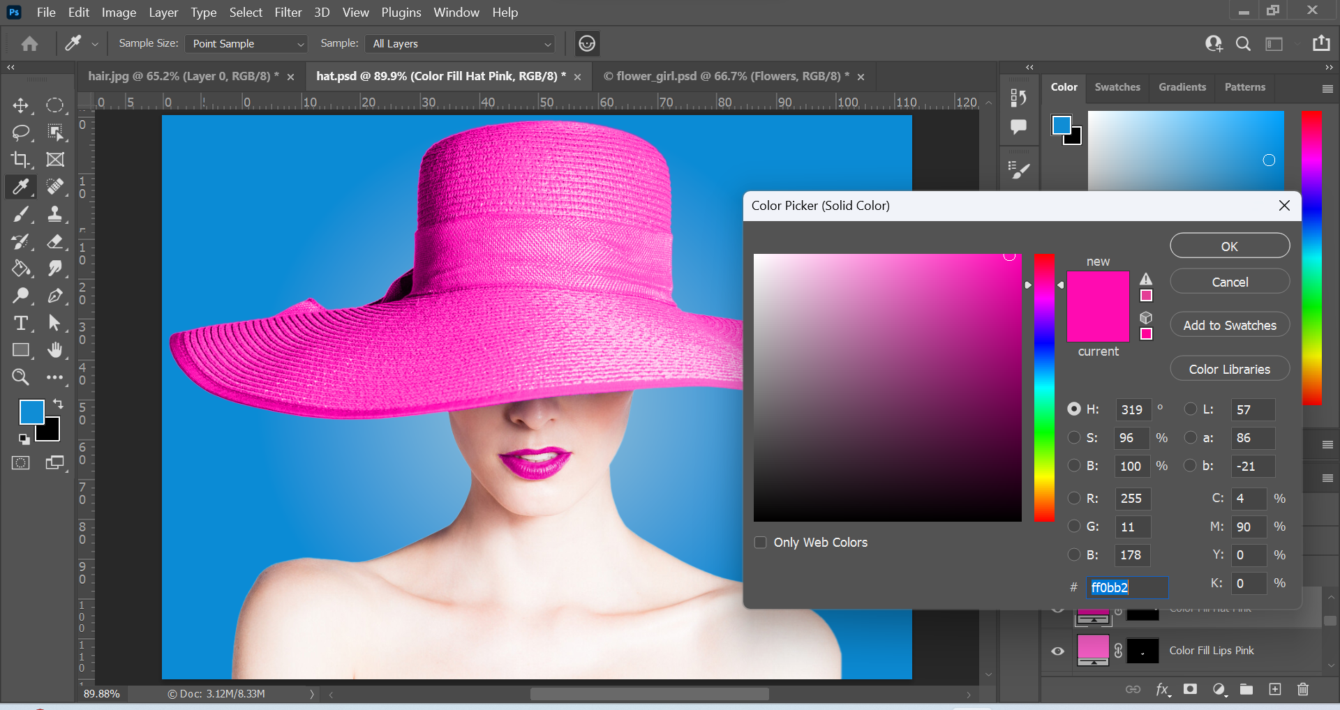
Above: Screenshots of edits in Photoshop and the final outcome for Image 3. I used the Quick Selection Tool to select the hat. The Quick Selection Tool is great for quickly selecting larger areas of an image. This can be done by dragging around the area you want to be selected. It is located in the toolbar right beside the Object Selection Tool via the drop down menu. Once the hat was selected, I created an adjustment layer. Adjustment layers are great because you can modify an image without damaging the original image underneath the adjustment layer. I chose the Solid Color of #ff0bb2 (pink) and changed the layer mode from Normal to Color, so that the hat is visible through the layer.
For the lips, I used the Object Selection Tool and then repeated the same steps as I did for the hat. The background was created via a Gradient adjustment layer and I used a Radial Gradient effect combining the colours #92bfd9 (light blue) and #0a8bd5 (medium blue). The cold blue background has contrast with the vibrant pink elements and the bright portrait. I really like this image because it is aesthetically pleasing and the contrasting elements work well together.
Funnily enough, during the process of this creation I had various thoughts running through my mind. Some of the thoughts were things like musicals, candy, Charlie and the Chocolate Factory, Mary Poppins and even Katy Perry’s California Girls. Perhaps it is because of the vibrant colours associated with them. After the first image, I wanted to design something more eye catching and a “feast for the eyes”. The colours pink and blue were the first colours to come to mind.
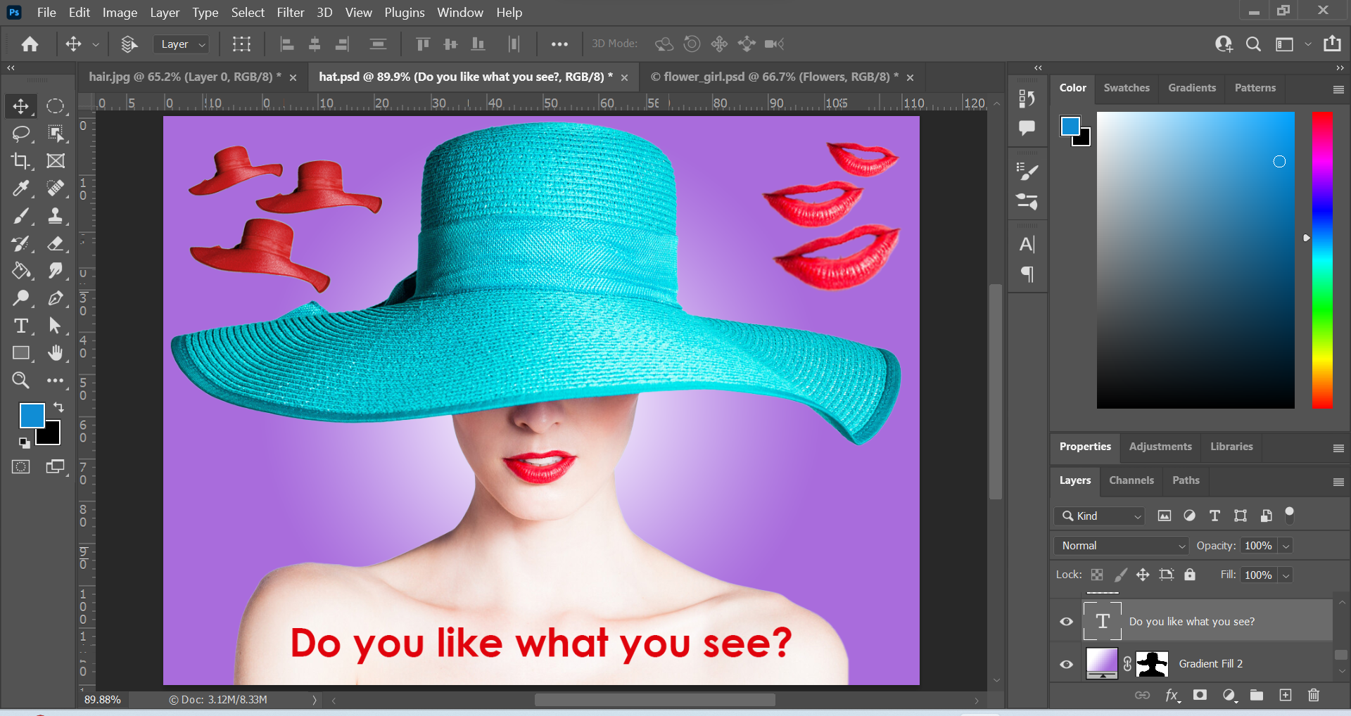
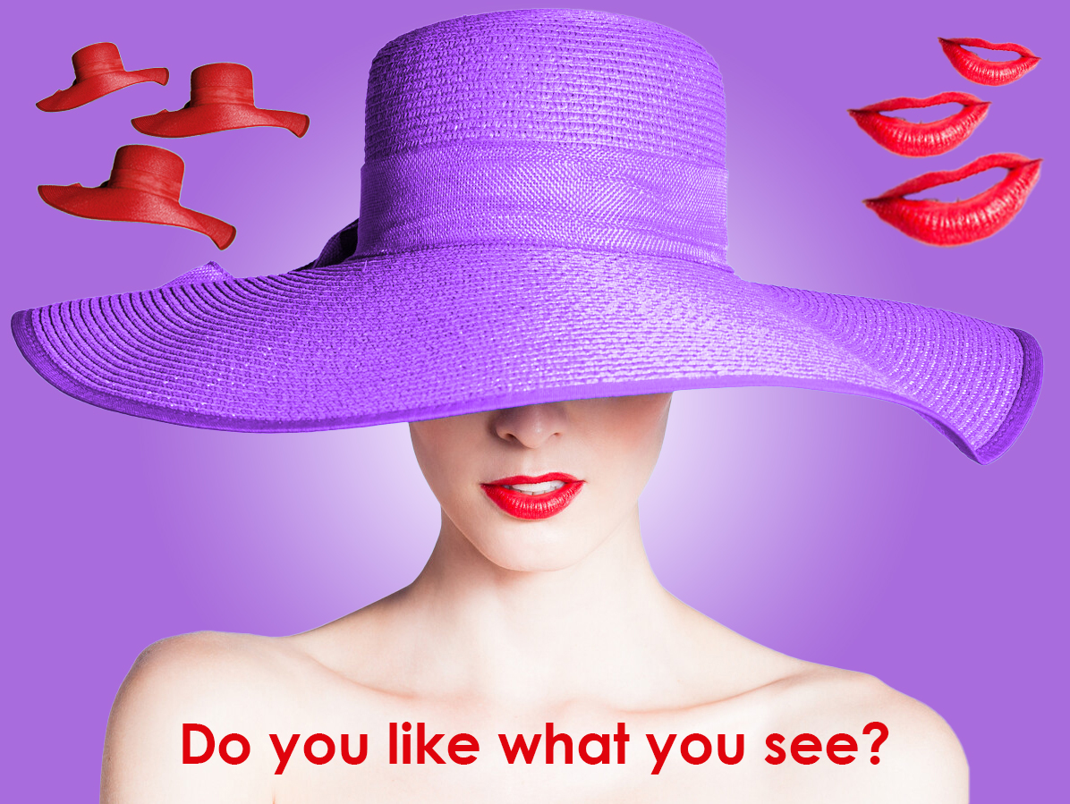
Image 4
Above: Screenshots of edits in Photoshop and the final outcome for Image 4. I wanted to do something a little different for the final image. I wanted to add extra elements to the original composition. The first thing I did was cut out the hat element and duplicate it a few times to create a repetition effect. I did this by using the Quick Selection Tool to select the hat and then I duplicated the selection unto a seperate layer using the keyboard shortcut: Ctrl + j on a windows computer. Then, I scaled the hat down to a smaller size and used the free transform tool (Ctrl + t) to rotate it slightly upwards. I wanted to match the colour of the hat with the colour of the lips so I used an adjustment layer and changed the hue to a similar colour to the lips. I also decreased the opacity for the hue from 100% to 90% to make it less intensive. I repeated the same steps for the other hats and rotated each hat slightly more clockwise and slightly increased the scale. This created a rhythm and a motion effect. I also repeated these same steps for the lips. Instead of clockwise, the lips were rotated anti-clockwise. This created contrast in terms of rotation compared to the hat elements, but also unity was formed because of the repetition, alignment and colour.
I used a Radial Gradient effect to create the background. I combined the two colours #ffffff (white) and #a96cdc (purple) to create a sense of mystery, and also to create a spotlight effect for the main subject. I created a #34144f (dark purple) Solid Color adjustment layer for the hat, and changed the layer mode from Normal to Hue. This allows the viewer to see through the layer. This also creates unity with the background but contrast because of the foreground (hat) texture.
To finish, I completed the design with a slightly daring question: “Do you like what you see?” This can refer to the design or the portrait. I thought the question perfectly matched the tone of the design. I chose the colour red to form unity, and I chose the font Century Gothic (Bold) because it reminds me of elegance and fashion which I feel matches the portrait.
During the process for Image 4, songs such as Santa Baby, Big Spender and films such as Who Framed Roger Rabbit came to mind. I guess it is because of the nature of the songs being slightly daring and the character Jessica Rabbits also fitting this description.
Conclusion
I enjoyed learning about the selection tools in Photoshop. I had the opportunity to experiment with the different tools and create interesting designs. The selection tools in Photoshop are really powerful and I was surprised how easy they were to learn. There are numerous ways to select elements in Photoshop so it was great to learn how to use them. This will certainly help me with my future projects in Photoshop.
This post is about Photoshop. I’m taking a course on LinkedIn Learning about how to use Photoshop.
Above: LinkedIn Learning is a resource for online courses. This is the tutorial I watched.
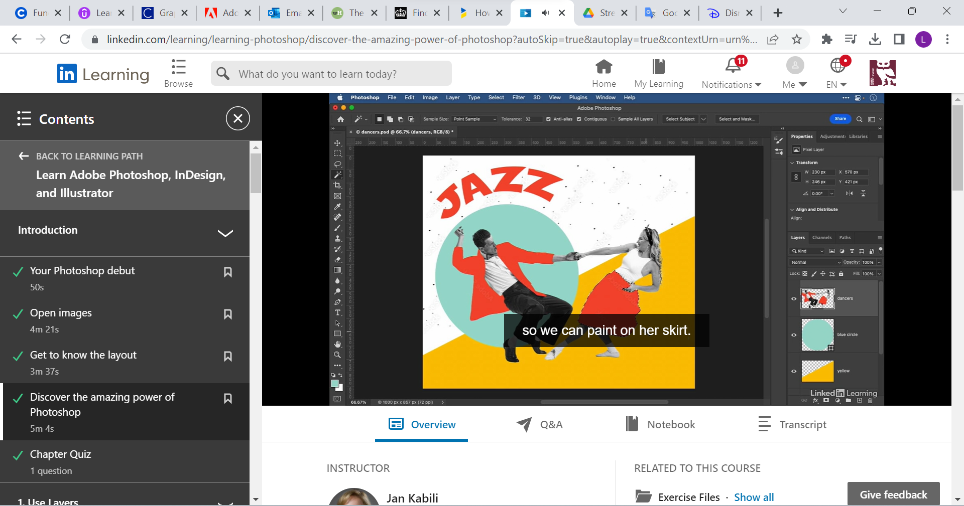
Above: This is the original image
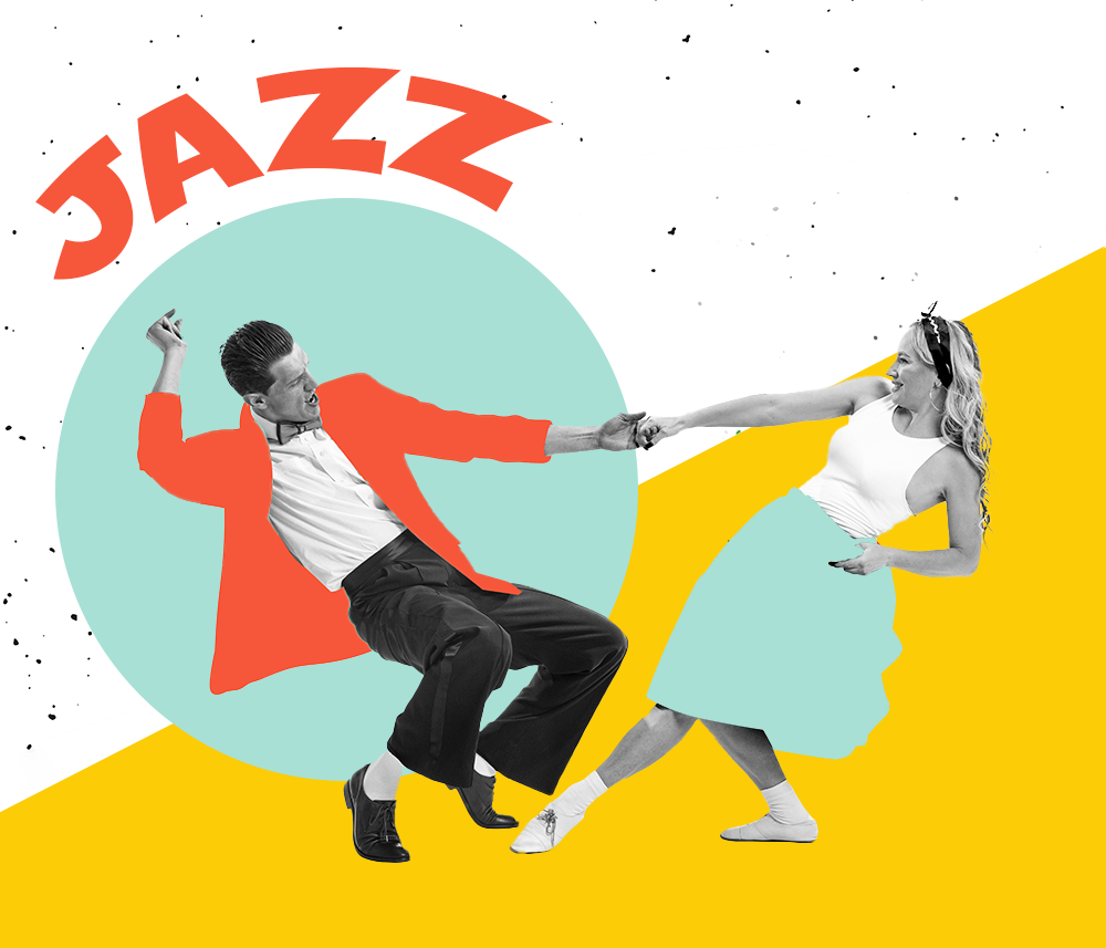
Above: First edited image. I followed the tutorial and changed the position of the title “Jazz” and the circle shape from the right side of the design to the left. Next, I flipped the dancers by using the Flip Horizontal technique in the Edit menu. Lastly, I changed the colour of the lady’s dress to match the colour of the circle. I used the selection tool and then the brush tool to do this.
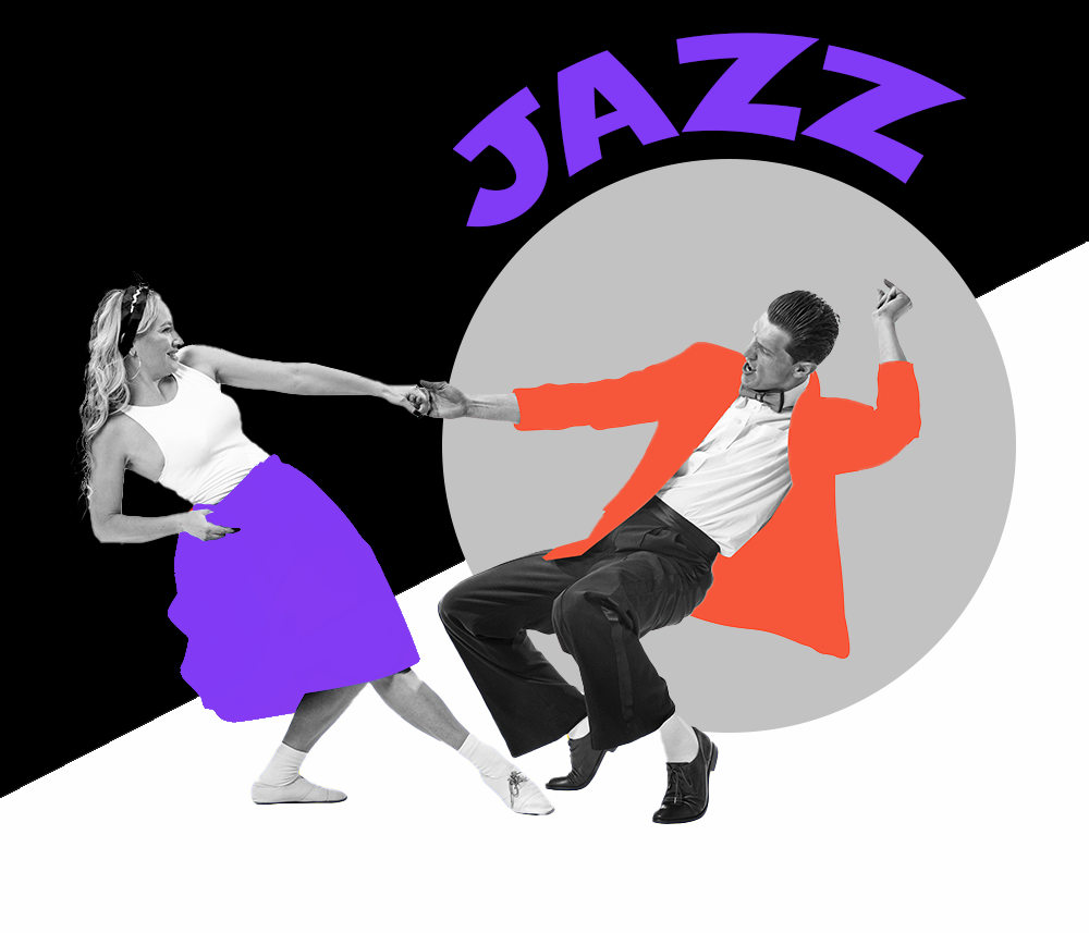
Above: Second edited image. I decided to play around a little bit. I kept the position of the dancers from the original image. For the foreground, I decided to change the colour for the title and the lady’s dress to purple. This creates unity. Purple was the first colour that came to mind when I thought of jazz. I also did some research and discovered that purple is associated with the word “creativity”, which is a good word for the music genre jazz. I used black and white to create contrast and dynamism. The grey colour for the circle is a mixture between white and black.
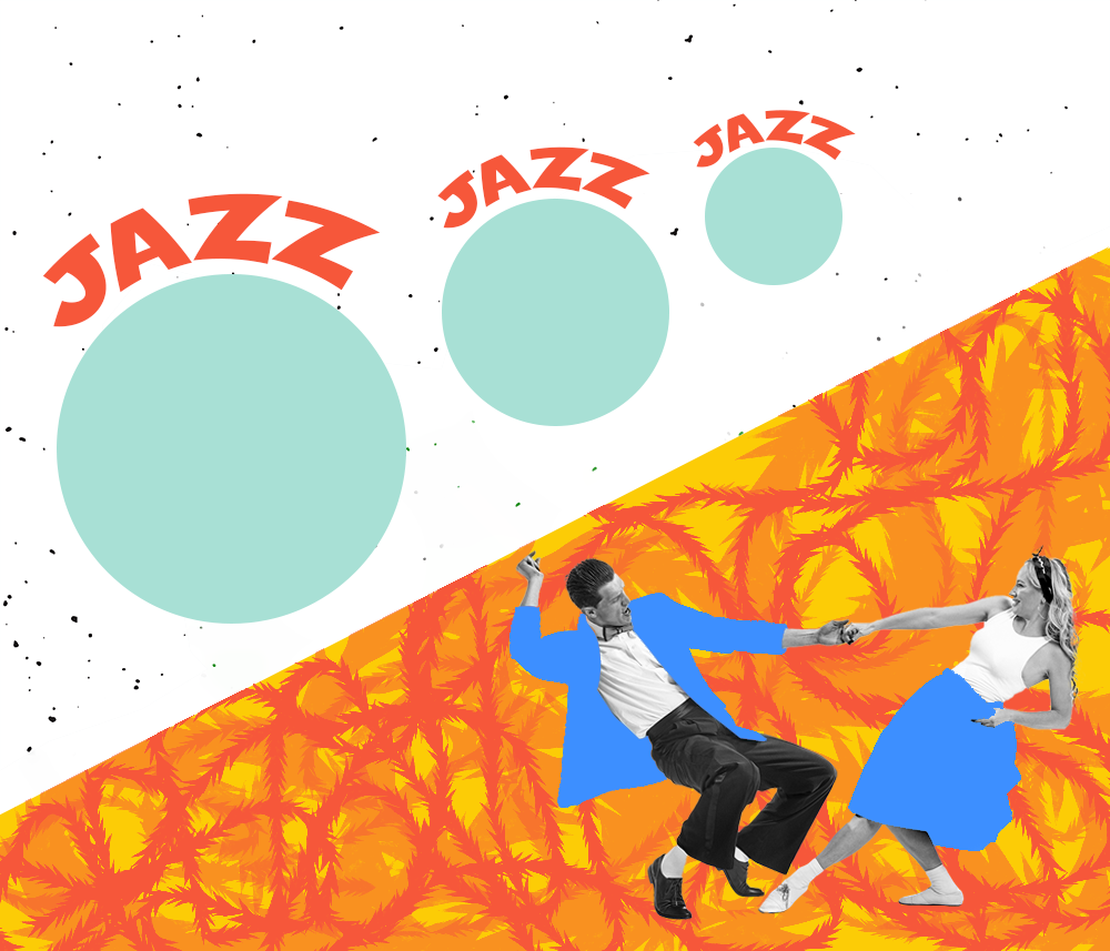
Above: Third edited image. I wanted to make a vibrant image. I used the repetition principle to create multiple circles and “jazz” titles above them. The repetition also created unity and the upward trajectory of the circles creates movement. They are also different sizes. In contrast, the bottom half of the design is full of energy via the colours, patterns and dancers. I used a special brush to create curvy lines. The line element can be used to create paths. It can be like taking a point or dot for a walk. So I had fun creating interesting patterns with the brush. I changed the scale and opacity for different effects. I used the orange colour to create energy. Similar to the circles in the top half of the design, I wanted to create movement via the curvy lines. Although the two halves are different, unity is created with the orange colour. The jacket and dress of the dancers are coloured blue to create contrast with the warm background colours. This allows the dancers to stand out.
To see other designs, feel free to check out my portfolio.
This post is about a book design cover I created for the Peter Pan story.
It was an exercise from a book titled Graphic Design School. The tasks were as follows:
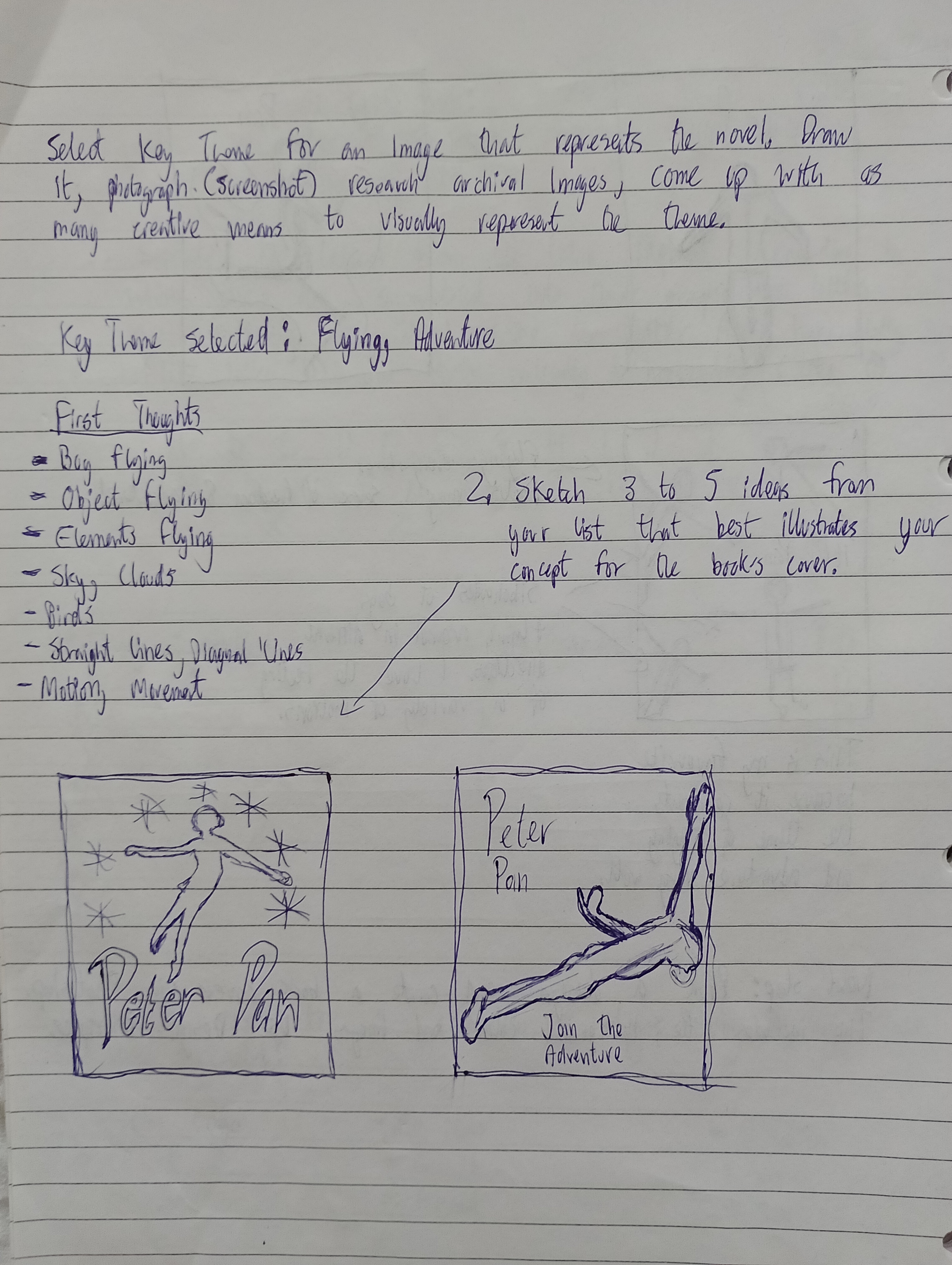
Select a classic novel that you have read and are fairly familiar with. Consider the story-line, the message and the overall tone of the writing. Make a list of the most influential elements in the novel such as characters, circumstances, defining events, time periods. Define the target audience for the novel. Select a key theme for an image that represents this novel, draw it, stage a photograph of it, research archival images, come up with as many creative means to visually represent this theme.
Sketch 3-5 ideas from your list that best illustrates your concept for the book’s cover. Choose a final design idea.
Develop and finalise the design by using traditional media or digital media
Why I chose the Peter Pan story
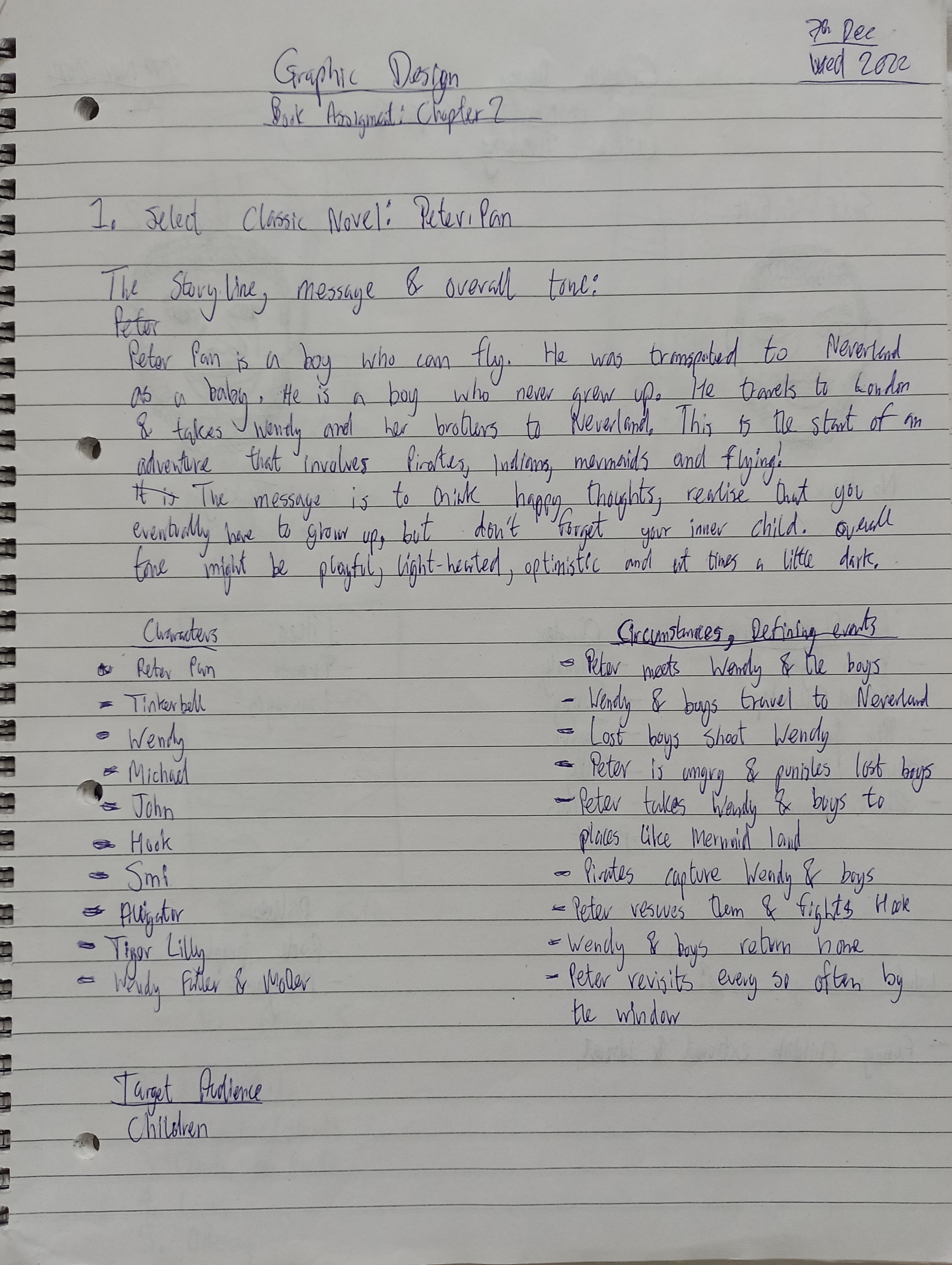
The Peter Pan story is about a boy who never grew up. He lives in a place called Neverland. He travels to London and takes Wendy and her brothers to Neverland. This is the start of an adventure that involves pirates, mermaids, flying and more! I chose the Peter Pan story because I loved it as a child. I have great memories watching the Disney Peter Pan film and being in awe of the characters, scenes and amazing animation. I also loved watching Hook, which is another version of the Peter Pan story. This time, Peter pan is an adult who forgets who he is, until he returns to Neverland. The 2003 Peter Pan film is the closest to the original book written by J.M.Barrie. I read the book as an adult. I love the book and film. It’s magical.
Research
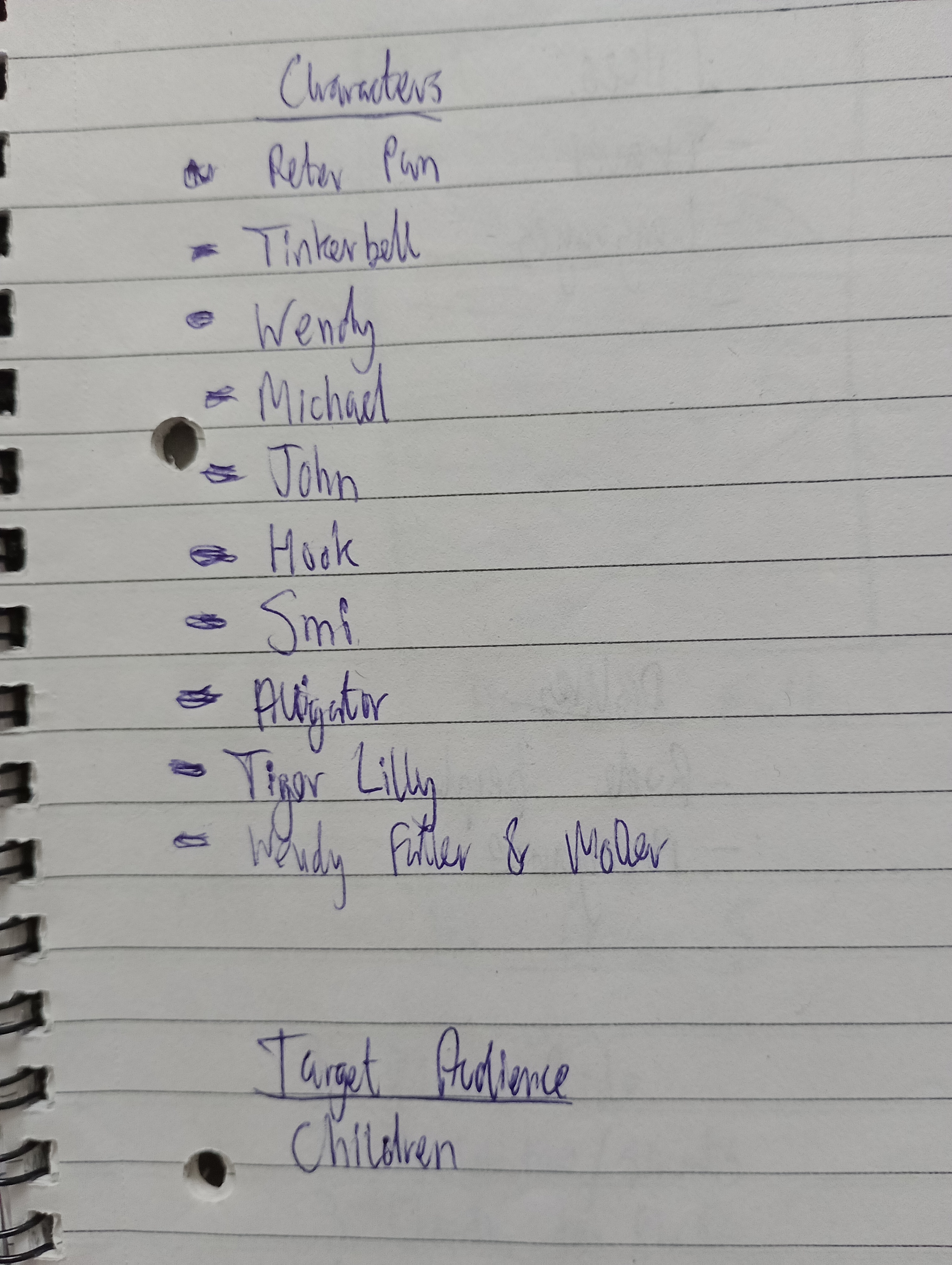
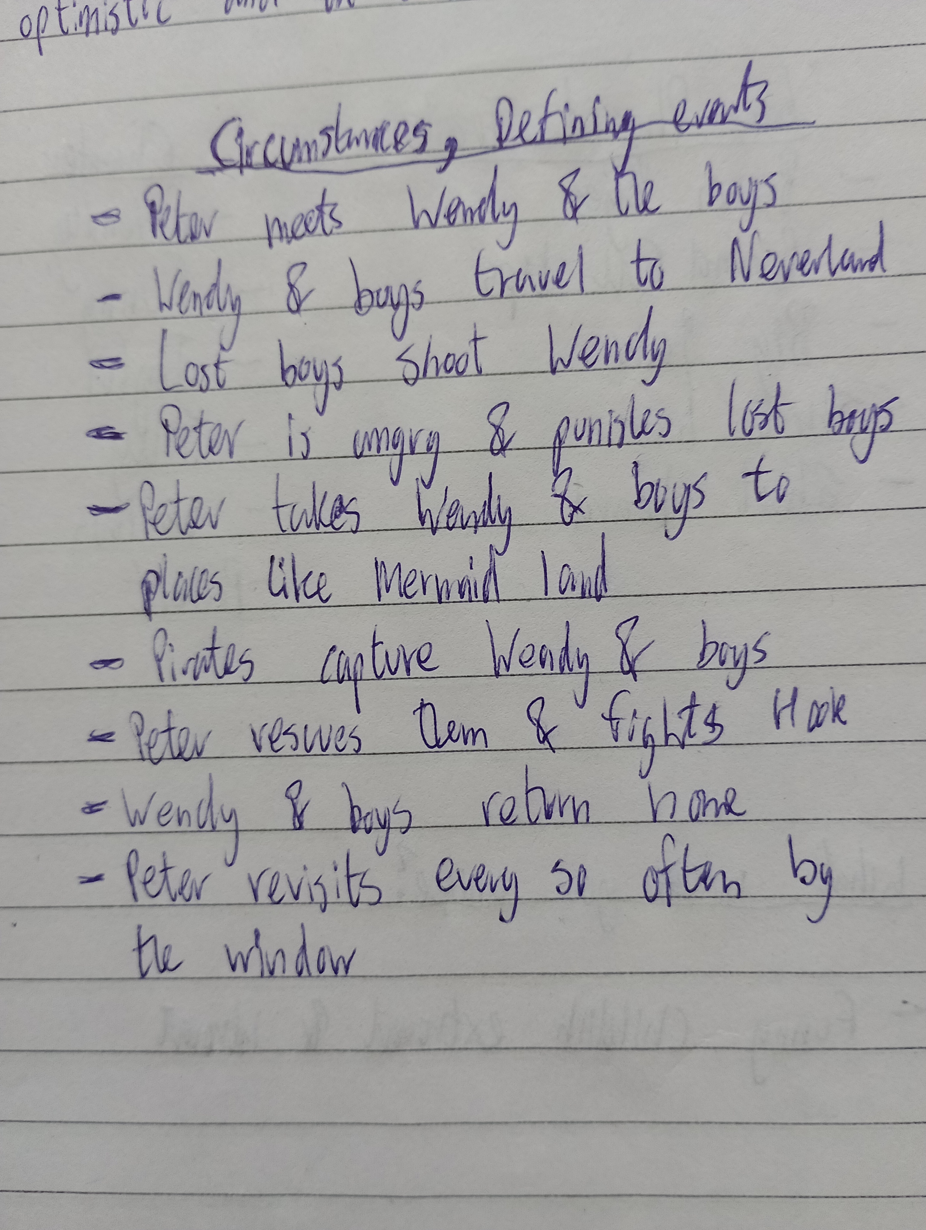
The first thing I did, was to make a list of the characters and defining events of Peter Pan. I also wrote down the target audience which is children.
Above:Images of character list and defining events of Peter Pan
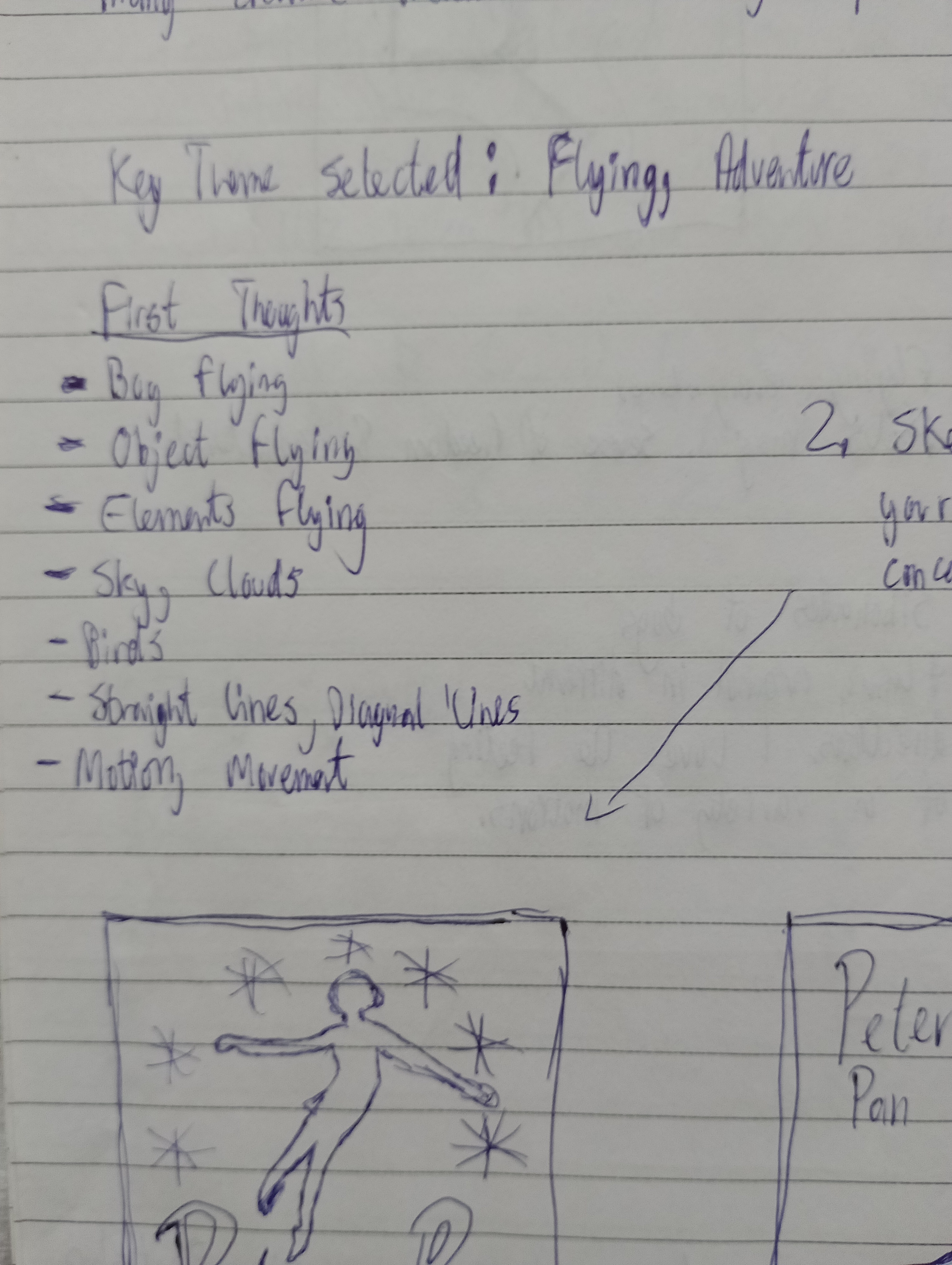
After much deliberation, the key themes selected were “flying” and “adventure”. I feel that these words represent Peter Pan really well. One of the first things I like to do during my research, is to come up with a list of words. This helps me generate ideas.
Above:Image of the first words that came into my head
After the research period, I like to start sketching. I created sketches based on the research gathered.
Above: Image of sketches
I really wanted the design to reflect the themes “flying” and “adventure”. The book cover is like the window to the book’s soul. It gives you an insight of the world you are about to enter. This is what I wanted to create through the design. A sense of flying, adventure…and freedom.
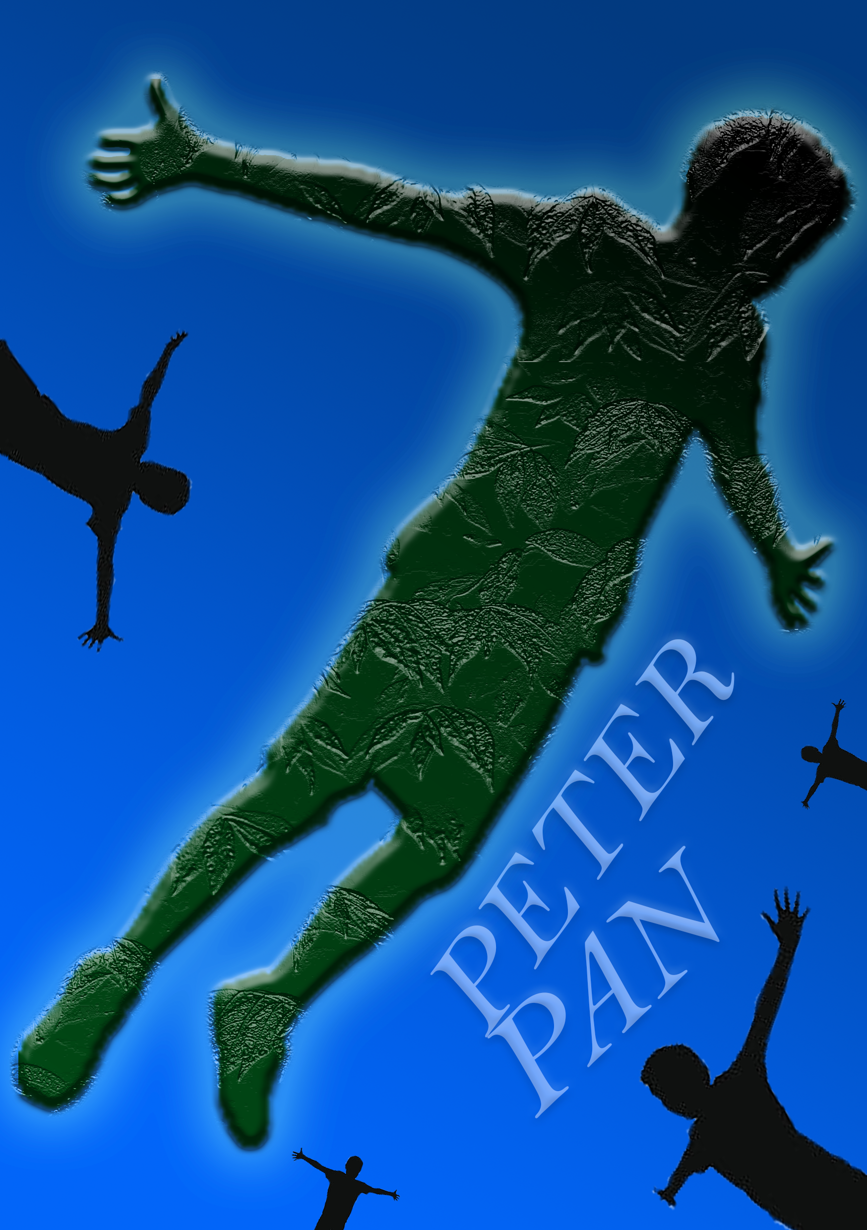
Final Design: Above is the design I chose
The next step was production. I decided to use the Photoshop software to make my design come to life.
The main element of the design is the image. So I browsed the internet to find the perfect image. The key words that were searched for were: “boy flying” and “boys jumping”. I managed to find a silhouette of a group of boys jumping from iStock. I really like this image.
Boys Jumping
Image of silhouettes
I used the magic wand tool to eliminate the white background. I wanted to created a focal point that grabbed the viewer’s attention immediately, so I placed one of the images in the centre, and increased the size so that it filled the majority of the design. I used the emphasis principle by creating an outer glow and an embossed effect. I also stylized the image by using a leafy texture. The contrast principle was used with a darker green colour and the bright outer glow. I chose the colour green because this is the colour that is most associated with the character. Calmer colours such as blue tend to be used for backgrounds because it appears to be further away from the viewer. I used a blue colour that is associated to the evening. It’s dark but not too dark. I remember watching the famous scene in the Disney animated Peter Pan film, where Peter Pan flies across London with Michael, John and Wendy, and the sky was a medium dark blue. That is what I was aiming for.
I chose four further images to surround the main image. I used the dominance principle to create volume and further enhance the main image. The four images are black with two of them being the same image. The colour black and the repetition creates unity. I also changed the scale of the images, so that they appear to be much smaller than the main image. I really like the images because they create a sense of flying and freedom.
I used a serif font because it symbolises an older and more classic period. Sans-serif fonts tend to feel modern but I wanted the typography to feel older or classic. I chose a very light blue colour which slightly matches the outer glow of the main image (which is white and yellow). I edited the angle of the fonts so that it matched the motion of the main image, steering it upwards. The letter “P” for “Peter” and “Pan” are closely linked but the rest of the letters slightly spread out. It’s as if the fonts are also flying.
Image of final design
To finish, feel free to listen to a wonderful soundtrack below from the 2003 Peter Pan film. It is one of my favourite film soundtracks. It really represents the feeling of wanting to fly. So what are you waiting for? Fly!
Conclusion
I had fun creating this design. It took me back to my childhood and made me think of all the wonderful memories I had with this story. I had the opportunity to work on design principles such as balance, unity, dominance and contrast. I used Photoshop to bring my designs to life. I used inspiration from the Peter Pan films and music. Overall, it was a great experience.
Lastly, wherever you are in the world. Remember that “to live would be an awfully big adventure“.
To see other designs, feel free to check out my portfolio.