Reading Challenge 2023: It’s Up to You, New York by Tess Daly

This post is about a book I read called “It’s Up to You, New York” by Tess Daly. In a previous post, I discussed the novel from a graphic design perspective. I discussed my initial thoughts on the novel based on the book’s cover design. In this post, I will discuss my thoughts on the book itself.

A few years ago, I visited New York and had a good time. I live in London, England and New York is similar in many ways. It’s a big city with people from all over the world. But it’s also very different. There’s a magical feeling about the place. It’s funny because when I was there, everything felt so familiar despite the fact that it was my first time visiting the city. This is because of all the movies and series I watched growing up, that took place in The Big Apple. One thing is for certain, there’s never a boring day in this unique city.

The reading challenge I chose to do was to read “a book set in another country”. I chose the US, specifically New York. I searched online for novels set in New York, created a short list and then went to my local library to borrow them. “It’s Up to You, New York” was one of them.

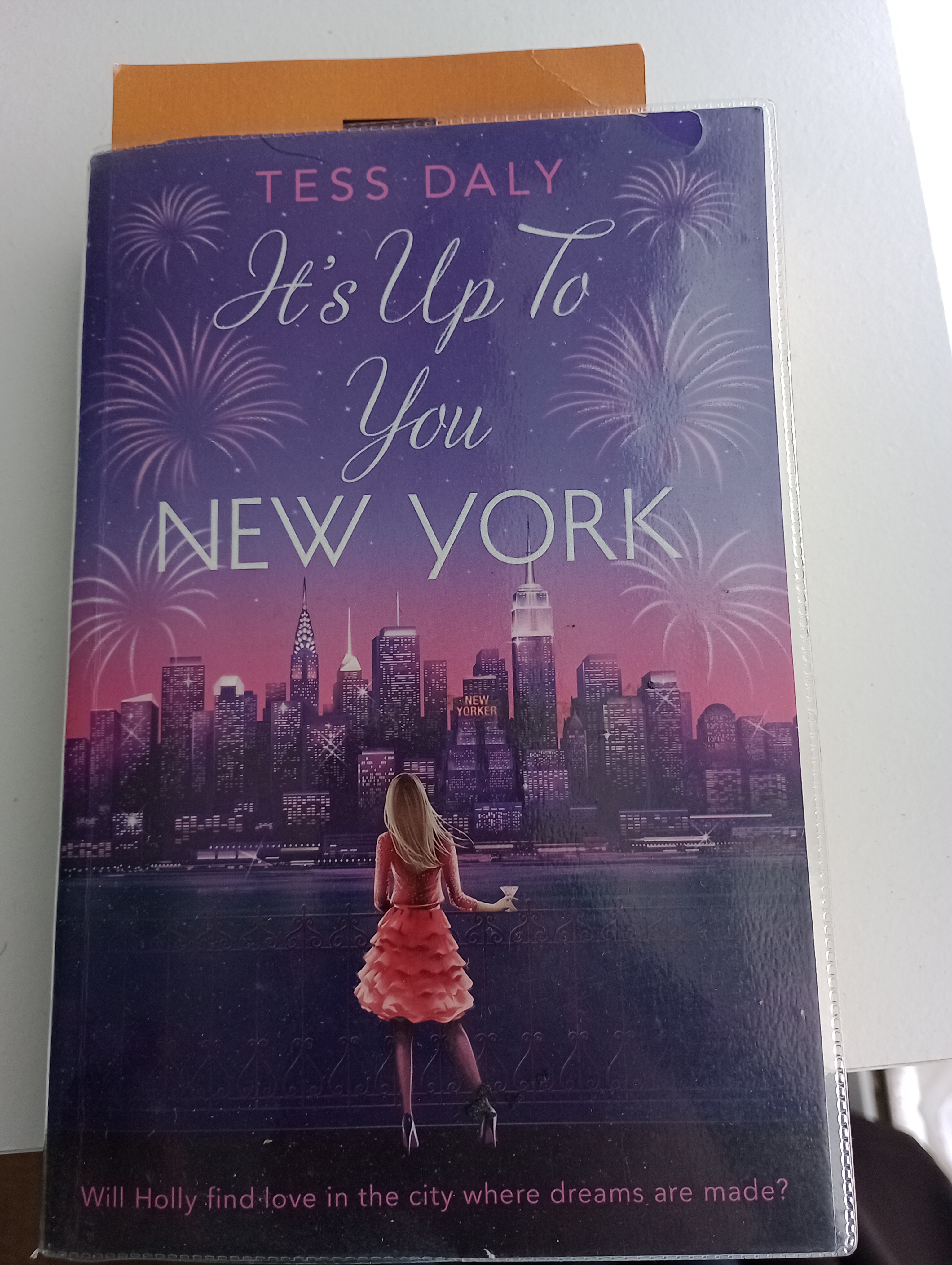
Above: Image of the book “It’s Up to You, New York”.

I didn’t have any expectations. I only wanted to feel the magic of the city and relive some of my own memories through the story, characters and places. Nothing too heavy. Just a casual read.

The story revolves around a young woman who works at a call centre. The young woman, Holly, has a lovely boyfriend named James and they both live in London. Life is pretty good…apart from the fact she doesn’t really like her job. Then one day, an opportunity arises to join a television show seeking the UK’s next supermodel. After much deliberation, Holly decides to join the show.

This is where the story really starts to take off. She enters into a completely different world from her own. This world involves luxury, celebrities, premieres, the spotlight and of course, New York! But above all, life changing experiences.

I think that the short chapters help create the sense of a fast paced world. Things happen so quickly in the life of Holly that, as the reader, you feel it too. It was really nice to read about locations that I visited, such as 5th Avenue, Little Italy, Chinatown, The Empire State Building and the Museum of Modern Art.

There were a few things that surprised me. Firstly, the book was set in London. I assumed that it would be set entirely in New York, however it was nice to start things off in London. I live there so I could relate to the things mentioned in the novel. Secondly, the fashion reality show is only part of the story. Many things happen outside the show that contribute to the story. For example, there is an incident that happens with her boyfriend which actually catapults her into New York, but then comes full circle towards the end of the story.

The characters were also interesting. There were many questions and thoughts going through my mind such as the motives of the characters including: Max (the billionaire host of the show, who is nothing but nice to her…but why?). Zane (who speaks so much slang, is he really saying anything?). Sasha (her friendly supervisor on the show, but then becomes frosty for some reason). Joe (a journalist, but can he be trusted?) and Moet (a foe on the show but then shows a sudden change of heart).

There are other more poignant moments such as her younger sister who is diagnosed with a condition that makes it difficult to walk and her child-like nature to trust people who eventually let her down. But also elements where she surprises herself with her bravery and courage, to overcome situations and figure things out.

I predicted a few things correctly during the course of the book, however, the big twist at the end had me shocked. I did not see it coming!

Conclusion

It took just under 2 weeks to read the novel. That is very quick for me. It can take me a while to read because I can be inconsistent, but I made a real effort to read on a daily basis.

The book is a love story to New York. There are romantic moments, but also very funny moments. It all made for a good read. I really enjoyed it.

This is part of a reading challenge I am doing inspired by popsugar. Click here to read other posts related to reading. I’m looking forward to reading other books as part of this challenge. So watch this space.

Graphic Design: Photoshop Selection Tool Challenge

This post is about a challenge I did from a course on LinkedIn Learning. I am learning Photoshop, which is a powerful software that allows the user to manipulate images. In this challenge, I had to manipulate an image using a variety of selection tools.

Above: LinkedIn Learning.

Above: Original Image

Image 1

Image 2

Above: Screenshots of edits in Photoshop and the final outcomes for Image 1 and Image 2. To create the 2 images, I used the Object Selection Tool to select elements. The Object Selection Tool can be used to automatically select something. You can click on a subject or drag a shape around the subject to select it. Firstly, I used this tool to select the hat. Then I created an adjustment layer and selected a solid colour. I chose the #1779bd (blue colour). I wanted a different feel to the original image, and chose a colder and calmer colour than the original colour for the hat. To make the hat visible, I changed the layer mode to Multiply. I repeated these steps for the lips.

I used the unity design principle to match the hat and lips by using the same colour. To make the elements further standout, I changed the background colour to a warmer colour. I did this by choosing Select in the top menu, and then Subject. This automatically selected the portrait image and then I inversed the selection by choosing SelectInverse. I used another adjustment layer to change the Hue to a warmer colour. For Image 2, I used the Hue adjustment layer to change the skin tone to purple. The colour purple can be associated with something mysterious so I thought it was a good colour to communicate this message.

Image 3

Above: Screenshots of edits in Photoshop and the final outcome for Image 3. I used the Quick Selection Tool to select the hat. The Quick Selection Tool is great for quickly selecting larger areas of an image. This can be done by dragging around the area you want to be selected. It is located in the toolbar right beside the Object Selection Tool via the drop down menu. Once the hat was selected, I created an adjustment layer. Adjustment layers are great because you can modify an image without damaging the original image underneath the adjustment layer. I chose the Solid Color of #ff0bb2 (pink) and changed the layer mode from Normal to Color, so that the hat is visible through the layer.

For the lips, I used the Object Selection Tool and then repeated the same steps as I did for the hat. The background was created via a Gradient adjustment layer and I used a Radial Gradient effect combining the colours #92bfd9 (light blue) and #0a8bd5 (medium blue). The cold blue background has contrast with the vibrant pink elements and the bright portrait. I really like this image because it is aesthetically pleasing and the contrasting elements work well together.

Funnily enough, during the process of this creation I had various thoughts running through my mind. Some of the thoughts were things like musicals, candy, Charlie and the Chocolate Factory, Mary Poppins and even Katy Perry’s California Girls. Perhaps it is because of the vibrant colours associated with them. After the first image, I wanted to design something more eye catching and a “feast for the eyes”. The colours pink and blue were the first colours to come to mind.

Image 4

Above: Screenshots of edits in Photoshop and the final outcome for Image 4. I wanted to do something a little different for the final image. I wanted to add extra elements to the original composition. The first thing I did was cut out the hat element and duplicate it a few times to create a repetition effect. I did this by using the Quick Selection Tool to select the hat and then I duplicated the selection unto a seperate layer using the keyboard shortcut: Ctrl + j on a windows computer. Then, I scaled the hat down to a smaller size and used the free transform tool (Ctrl + t) to rotate it slightly upwards. I wanted to match the colour of the hat with the colour of the lips so I used an adjustment layer and changed the hue to a similar colour to the lips. I also decreased the opacity for the hue from 100% to 90% to make it less intensive. I repeated the same steps for the other hats and rotated each hat slightly more clockwise and slightly increased the scale. This created a rhythm and a motion effect. I also repeated these same steps for the lips. Instead of clockwise, the lips were rotated anti-clockwise. This created contrast in terms of rotation compared to the hat elements, but also unity was formed because of the repetition, alignment and colour.

I used a Radial Gradient effect to create the background. I combined the two colours #ffffff (white) and #a96cdc (purple) to create a sense of mystery, and also to create a spotlight effect for the main subject. I created a #34144f (dark purple) Solid Color adjustment layer for the hat, and changed the layer mode from Normal to Hue. This allows the viewer to see through the layer. This also creates unity with the background but contrast because of the foreground (hat) texture.

To finish, I completed the design with a slightly daring question: “Do you like what you see?” This can refer to the design or the portrait. I thought the question perfectly matched the tone of the design. I chose the colour red to form unity, and I chose the font Century Gothic (Bold) because it reminds me of elegance and fashion which I feel matches the portrait.

During the process for Image 4, songs such as Santa Baby, Big Spender and films such as Who Framed Roger Rabbit came to mind. I guess it is because of the nature of the songs being slightly daring and the character Jessica Rabbits also fitting this description.

Conclusion

I enjoyed learning about the selection tools in Photoshop. I had the opportunity to experiment with the different tools and create interesting designs. The selection tools in Photoshop are really powerful and I was surprised how easy they were to learn. There are numerous ways to select elements in Photoshop so it was great to learn how to use them. This will certainly help me with my future projects in Photoshop.