This post is about a task I did for university. This was part of a visual design module and the objective for this task was to experiment with the Adobe Xd software, by using a selection of images to create a layout design. We had a 4×4 modular grid to help structure our designs.
I wanted to tell a story through my design, and so I chose a theme. The theme is about the different stages in our lives. There were numerous images to choose from but I decided to go with images that contained people. By doing this, I could vividly display the different stages of life.
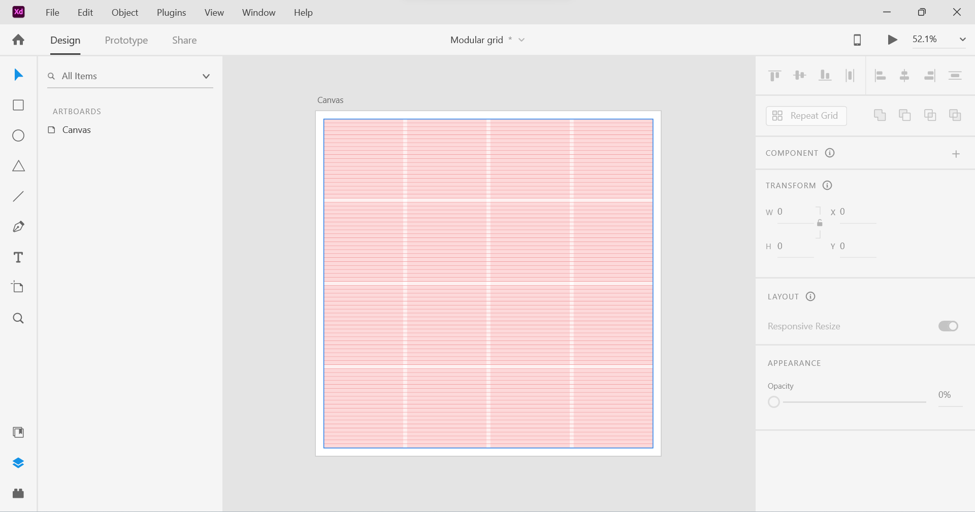
Above: Modular Grid (4×4)
Once I selected the images, the next decision was to figure out how I was going to express the theme. Should it be in chronological order? Should it be sporadic? I decided to go with chronological order, which meant starting from the beginning of life to the end of a person’s life.
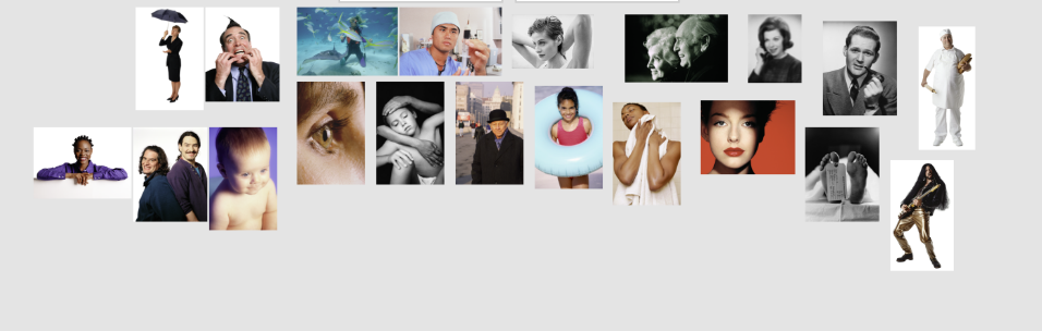
Above: Images that I selected.
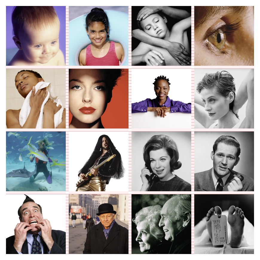
The first thing I did was to create a 200px by 200px square and place it in the first grid area in the top right hand corner. Then I placed an image of the baby on top of it by copying it and then using the “paste appearance” option. This is a great feature which permits the user to paste an image to fit in a shape. I effectively repeated the same step for the other sections of the grid layout.
So, I effectively created a series of images from life to death. From youth to old age. I also wanted to add images that expressed certain emotions and feelings such as joy and great pleasure which can be seen in the image of a man and his guitar. Fear which can be seen in the image in the bottom left hand corner. I like the second to last image in particular. They are reaching towards the end of their lives, but instead of worrying or having fear, you can see a sense of joy and happiness as they look back to what they managed to do in their lives. Together, they have reached the end.
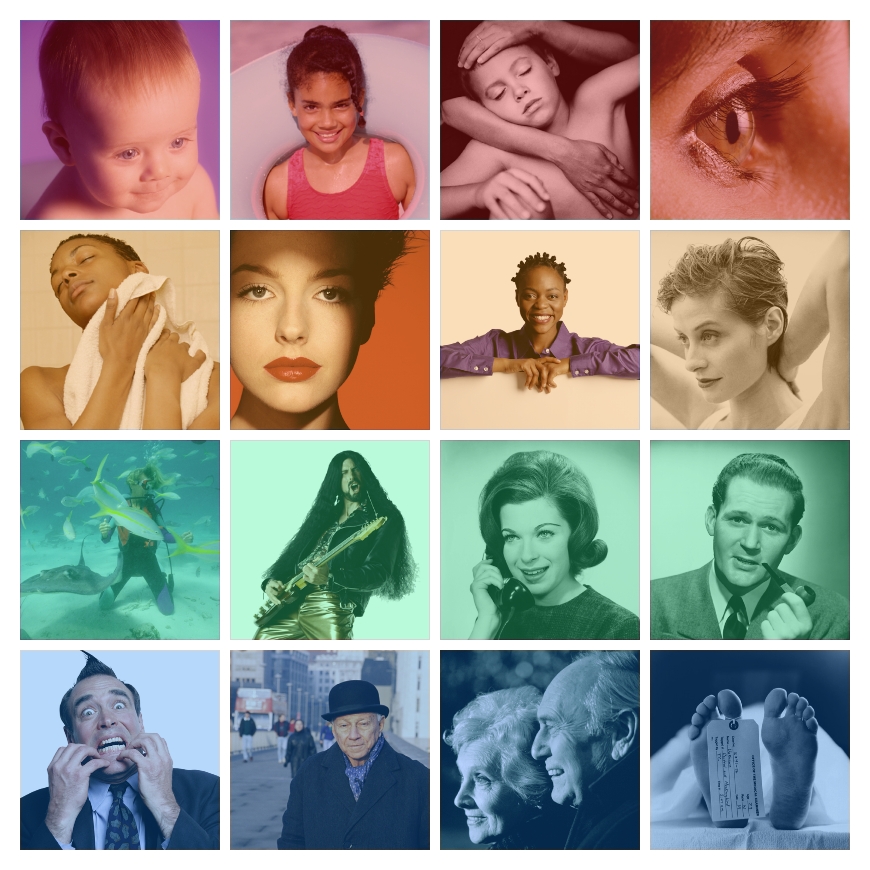
Above: Two layout designs. For the second layout design, I added coloured squares and placed them on top of the images. The colours go from warm temperatures to cold. This is another way of communicating changes or growth.
