I’ve been thinking a lot about New York recently. It all started with a podcast I listened to. It’s a French podcast I use to practice my listening skills. The title of the podcast is “Raconte-moi New York” which means “Tell me about New York” in French. The host tells the listener about his love, passion and adventures of New York. He is a French person who fell in love with the city by watching shows like Friends, movies by Stanley Kubrick, and following sports such as baseball. When I was listening to the podcast, it stirred up memories of my own. I went to New York several years ago and as the host was talking, it reminded me of my own experiences. I had also grown up watching shows and movies set in New York. After listening to an episode or two, it triggered my interest in the city once again.
So, I re-watched some of my favourite movies and series set in New York. I looked at some of the photos I took when I was there, and I even watched a few YouTube videos of people travelling to the city that never sleeps for the first time. It was all good fun. Then, I realised something. I’m doing a reading challenge (similar to popsugar‘s challenge of reading a variety of books for the year). I had never read a book set in New York before. Now was my chance.
I searched up books set in New York online, created a list and went to my local library to see if some of them were there. For the first read, I wanted something light-hearted and not so serious. A book that showed the magic of New York, a book that made me think of the city and perhaps want to visit again. Preferably in modern New York. Perhaps a romantic novel, or one with some humour I thought. So, I came across a few books and one of them was called “It’s Up to You New York” by Tess Daly. It fit the mood I was in. A good choice for a casual read. I just started it and I’m enjoying it so far.
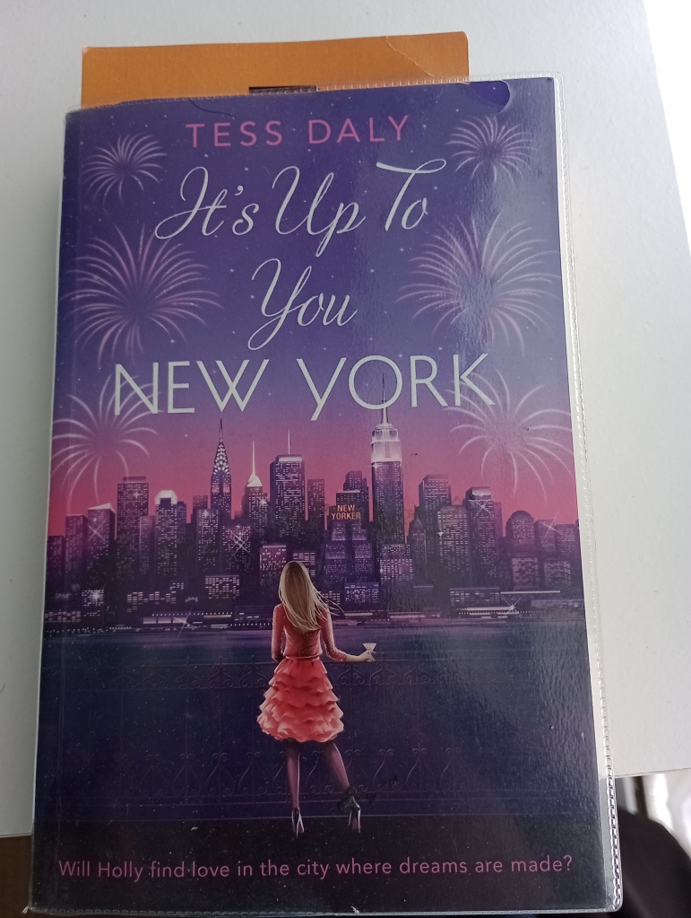
The first thing I loved about the book was the book cover design. It really stood out from the crowd. It’s beautiful. This post is about the book cover from a graphic design perspective.


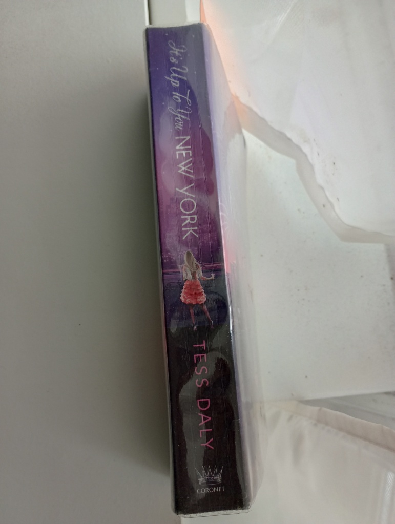
Above: Image of book (front and spine)
The first thing that stood out for me, was just how elegant and beautiful everything was. It really felt romantic and magical. I love the title. The decorative serif font used for the “It’s Up To You” part of the title, fits well with the theme of New York being a magical place. It’s as if the protagonist is saying this with a strong attachment to the city. In fact, there is an image of a woman staring at the skyline, perhaps romantically and in deep thought. It’s really clever because the viewer can also see what she sees, and assume her thoughts through the title. It’s mysterious. You want to know more.
The colours enchance the mystery. The colour purple can be associated with mysteriousness, and it is used to good effect in the design. The purple mixed with pink and then a darker purple from top to bottom of the cover, creates unity and communicates a sense of wonder and curiosity. It also creates elegance and romance. Purple can also be associated with luxury and royalty. The pink creates a slight contrast, but also creates unity because it is close to purple on the colour wheel; making it analagous. There is also unity with the image of the woman as she is dressed in a pink colour and her fashion also represents elegance.
The added effect of the fireworks in the sky surrounding the title fits well with the font-style. There is nice contrast between the words “New York” with the rest of the title. It is a sans-serif and is more modern. Perhaps communicating the time period of the novel or the well-structured modern city style. The title also stands out. It is light whilst the background is dark. The name of the author and what it is about (bottom) is synced with the background in pink, showing that the more important information is the title of the book and the image. It all works out for a great design. It makes me want to read it, and that is what I am doing.