This post is about Photoshop. I’m taking a course on LinkedIn Learning about how to use Photoshop.

Above: LinkedIn Learning is a resource for online courses. This is the tutorial I watched.

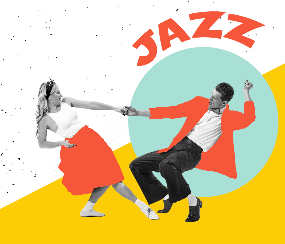
Above: This is the original image

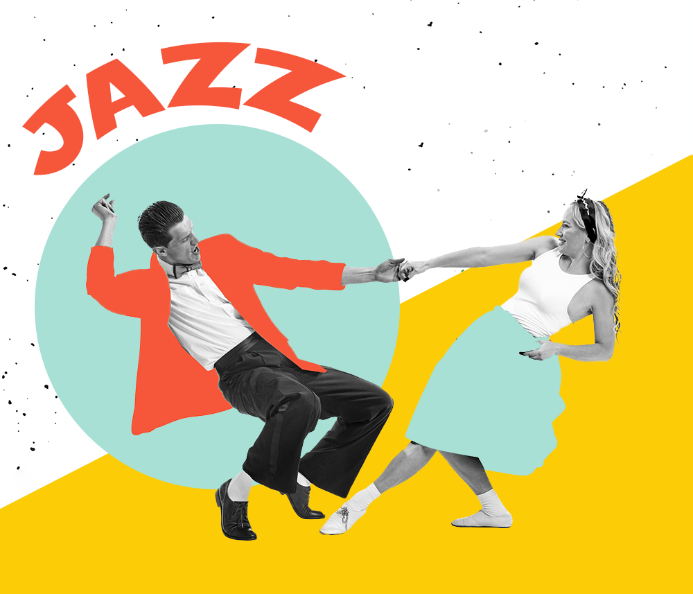
Above: First edited image. I followed the tutorial and changed the position of the title “Jazz” and the circle shape from the right side of the design to the left. Next, I flipped the dancers by using the Flip Horizontal technique in the Edit menu. Lastly, I changed the colour of the lady’s dress to match the colour of the circle. I used the selection tool and then the brush tool to do this.

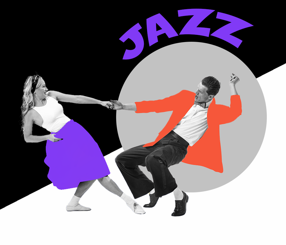
Above: Second edited image. I decided to play around a little bit. I kept the position of the dancers from the original image. For the foreground, I decided to change the colour for the title and the lady’s dress to purple. This creates unity. Purple was the first colour that came to mind when I thought of jazz. I also did some research and discovered that purple is associated with the word “creativity”, which is a good word for the music genre jazz. I used black and white to create contrast and dynamism. The grey colour for the circle is a mixture between white and black.

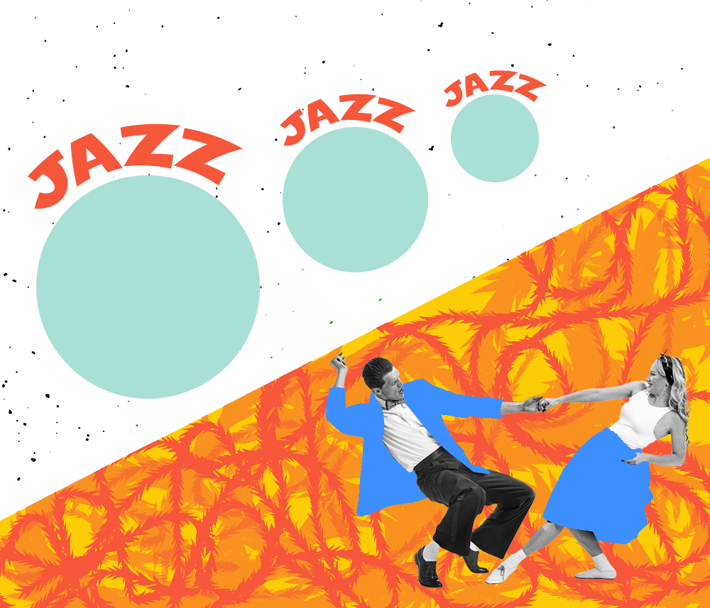
Above: Third edited image. I wanted to make a vibrant image. I used the repetition principle to create multiple circles and “jazz” titles above them. The repetition also created unity and the upward trajectory of the circles creates movement. They are also different sizes. In contrast, the bottom half of the design is full of energy via the colours, patterns and dancers. I used a special brush to create curvy lines. The line element can be used to create paths. It can be like taking a point or dot for a walk. So I had fun creating interesting patterns with the brush. I changed the scale and opacity for different effects. I used the orange colour to create energy. Similar to the circles in the top half of the design, I wanted to create movement via the curvy lines. Although the two halves are different, unity is created with the orange colour. The jacket and dress of the dancers are coloured blue to create contrast with the warm background colours. This allows the dancers to stand out.
To see other designs, feel free to check out my portfolio.
Ciao for now!