This post is about a UI (User Interface) design I created for a TV app.
The project was generated using the design brief generator. The brief description is as follows:
I am Karen, I am looking for a UI designer. I need a design of a TV app.
Although the description is very short, it gave me the opportunity to practice my design skills.
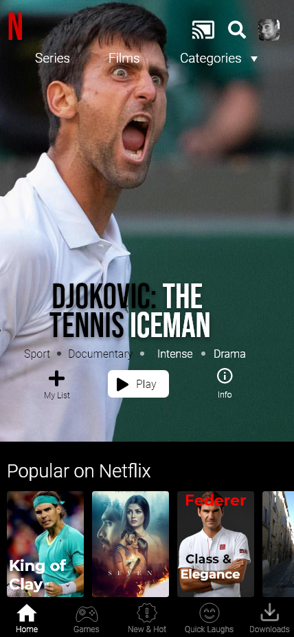
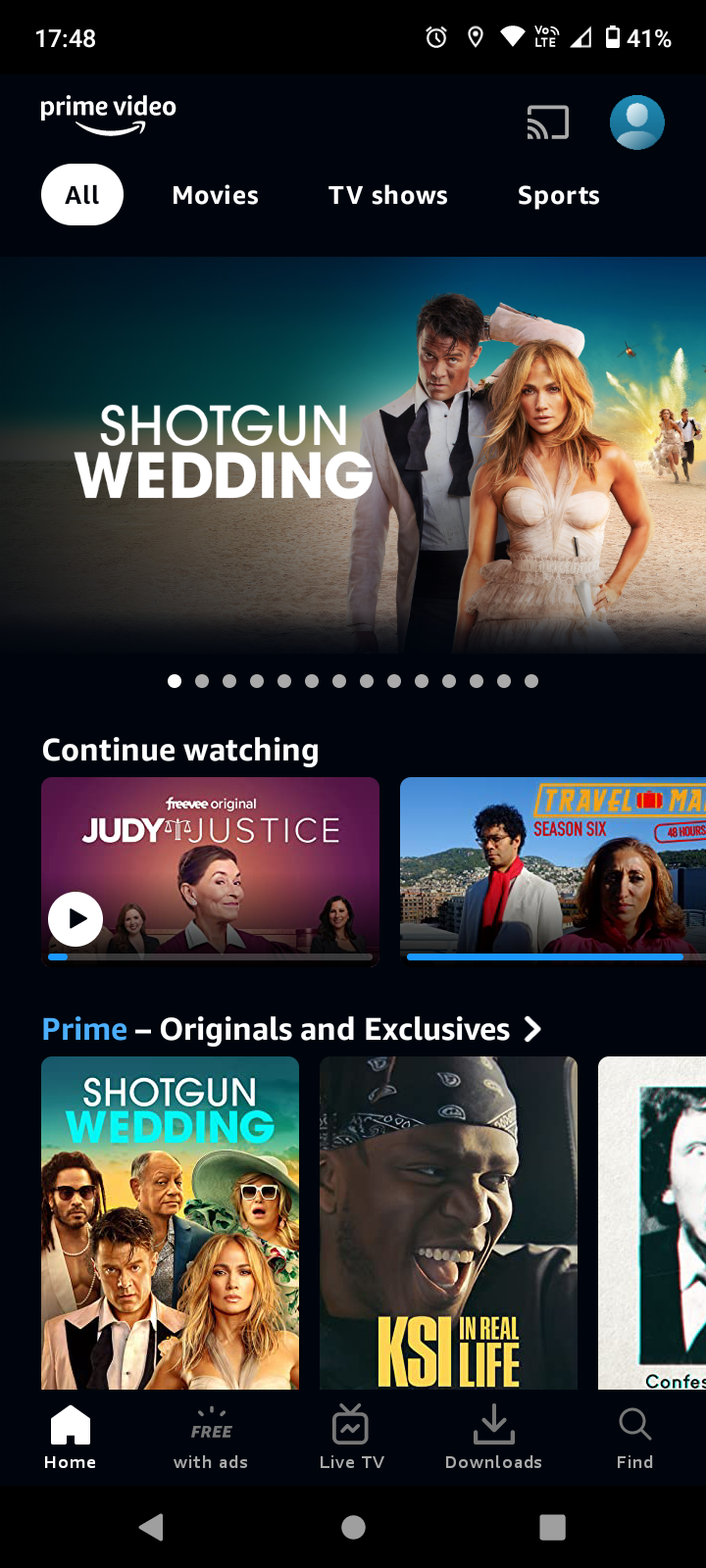
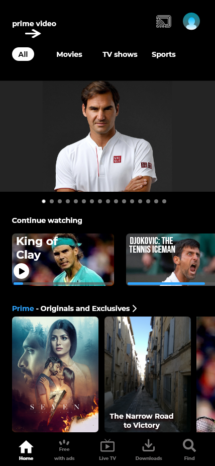
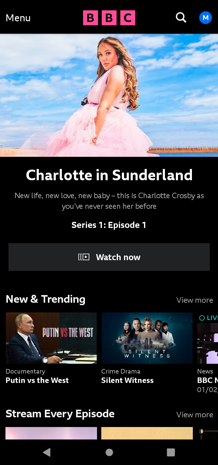
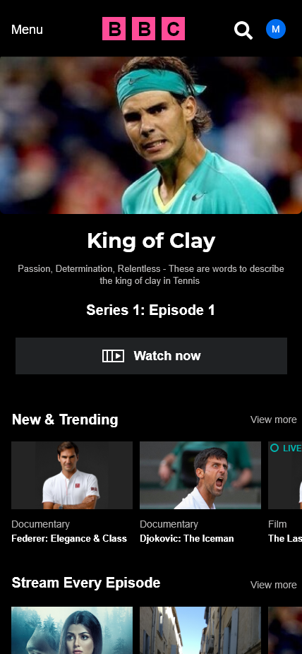
The first thing I did was browse through my phone and look for TV and streaming apps I had installed. I found four apps: Netflix, Amazon Prime, BBC iPlayer and ITVX. The next step was to analyse the UI designs and decide which screen I wanted to design. I decided to choose the home/main screen that a user sees when the app is opened, then I sketched the four apps I found on my phone and took some notes.
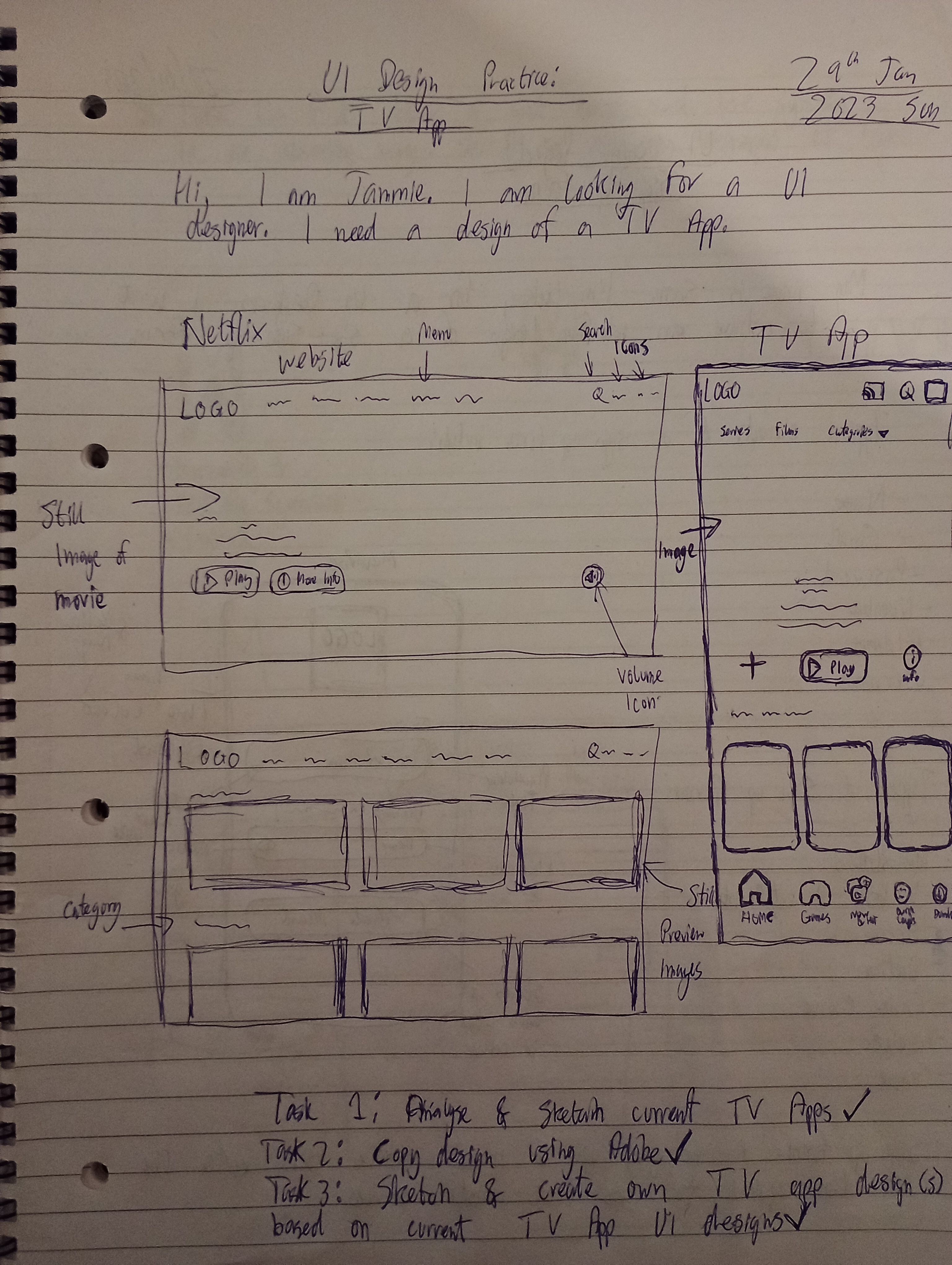
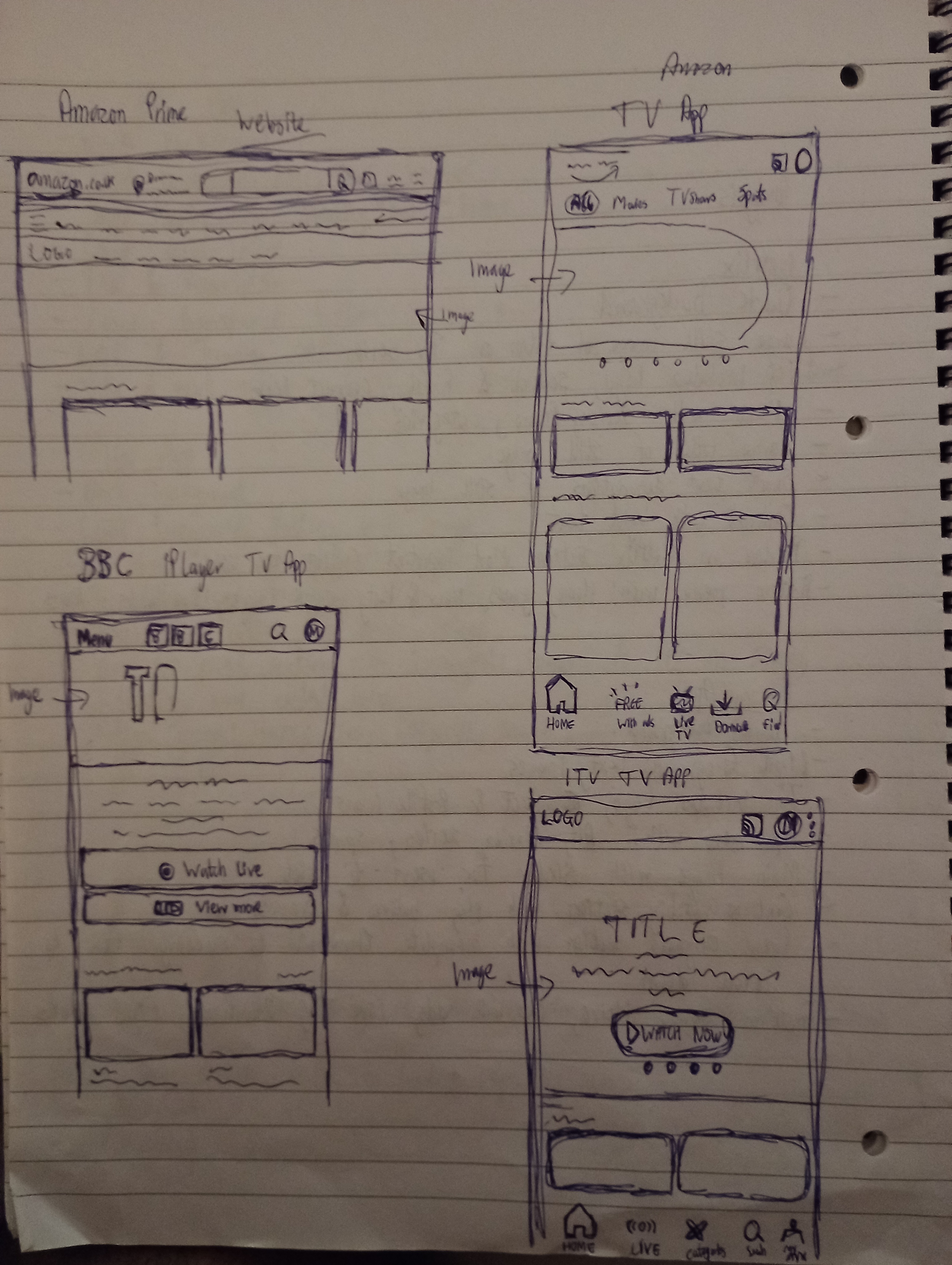
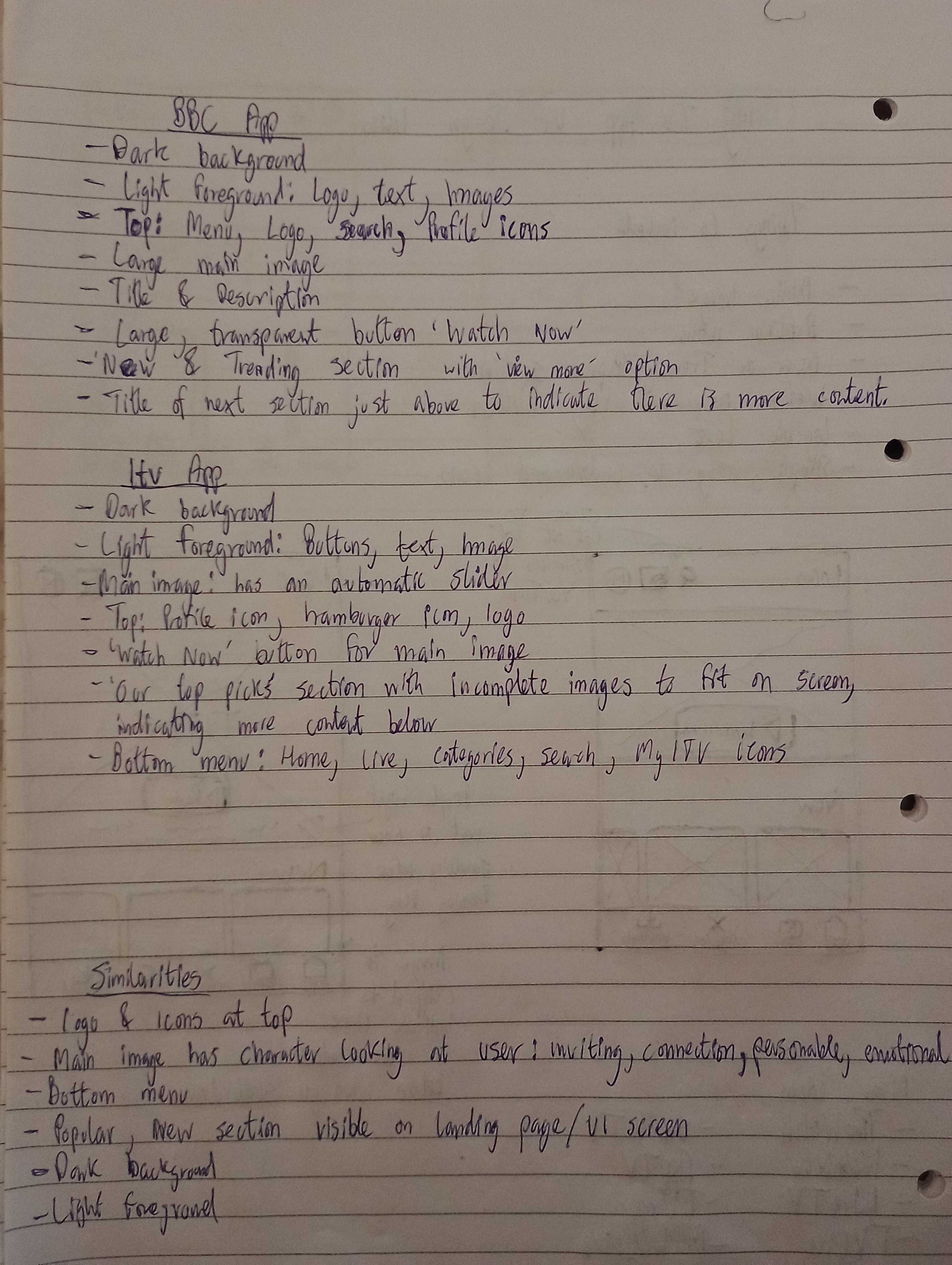
When I was analysing the different TV apps, I started to notice some similarities and differences. For instance, all four apps had a dark background and light foreground which helped create contrast and make elements standout. Three out of the four apps had a bottom menu to allow the user to navigate to other parts of the app. The logo and profile/account icons were placed at the top. Some of the differences were the size of the images, content information and visual elements such as buttons with only two of the apps having an image slider. What I found really interesting is that all of the apps used a main image that connected with the user. The main image has a character looking at the user; this is inviting and creates an instant emotional connection with the viewer.

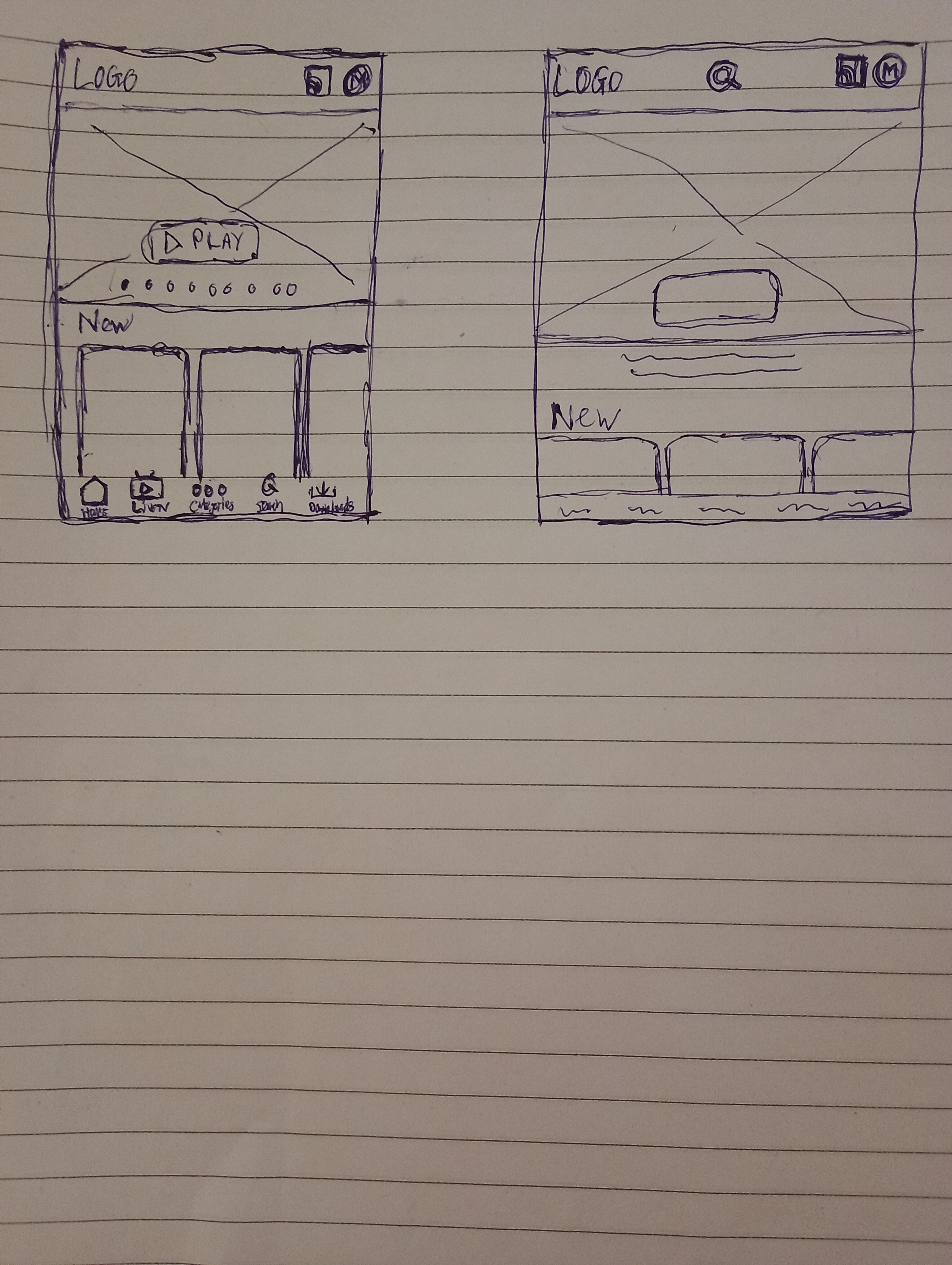
“Good artists copy. Great artists steal.“, I remember reading this quote from somewhere, and what I got from it is that nothing is really original. We find inspiration from what we see around us and what has already been done. So redesigning is a great way to practice design skills. I took screenshots of the UI designs and imported them into Adobe Xd, and copied the designs. This was a great thing to do because it made me think about the elements that are placed on the UI. I started to see certain patterns and icons being used. It made me think of principles such as alignment and repetition.
By the way, if you know where the quote is from, feel free to leave a comment on this post!


The original UI’s are on the left, and the redesigns are on the right. I found images that were already downloaded on my computer and used for other design practices. I created titles to match the images and make it look like movie posters. It was fun experimenting with the typography, layout and images.
After these exercises, it was time for me to come up with ideas for my own TV UI app design. I started off by making a list of things I wanted to include such as: a main image, bottom menu and simple, easy to understand icons. Following the list, I created a few thumbnail sketches.

Then it was time to get practical, I opened up Adobe Xd and used the sketches to guide me. I did not choose a colour whlist sketching but I decided to choose the colour purple. Purple can represent royalty or luxury and I wanted the viewer to feel like they were in a creative soothing and perhaps calm environment. I chose dark purple to cover the majority of the background and a lighter shade of purple to cause a division for different sections.
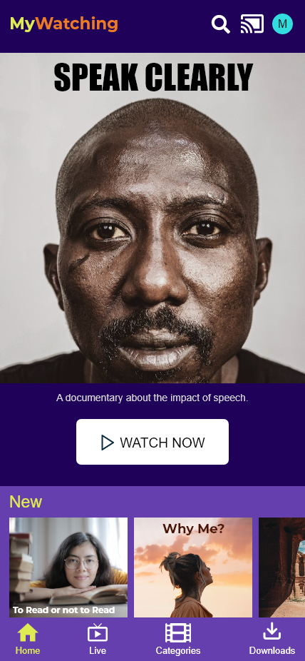
Image of my UI design
At the top left-hand corner I placed the logo. This is considered a standard for TV UI app designs. To make the logo standout, I made sure to choose colours different from the majority of the design. I chose warm and energetic colours like yellow and orange with the sans-serif font Montserrat. In fact, all of the fonts in the design are sans-serif. The body text is Arial and the title texts are Impact for the main image and Montserrat for the smaller images. I chose to have 3 icons in the top right-hand corner because I could not get the balance right to have 5 icons for the bottom menu. It was too crowded for the size I wanted the icons to be for the bottom menu, therefore it was best to position 4 at the bottom and 3 at the top. I chose the search function to be placed at the top as that is one of the main functions the user looks for, and I also used YouTube as an inspiration for the icon’s position. The connect and profile icons are also there. I chose bright colours to create contrast between the icons and the background.
For the main image, I wanted a striking image that immediately caught the attention of the viewer. I also wanted an image that had a character or human being looking directly at the user to create an instant connection. I chose the image taken by the photographer David Kuko. I chose the Impact font to do what it says on the tin, and chose the title “Speak Clearly” to enchance the image and overall design. The description allows the user to know more about the content.
The button is directly below the image and uses the rectangle shape with rounded corners. I took inspiration from the ITVX app for the button. It really made me want to press it. I also used contrast to create greater visibility and made it 50% the width of the screen. The words “WATCH NOW” are simple, effective and urgent. The placement of the button is also important as I realised it made sense to make it closer to the bottom than the top in order to make it more comfortable for the user to press the button. Having to reach for a big button nearer the top of the screen could cause a little frustration.
The bottom section comprises some smaller images that represent more content. Again, I tried to choose images that look like film posters but are also captivating. The titles are both light and dark and relate to the other colours in each image. To emphasise the section I made the word “New” standout with yellow, and highlighted the “Home” icon in the same colour. The rest of the bottom menu options are in white. This helps the user understand where they are in the app. The images formed at the bottom were from Andrea Piacquadio, Yuri Manei and Spencer Davis. All of the images were taken from the website pexels. I downloaded a plugin in Adobe Xd to implement the icons.
Conclusion
This was a great experience. I was a little nervous at the start because I did not know how I was going to create the UI. But it really helped to analyse real life apps and then gain inspiration from them. More to follow.
Ciao for now!
