This post is about a challenge I did from a course on LinkedIn Learning. I am learning Photoshop, which is a powerful software that allows the user to manipulate images. In this challenge, I had to combine textures with a photo using blend modes and layer masks.
Above: LinkedIn Learning
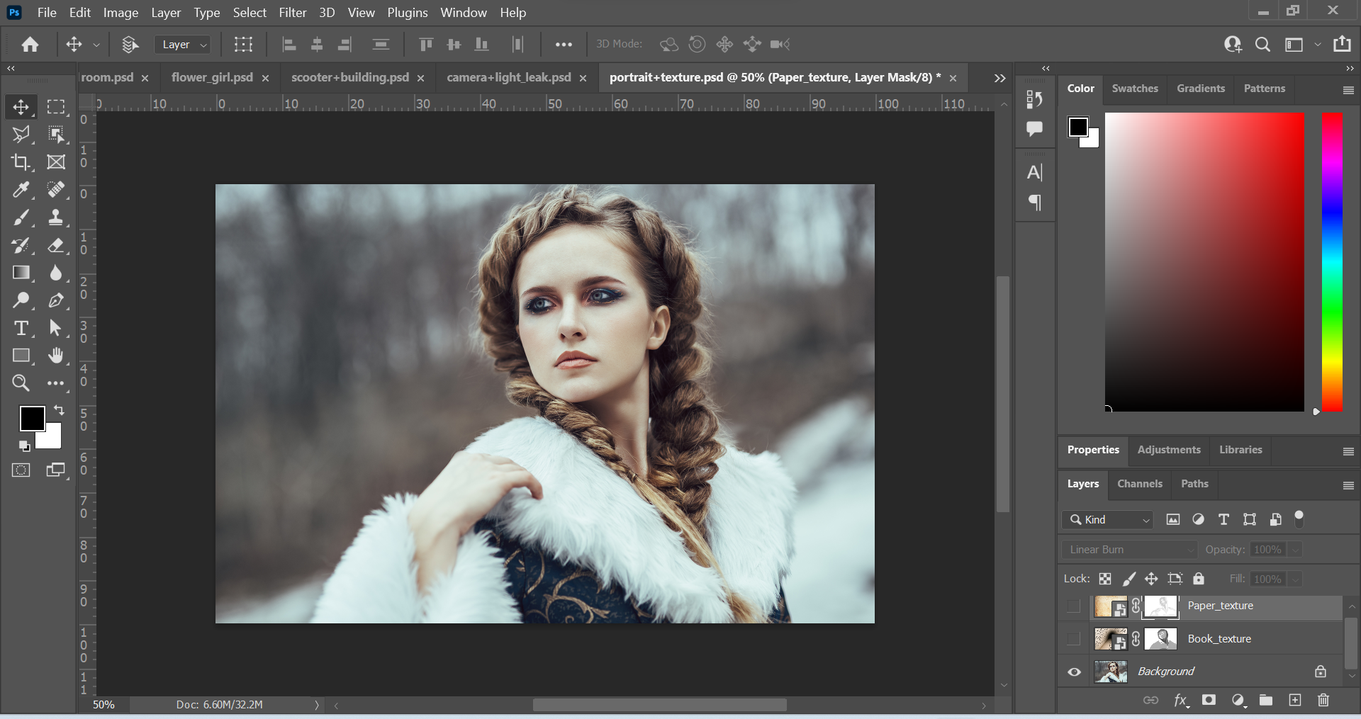
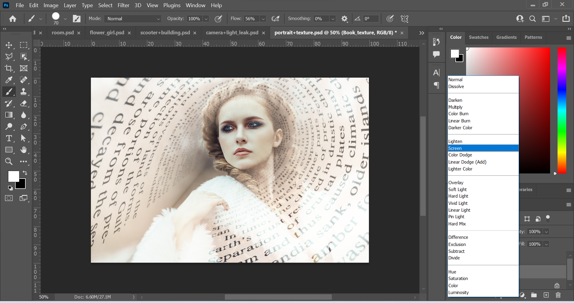
Above: Screenshots of Original Images in separate layers.
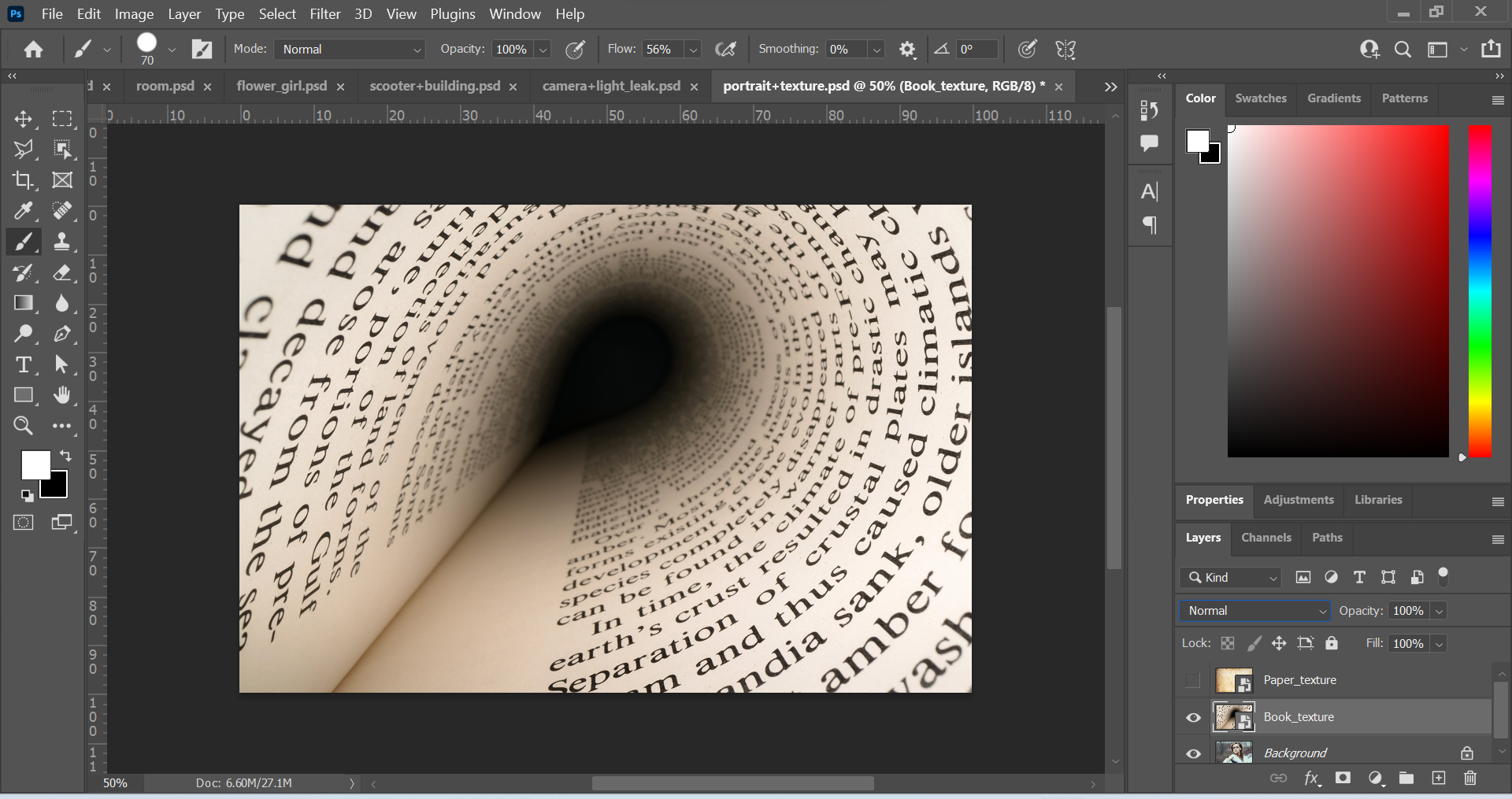
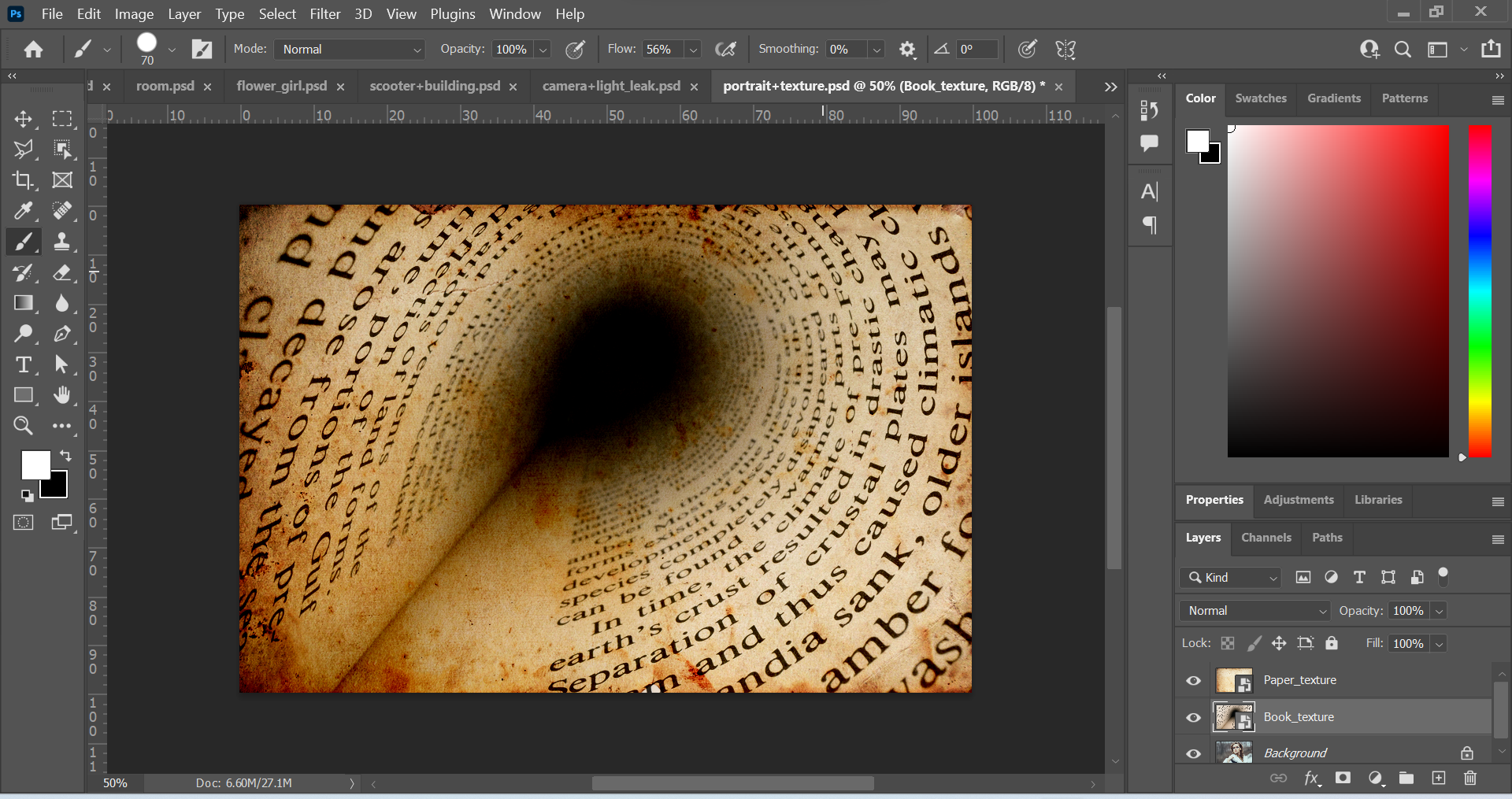
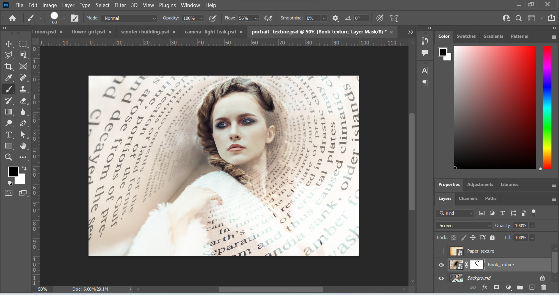
Above: Screenshots of edited images. The first thing I did was change the Book_texture layer into a different blend mode. I changed the mode from Normal to Screen. This created a slightly transparent look, where the woman in the image was visible. Next, I made the Book_texture layer into a layer mask by clicking on the rectangle icon with the circle in the middle at the bottom of the layer panel. Then, I used the brush tool to remove parts of the texture. I wanted to reveal more of the woman’s face, hair and overall appearance. I used black paint to remove elements of the image and this created a focal point.
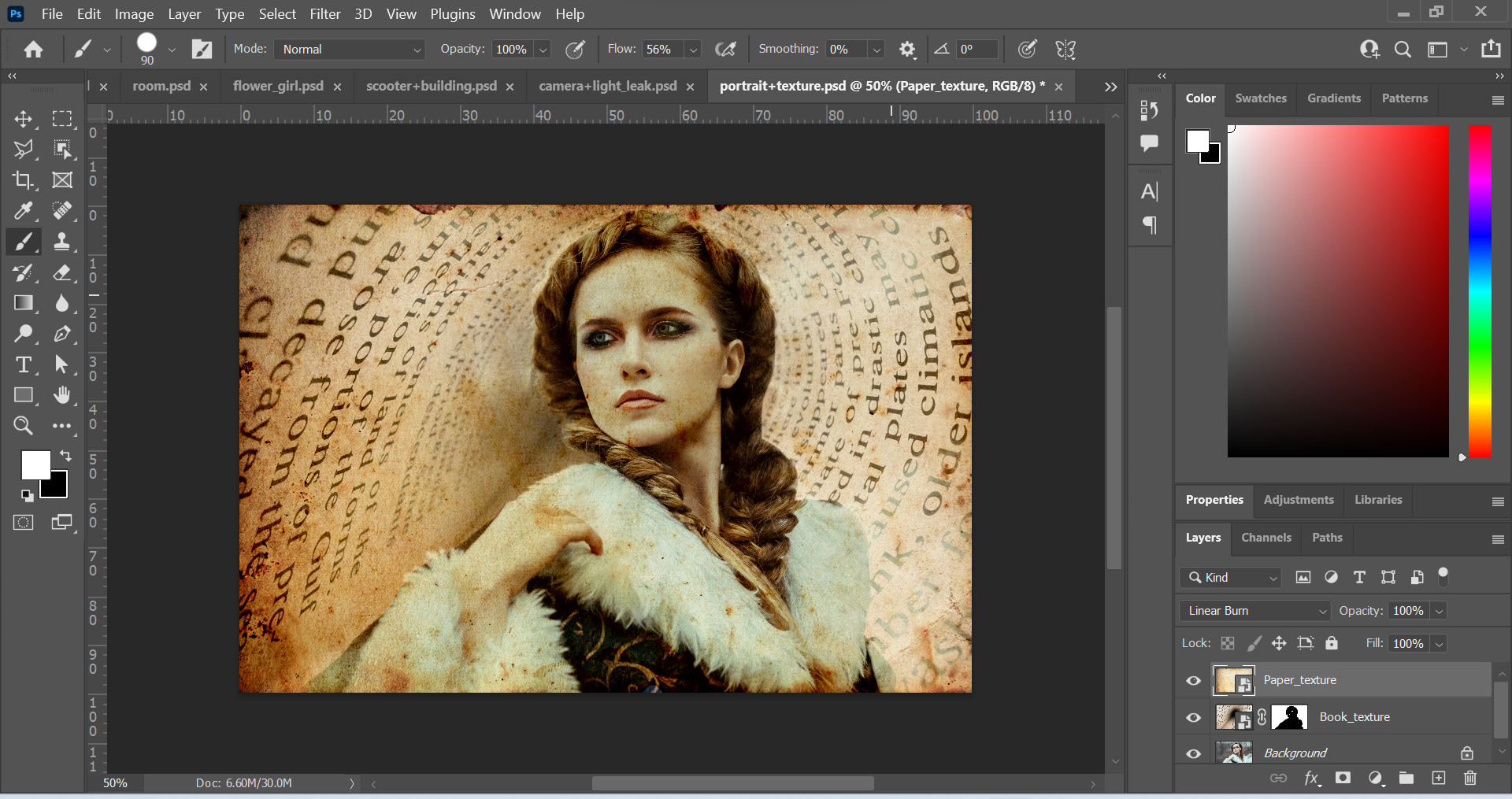
After this, I worked on the Paper_texture layer by changing the mode from Normal to the Linear Burn mode. I liked this as it created a sort of vintage look. I made the layer into a layer mask and removed parts of the image with the paint tool. This time, I lowered the opacity of the brush tool so that the colour was grey and not black. I wanted to do this so that when I used the brush tool to remove parts of the image, it would be subtle. I created a brighter effect around the woman by doing this.
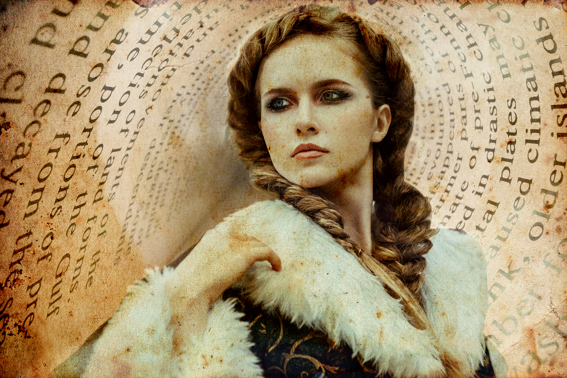
Above: Final Outcome
Conclusion
It was great to learn about blend modes and layer masks. It was also great to put it into practice. I look forward to learning more things in Photoshop.
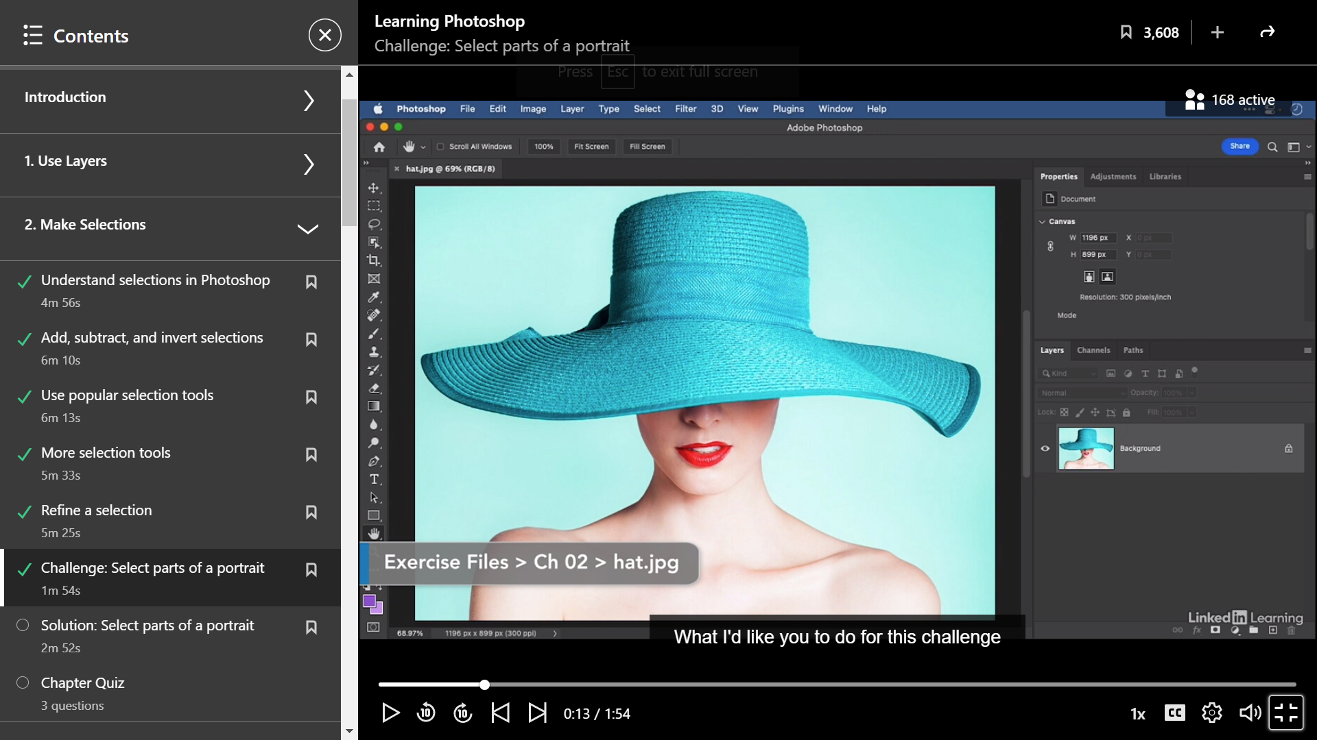
This post is about a challenge I did from a course on LinkedIn Learning. I am learning Photoshop, which is a powerful software that allows the user to manipulate images. In this challenge, I had to manipulate an image using a variety of selection tools.
Above: LinkedIn Learning.
Above: Original Image
Image 1
Image 2
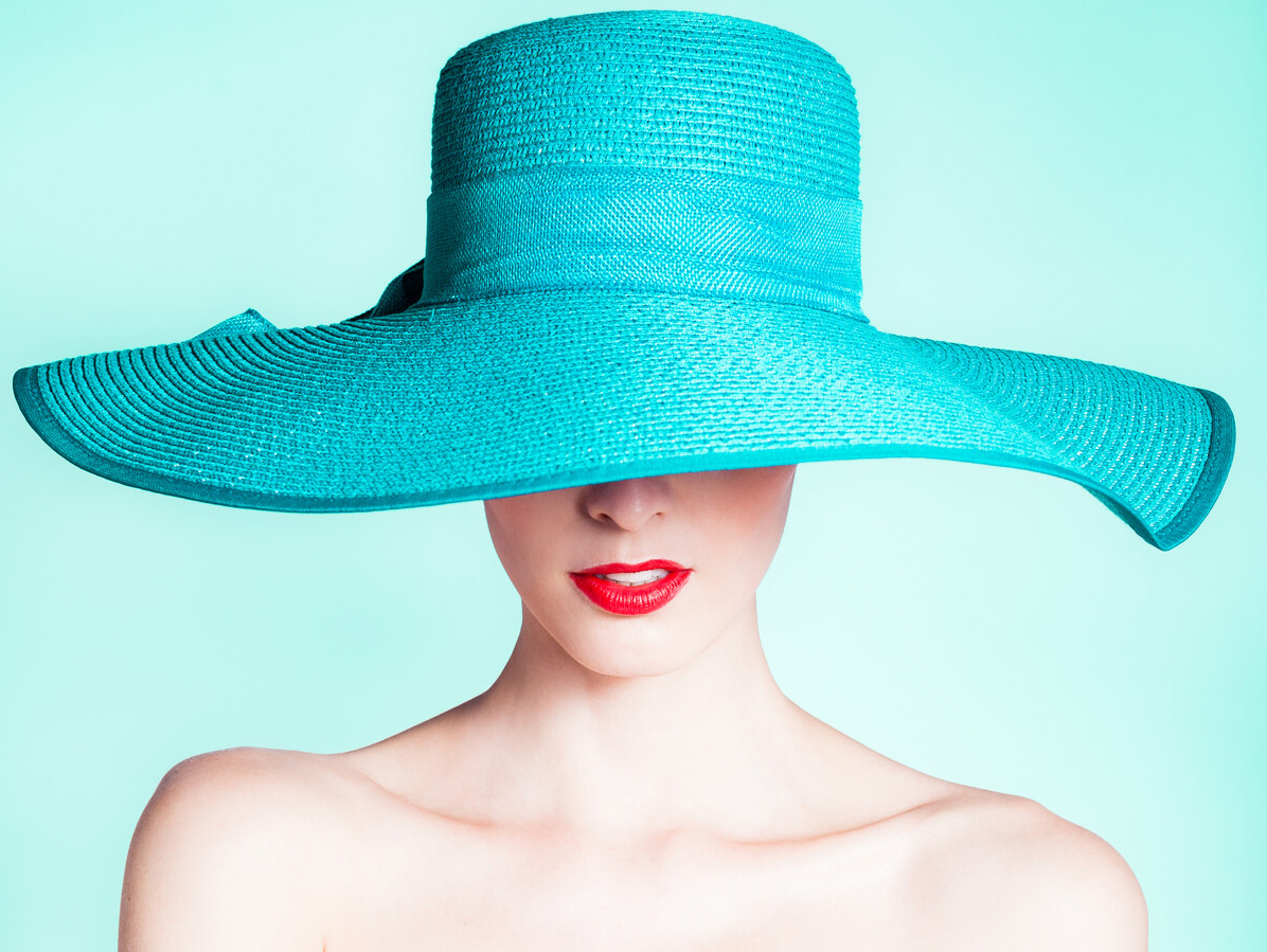
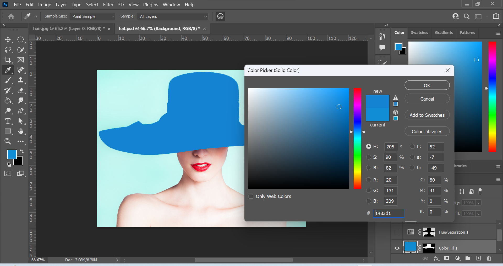
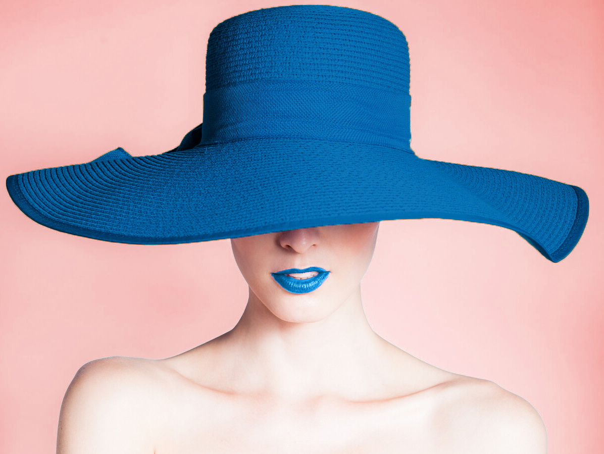
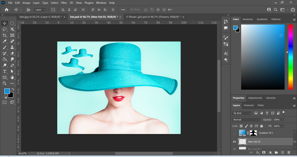
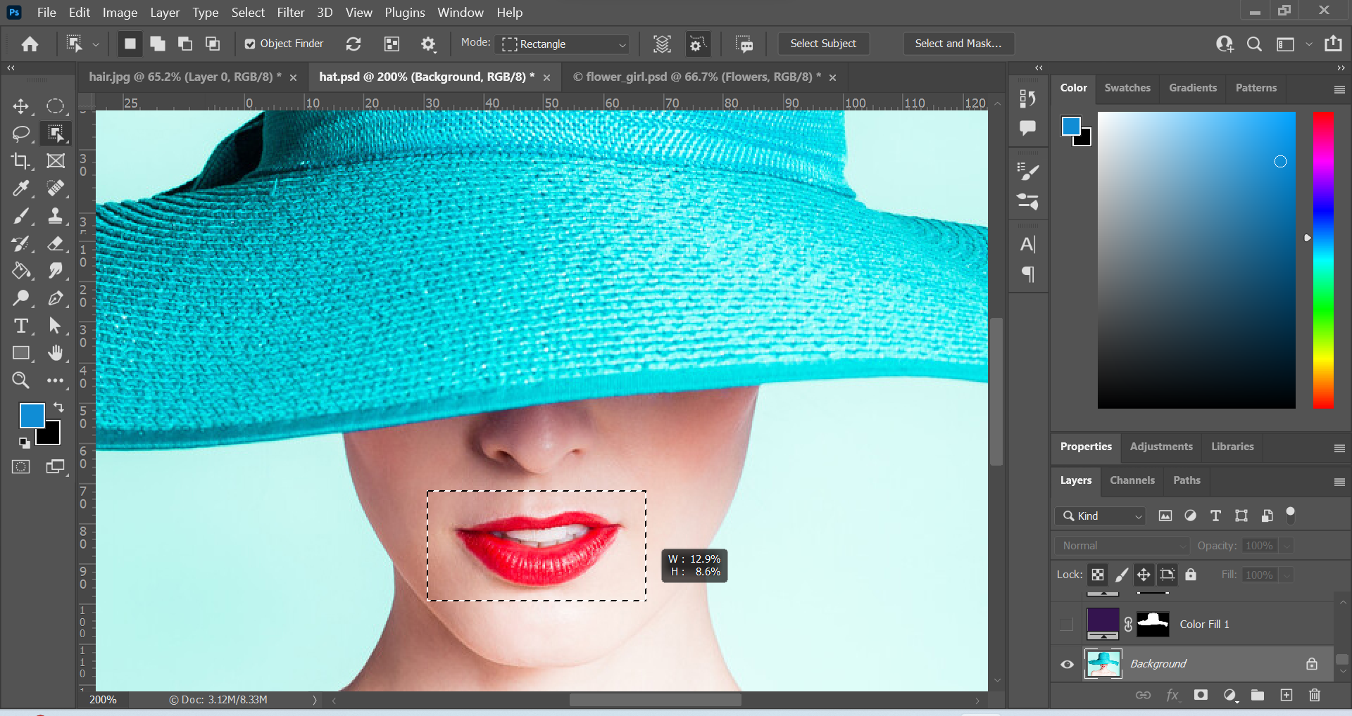
Above: Screenshots of edits in Photoshop and the final outcomes for Image 1 and Image 2. To create the 2 images, I used the Object Selection Tool to select elements. The Object Selection Tool can be used to automatically select something. You can click on a subject or drag a shape around the subject to select it. Firstly, I used this tool to select the hat. Then I created an adjustment layer and selected a solid colour. I chose the #1779bd (blue colour). I wanted a different feel to the original image, and chose a colder and calmer colour than the original colour for the hat. To make the hat visible, I changed the layer mode to Multiply. I repeated these steps for the lips.
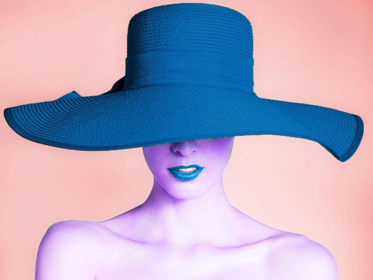
I used the unity design principle to match the hat and lips by using the same colour. To make the elements further standout, I changed the background colour to a warmer colour. I did this by choosing Select in the top menu, and then Subject. This automatically selected the portrait image and then I inversed the selection by choosing Select – Inverse. I used another adjustment layer to change the Hue to a warmer colour. For Image 2, I used the Hue adjustment layer to change the skin tone to purple. The colour purple can be associated with something mysterious so I thought it was a good colour to communicate this message.
Image 3
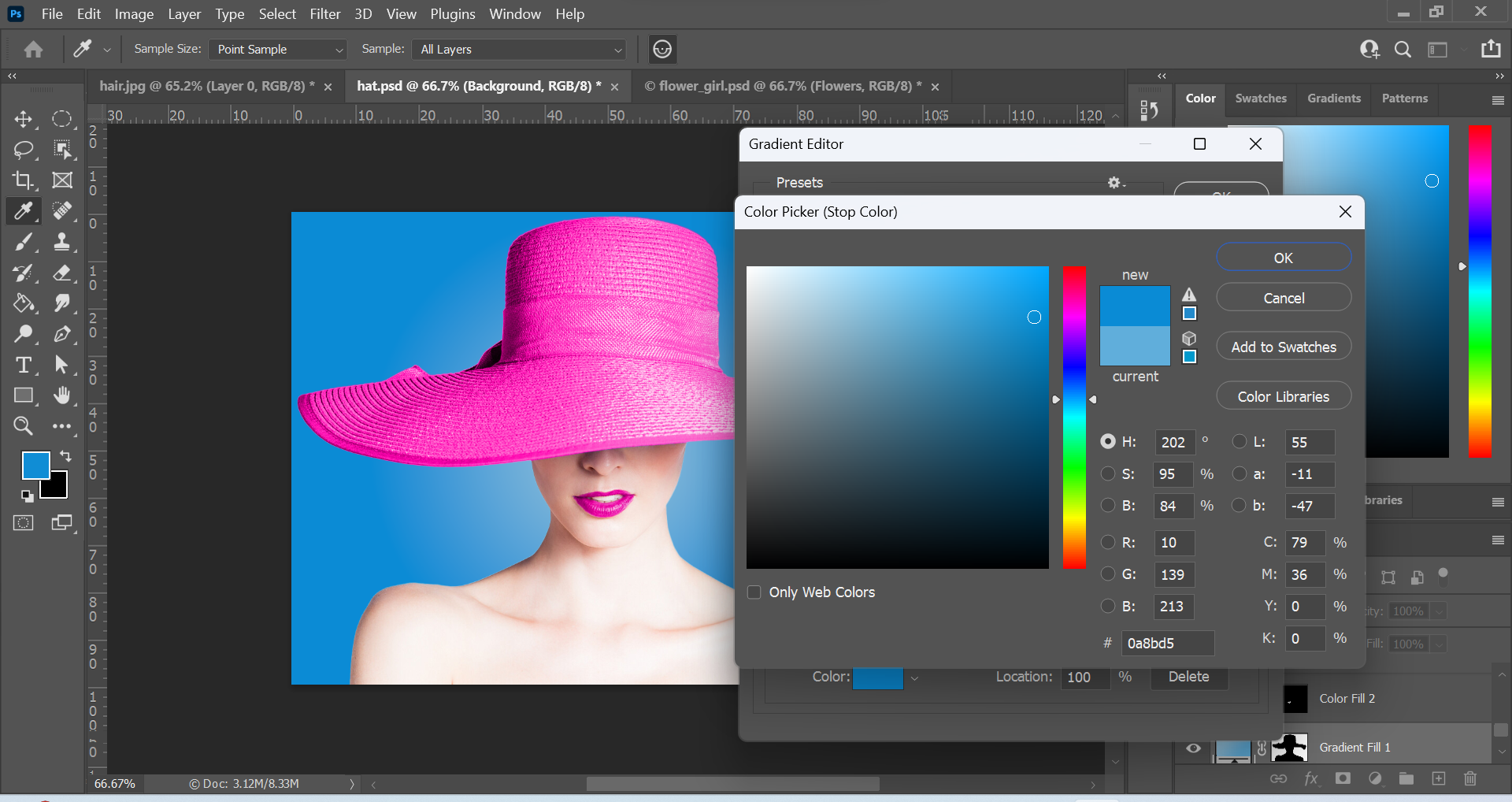
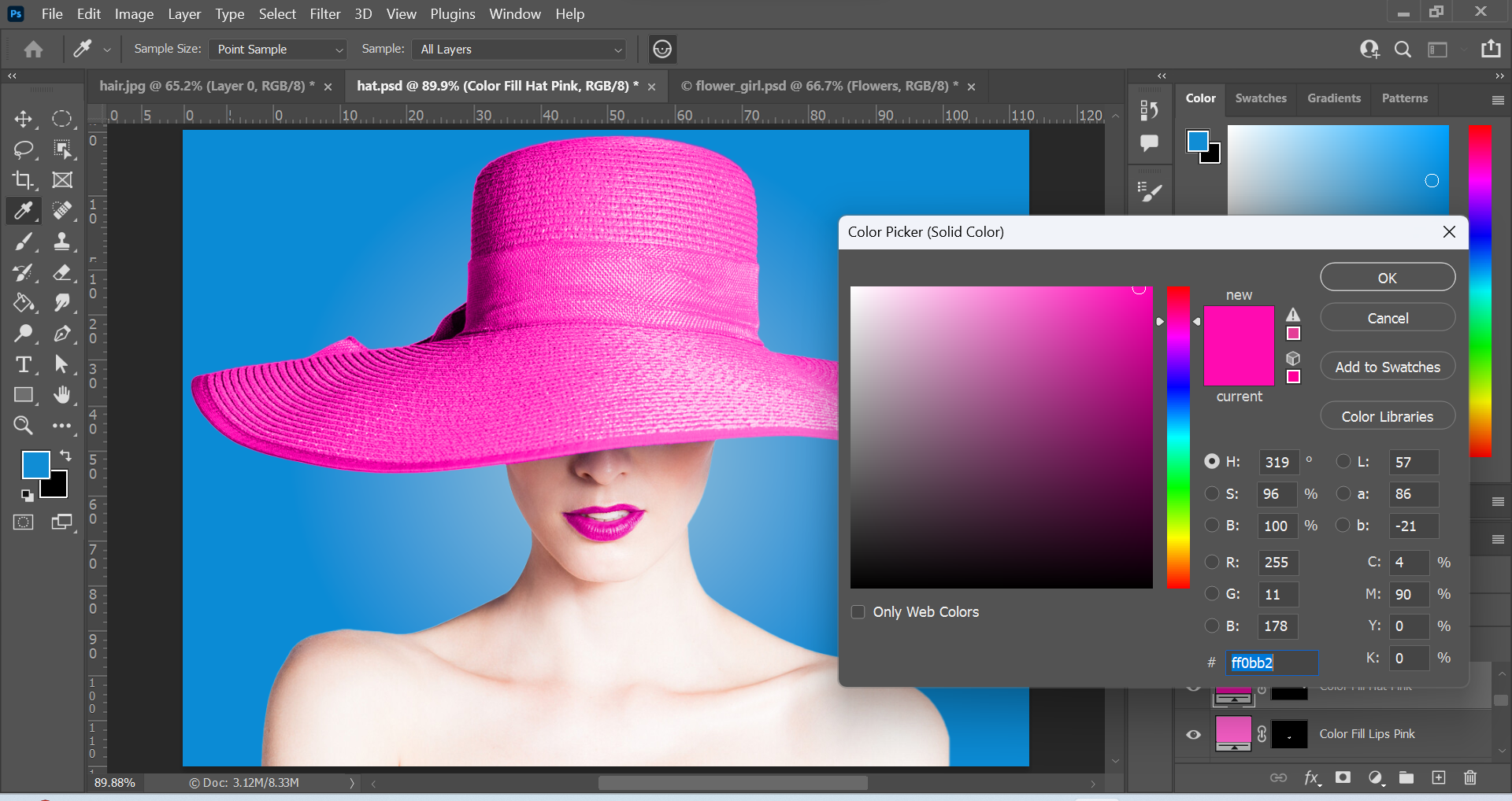
Above: Screenshots of edits in Photoshop and the final outcome for Image 3. I used the Quick Selection Tool to select the hat. The Quick Selection Tool is great for quickly selecting larger areas of an image. This can be done by dragging around the area you want to be selected. It is located in the toolbar right beside the Object Selection Tool via the drop down menu. Once the hat was selected, I created an adjustment layer. Adjustment layers are great because you can modify an image without damaging the original image underneath the adjustment layer. I chose the Solid Color of #ff0bb2 (pink) and changed the layer mode from Normal to Color, so that the hat is visible through the layer.
For the lips, I used the Object Selection Tool and then repeated the same steps as I did for the hat. The background was created via a Gradient adjustment layer and I used a Radial Gradient effect combining the colours #92bfd9 (light blue) and #0a8bd5 (medium blue). The cold blue background has contrast with the vibrant pink elements and the bright portrait. I really like this image because it is aesthetically pleasing and the contrasting elements work well together.
Funnily enough, during the process of this creation I had various thoughts running through my mind. Some of the thoughts were things like musicals, candy, Charlie and the Chocolate Factory, Mary Poppins and even Katy Perry’s California Girls. Perhaps it is because of the vibrant colours associated with them. After the first image, I wanted to design something more eye catching and a “feast for the eyes”. The colours pink and blue were the first colours to come to mind.
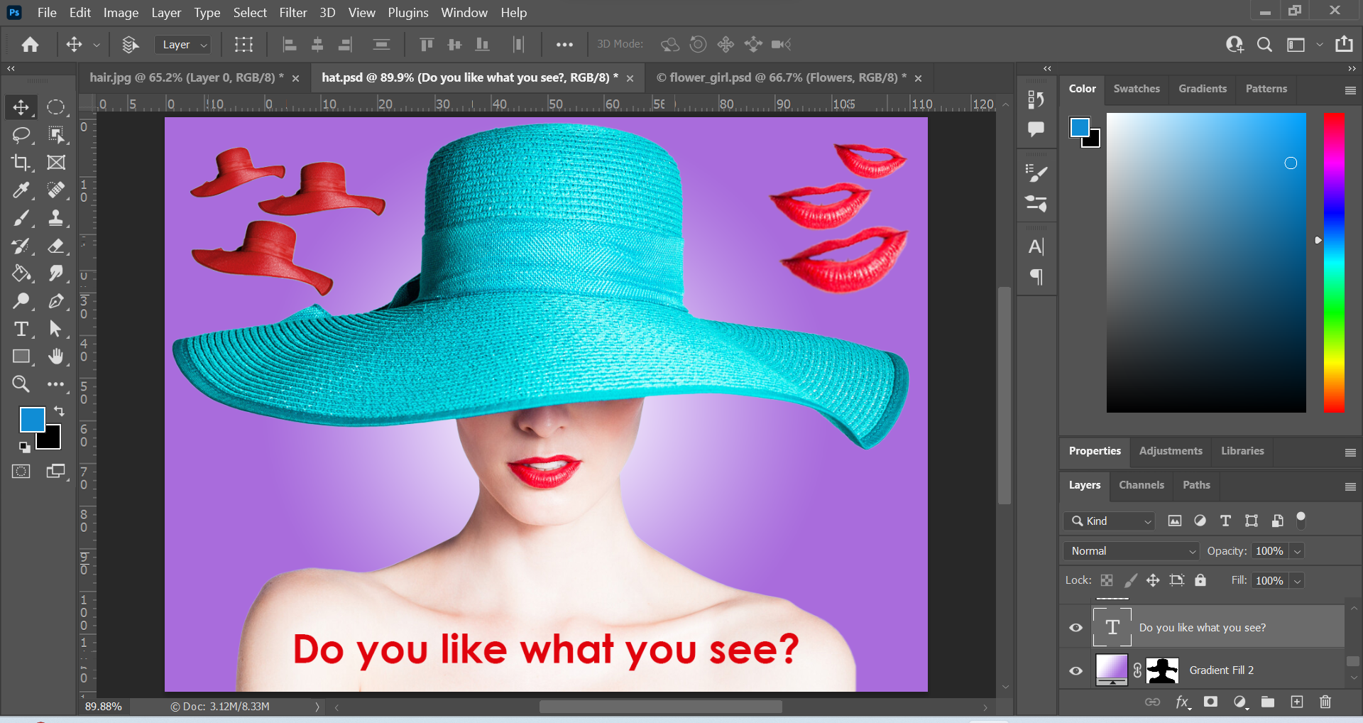
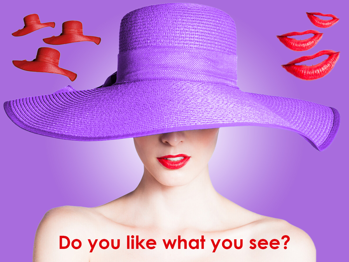
Image 4
Above: Screenshots of edits in Photoshop and the final outcome for Image 4. I wanted to do something a little different for the final image. I wanted to add extra elements to the original composition. The first thing I did was cut out the hat element and duplicate it a few times to create a repetition effect. I did this by using the Quick Selection Tool to select the hat and then I duplicated the selection unto a seperate layer using the keyboard shortcut: Ctrl + j on a windows computer. Then, I scaled the hat down to a smaller size and used the free transform tool (Ctrl + t) to rotate it slightly upwards. I wanted to match the colour of the hat with the colour of the lips so I used an adjustment layer and changed the hue to a similar colour to the lips. I also decreased the opacity for the hue from 100% to 90% to make it less intensive. I repeated the same steps for the other hats and rotated each hat slightly more clockwise and slightly increased the scale. This created a rhythm and a motion effect. I also repeated these same steps for the lips. Instead of clockwise, the lips were rotated anti-clockwise. This created contrast in terms of rotation compared to the hat elements, but also unity was formed because of the repetition, alignment and colour.
I used a Radial Gradient effect to create the background. I combined the two colours #ffffff (white) and #a96cdc (purple) to create a sense of mystery, and also to create a spotlight effect for the main subject. I created a #34144f (dark purple) Solid Color adjustment layer for the hat, and changed the layer mode from Normal to Hue. This allows the viewer to see through the layer. This also creates unity with the background but contrast because of the foreground (hat) texture.
To finish, I completed the design with a slightly daring question: “Do you like what you see?” This can refer to the design or the portrait. I thought the question perfectly matched the tone of the design. I chose the colour red to form unity, and I chose the font Century Gothic (Bold) because it reminds me of elegance and fashion which I feel matches the portrait.
During the process for Image 4, songs such as Santa Baby, Big Spender and films such as Who Framed Roger Rabbit came to mind. I guess it is because of the nature of the songs being slightly daring and the character Jessica Rabbits also fitting this description.
Conclusion
I enjoyed learning about the selection tools in Photoshop. I had the opportunity to experiment with the different tools and create interesting designs. The selection tools in Photoshop are really powerful and I was surprised how easy they were to learn. There are numerous ways to select elements in Photoshop so it was great to learn how to use them. This will certainly help me with my future projects in Photoshop.
I think that a great source for drawing can be found in catalogues. The reason being that the people pose in different and interesting shapes. So I decided to do just that. I picked up a catalogue found at home and picked a few poses to draw from.
Freemans.com Catalogue Page
Freemans.com Catalogue Page
Catalogue Models drawn from the catalogue ‘freeman’s.com’
So as mentioned above, I picked out two poses that appealed to me and drew them. From the left, I picked the female with the orange dress and the female with the handbag being held by her left hand. This time round I had a go at drawing the facial features as well.
Catalogue Page, La Redoute
Catalogue Page La Redoute
Catalogue Drawing Male & Female
Drew both a male and female here. I liked the shape of the poses hence I went with these two in particular. I liked the smart look on the female so it was fun to draw although I had trouble with the face looking downward sort of angle.