This post is about a graphic design I created for an architecture company.
I used a design brief generator to find a project to work on. The brief description is as follows:
I am Tillie, the creator of Sion. I’m looking for someone that can design something for my architectural firm. I would like a simple flyer for an event. We primarily use the colour blue #42cfff.
Although the description is very short and, is not a real life creative brief, it gave me the opportunity to continue working on the principles of design.
The first step was to note down my thoughts. Any thought that came to mind was noted down immediately. and this helped me generate ideas which you can see below.
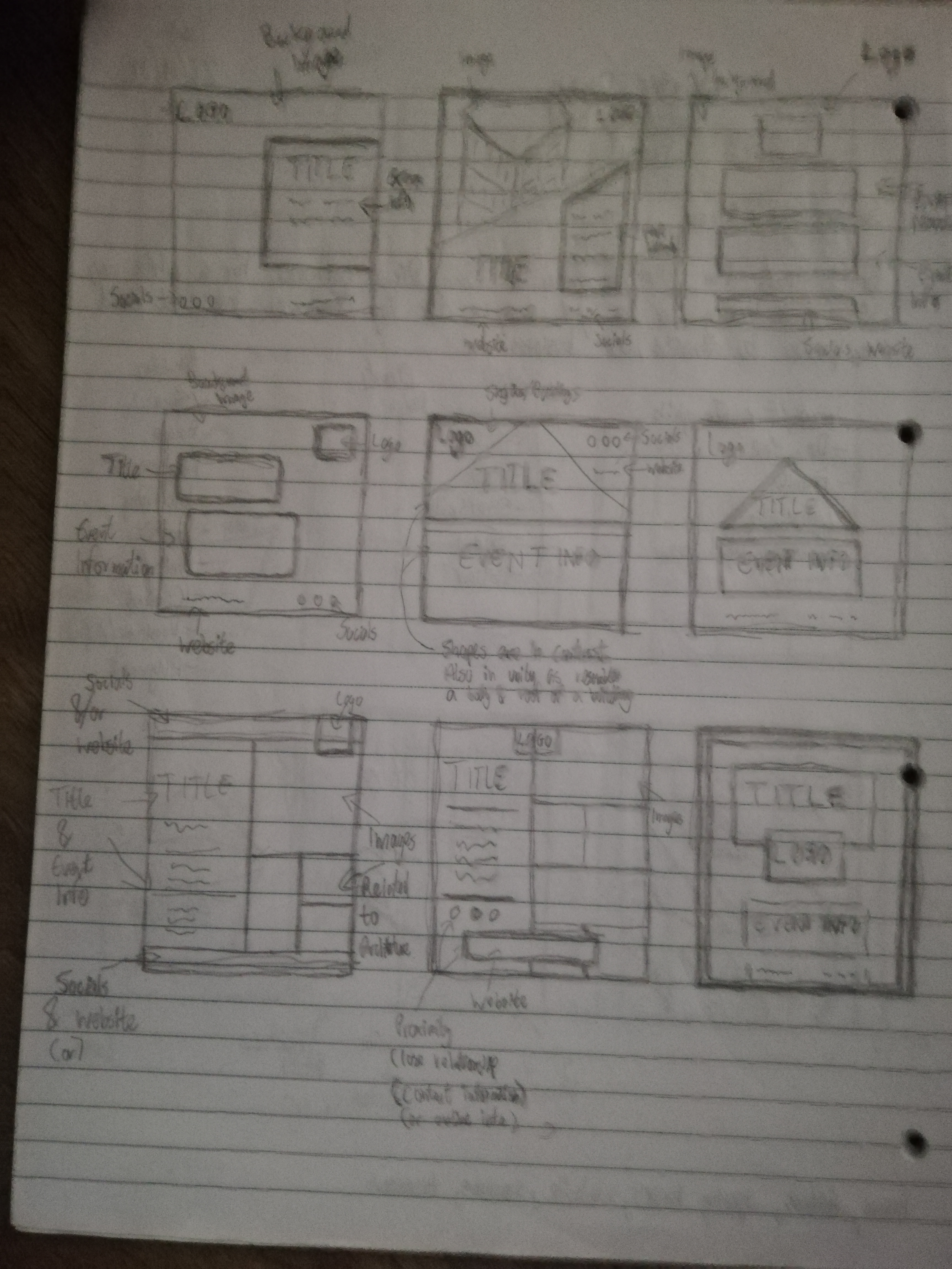
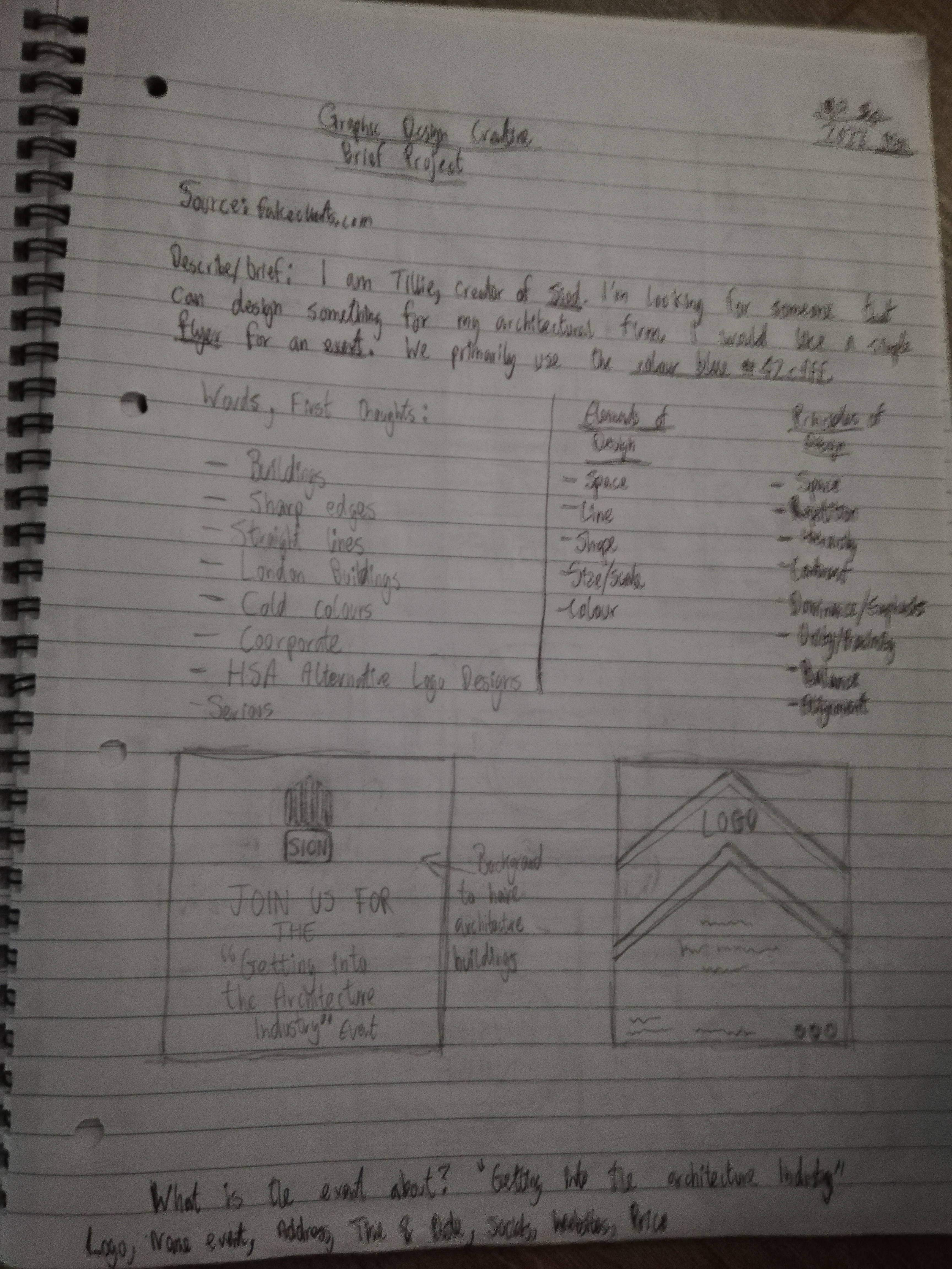
The next step was to do some research and look at architecture flyers. I searched online for different types of architecture flyers and this gave me inspiration and ideas of how to design a layout for a flyer and also what details to implement. After this, I sketched out a few ideas in the form of thumbnails which you can see in the images above. I tried to incorporate the principles of design for each idea.
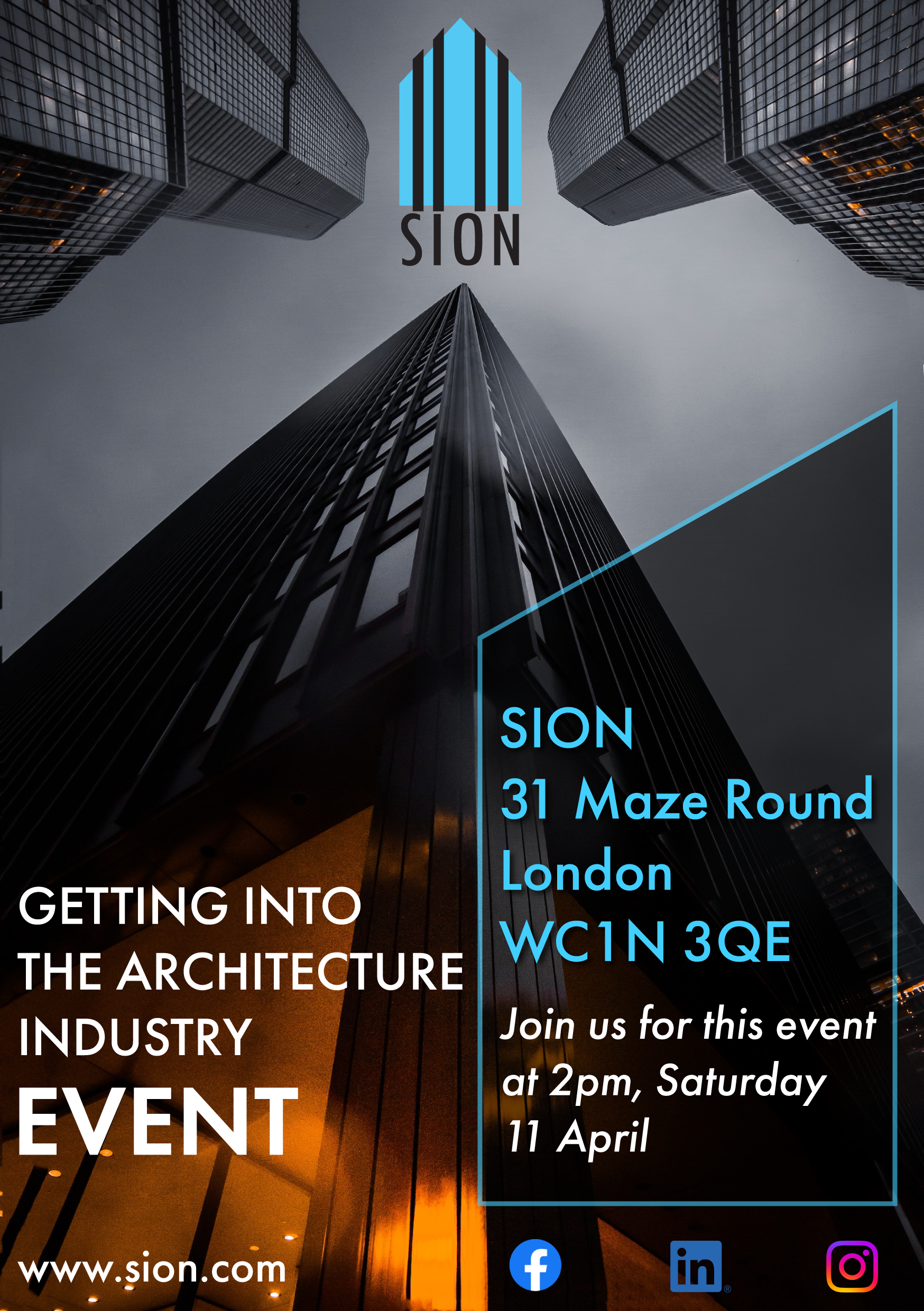
You can see the final design above. One of the words I noted down during the first step was cold colours and the other was buildings. So I made sure to incorporate the blue colour the client requested in some of the elements such as the text and logo design. I also chose a picture from pexels which had buildings. I thought that the image was really interesting and I liked the perspective it gave to the viewer. The logo design was created in Illustrator and is a combination of different size rectangles replicating the shape of a building. The black slanted thick lines were used for an added dimension and I chose a font style which was light and thin.
I placed the logo at the top in the centre because that is where the poster image provides a focal point. The contrast design principle was used to seperate the logo, text and icons through the use of colour i.e. light and dark colours. The placement of the text at the bottom also allows the logo and buildings to stand out further and instantly grabs the viewer’s attention. The principle of unity was used to create a strong relationship between the logo and the company information in the slanted box in the bottom right of the design. This was used by having the same colour. The text is wrapped around the rectangle to divide the information; one was the address and information about the schedule, the other was the purpose of the event. They are all linked by using the same font which I wanted to represent corporate modern architecture, straight clean lines in sans-serif form. The rectangle is slanted to make it interesting and also to replicate a building shape. The slightly transparent effect adds more dimension.
The largest word in the design is “Event” and this is to emphasis to the viewer what the flyer is about (perhaps I could have also emphasised the words “Architecture Industry” for specificity). I placed additional information about the company including the website underneath the event title and the social icons underneath the company information. Both sets of additional information are the smallest in terms of scale indicating to the viewer the lower level of importance compared to the other elements.
Conclusion
I created graphic designs responding to the creative brief for an architecture firm. It took a while to get going but I really enjoyed the journey. I also like creating these posts about my designs because it allows me to go through my thought processes and analyse the works.
To see other designs, feel free to check out my portfolio.
Ciao for now!
