This post is about graphic designs I created about my trip to France.
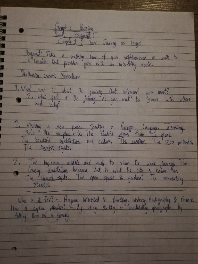
It was an exercise from a book titled Graphic Design School. The task was to choose a walking tour or location that provides me with an interesting route. I decided to choose a city in the south of France called Montpellier. I travelled to the city a couple of times and it is a lovely city. I wrote a post about my time there which you can read by clicking here. But in a nutshell, Montpellier is one of my favourite cities!
The first step was to do some research. I started off by exploring the city on foot and public transportation, and then took photos of streets, buildings, open spaces, sights, people and more. Once I gathered the first batch of primary research and analysed the findings, I started asking questions such as:
- What was it about the journey that intrigued you most?
- What part of the journey do you want to share with others and why?
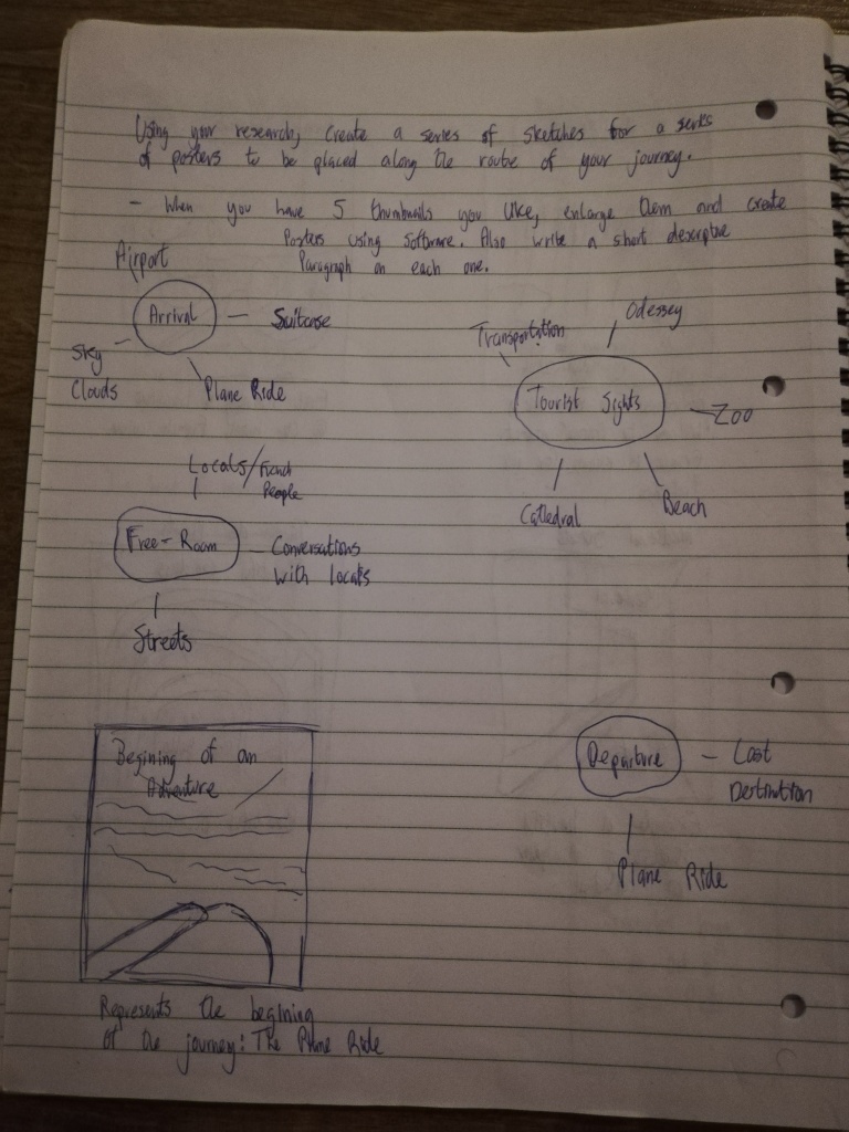
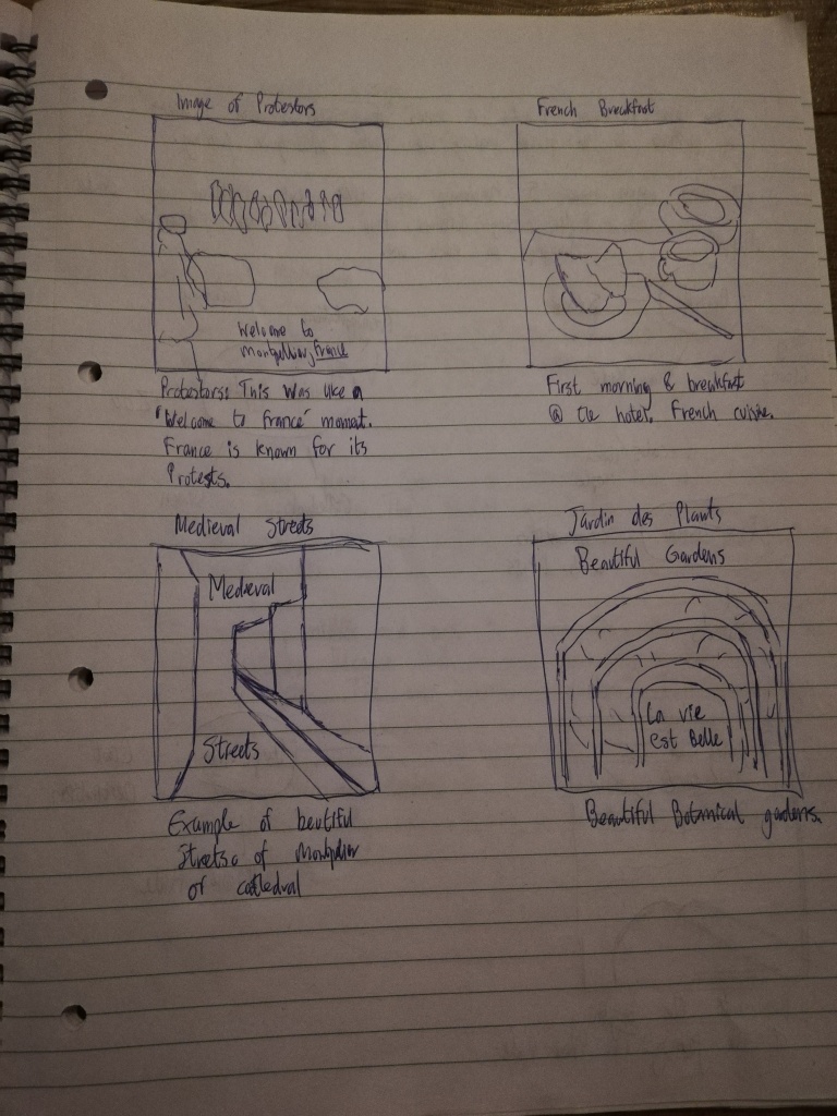
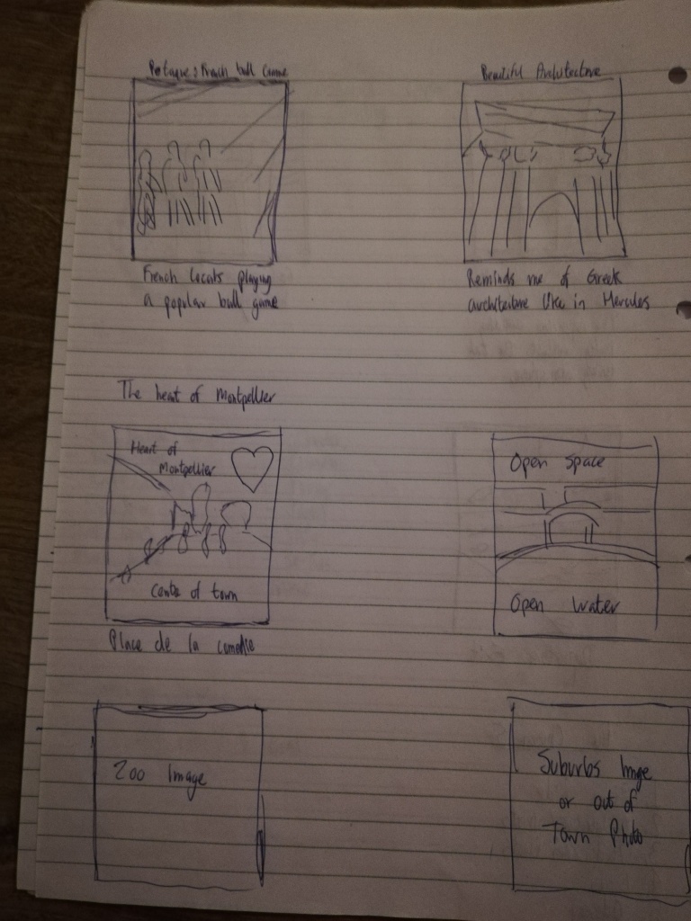
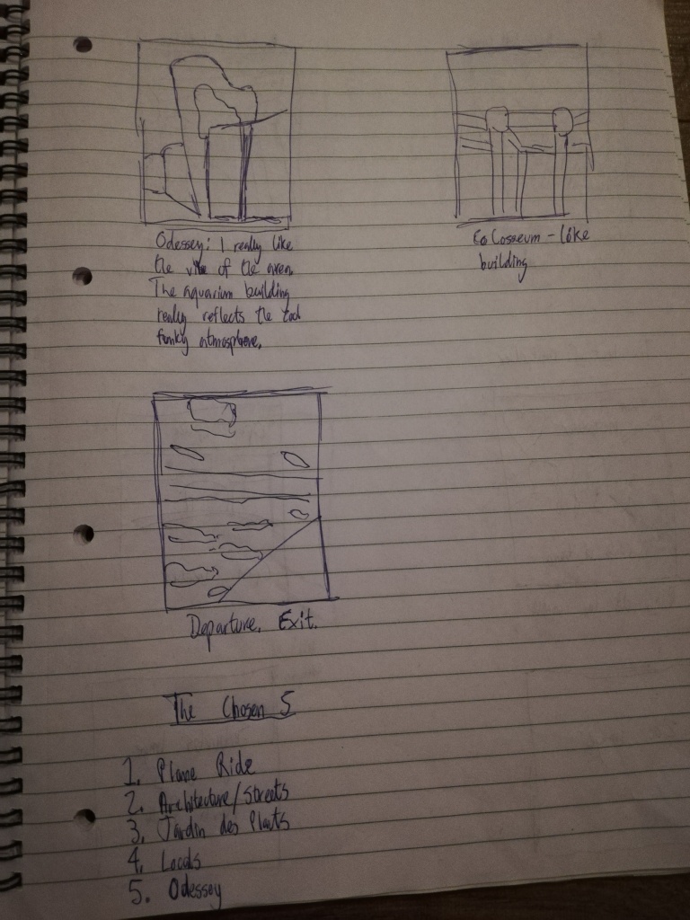
After this, I brainstormed ideas with words associated with my travelling experience, and then I created several sketches in the form of thumbnails (which can be seen above). These sketches were to represent my journey as images. The task was to create posters based on my chosen location which showcases my journey through images.
I had to choose 5 final thumbnails that I would turn into posters. I decided to go with the sketches that demonstrated:
- An Arrival
- Examples of Architecture/The Streets
- Tourist Sights
- The Locals
- My Favourite Spot
Image 1: The Plane Ride
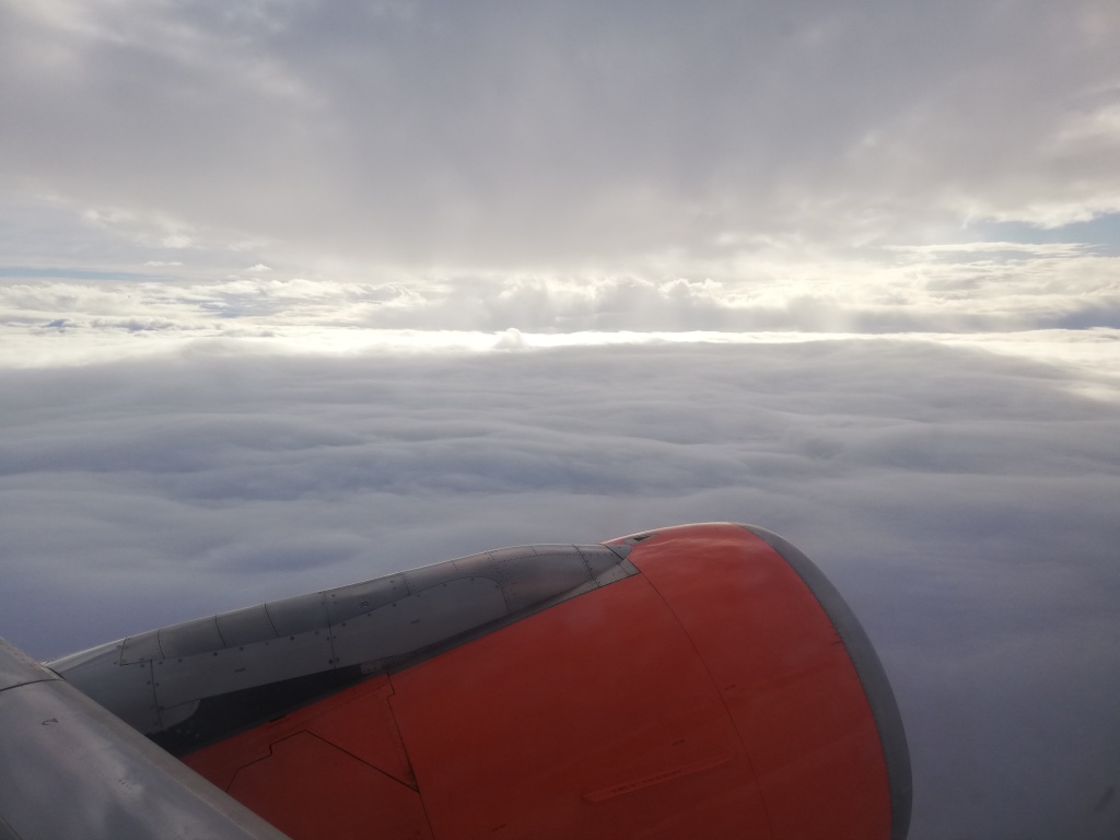
The first image represents my arrival to the destination. It is a photo I took when I was on the window side of the plane and it brings back great memories. I love travelling by plane and seeing the world from the perspective of a bird. It is absolutely stunning and gets me every time! The views from above makes me think about how much more there is to earth than what we experience in our normal day to day lives. The picture in question is actually quite cloudy, but it opened up later on during the day to a wonderful sunshine. I went to Montpellier in February which is considered cold and part of the winter season, however for me it was warm. I’m from the UK after all!
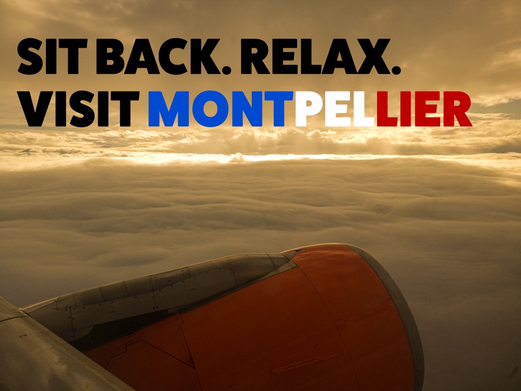
The original photo and the edited photos can be seen in the slideshow above. I used Photoshop to edit and design the posters. I thought the original photo was good but I wanted to alter the mood a bit, and so I played around with the settings in Camera Raw. I created a warmer temperature by adjusting the temperature option to a more orange yellowish colour. This represents Montpellier really well, as it has a very warm climate for most of the year. I also decreased the exposure a little, to create contrast between the dark and light elements and this created a more awe-inspiring look.
I remember watching a video about images and text in graphic design. The video was part of a LinkedIn Learning course and the instructor stated that when you combine images and text, the words should never simply repeat what the image is saying. So I took that in mind when choosing the text for the images. For the first edited image, my thinking process was to create a relaxed mood to represent the words and therefore I chose a font-style that had round corners rather than sharp ones. It was also thin to create a light sense of feeling. The second edited image, I went with the opposite. I used the Fat Frank font to create a bold and slightly playful impression on the viewer. I went with black for contrast and readability. I went with the French flag colours for the word Montpellier. This made the word stand out more and gave a clue to the viewer that the city was located in France.
Image 2: Architecture
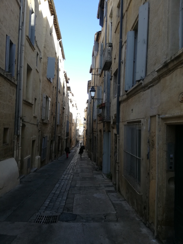
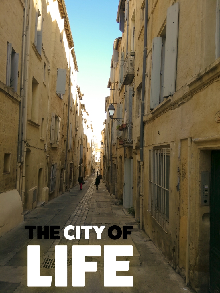
The second image was my first full day in the city. I was staying in the city centre and decided to have a walk around. I ended up getting a little lost but then I came across beautiful streets and architecture. I noticed that the narrow winding streets were a thing of beauty. I loved it! I felt free and happy. I felt alive.
The original image has great contrast and very little exposure for the buildings. This allows the focus to be at the end of the street. I wanted the photo to come to life, and so I edited the photo with the intention of making it brighter and warmer. I increased the temperature by using the Camera Raw settings in Photoshop and I also increased the exposure to give it a brighter effect. This combination created a pleasant and warm appearance. I gave this design the title “The City of Life” to further enhance the meaning of the image. The Fat Frank font was used once again and I combined the colours black and white for contrast, emphasis and unity. The emphasis is on the words “city” and “life” because this is what I wanted to communicate to the viewer first. I wanted to send a message that this city is full of life and adventure, and I communicated through design elements such as size and colour.
You can see that the size of the word “Life” is larger than any other word. It also has a glow effect around it emphasing its’ meaning. The words in black are less important and so are almost in the shadows. The focal point is centred with the words in white, which also creates contrast with the background image.
Image 3: Jardin des Plantes
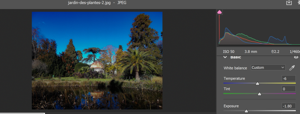
Jardin des Plantes translates as the garden of plants and it is a botanical garden. It is one of the tourist sights of Montpellier and it consists of a variety of plants and beautiful flowers. The photo I took was at the heart of the garden. I really like it because it showcases the richness and beauty of the sight.
The original image shown in the slideshow above, has a lot of exposure so the first thing I did was decrease the exposure for the edited image. I also made it more crisper and sharper by slightly experimenting with the clarity and dehaze sliders in the Camera Raw settings in Photoshop (below). For the text, I used Fat Frank and placed it at the top. The colours are white and orange, and they stand out from the background dark blue. The word “paradise” is slightly bigger and has a different colour for emphasis. It is also slightly shifted to the right making the overall title dynamic. The chosen title of “Welcome to Paradise” best represents my feeling when exploring this beautiful botanical garden.
Image 4: The Locals
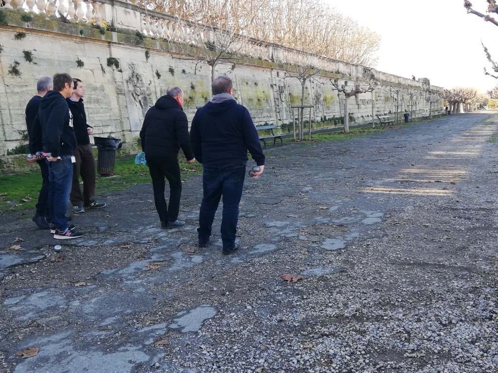
Whilst walking to a tourist sight, I saw a group of locals playing a national sports game called Pétanque. So I snapped a photo of them.
The main differences between the original and edited versions are the exposure and temperatures. I changed the mood into something more…personal? I really wanted to create harmony and focus on the path and direction the group was looking in. I did this by decreasing the exposure and uniting the elements through the use of similar colours. The text is placed at the bottom and is big and bold. It’s in stark contrast to the subjects (people). The word “Locals” is slightly bigger in size for emphasis. The elements are all placed on the left, creating a balance and space for the right side.
Image 5: Odysseum
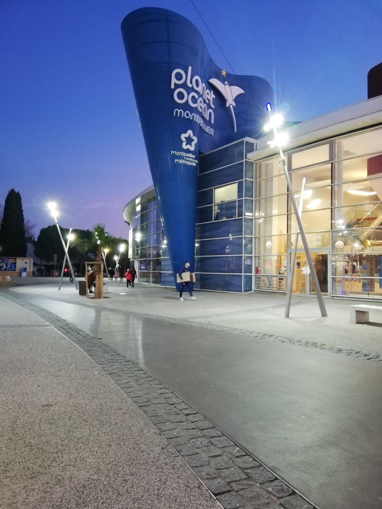
The last photo is located in my last stop in Montpellier. I stayed in the city centre and went outside the centre to a place called Odysseum. It’s really a vast shopping centre but it’s a really cool place to walk around and explore with cinemas and cool buildings about. I even spotted cool architecture which looked like something out of the roman empire. My favourite building was the aquarium because it looked really interesting and represented the waves of the ocean really well. It truly made me smile!
I liked the original photo that I took. It is a cool angle showing the aquarium building in all its’ glory. I gave the photo a cooler look by sliding the temperature option to the left, making it more blue. I also moved the clarity slider to the right making the image clearer and more precise. The text is white to create contrast to the darker background. It is also slightly tilted to the right and coloured in white to create a sense of unity with the text on the building.
Conclusion
So there you have it! Graphic design exercises inspired from a book. I enjoyed the exercises because it gave me the opportunity to get my creative juices flowing, it allowed me to practice working with Photoshop and think about the principles of design.
To see other designs, feel free to check out my portfolio.
Ciao for now!
