This post is about a graphic design I created for an architecture company.
I used a design brief generator to find a project to work on. The brief description is as follows:
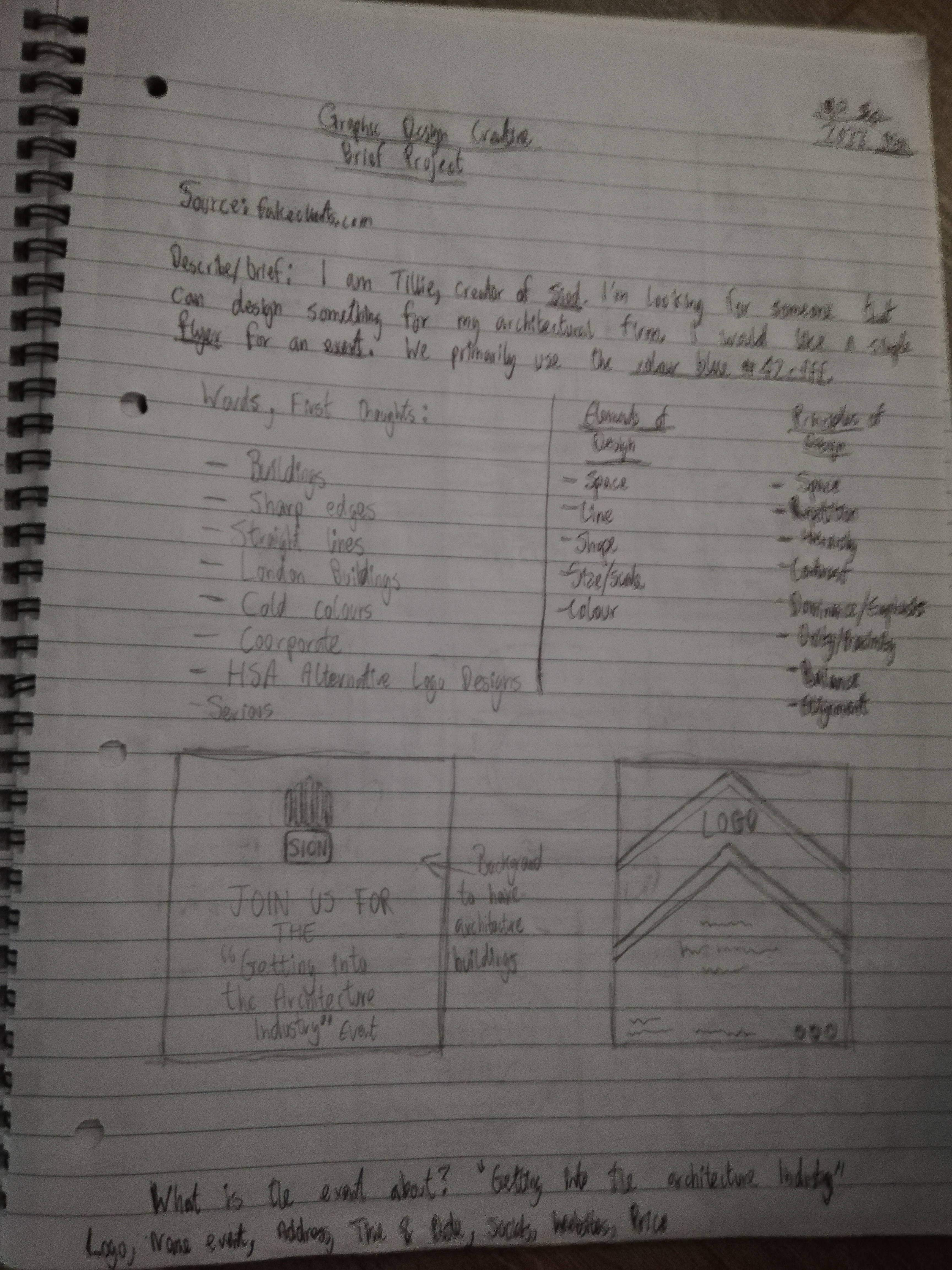
I am Tillie, the creator of Sion. I’m looking for someone that can design something for my architectural firm. I would like a simple flyer for an event. We primarily use the colour blue #42cfff.
Although the description is very short and, is not a real life creative brief, it gave me the opportunity to continue working on the principles of design.
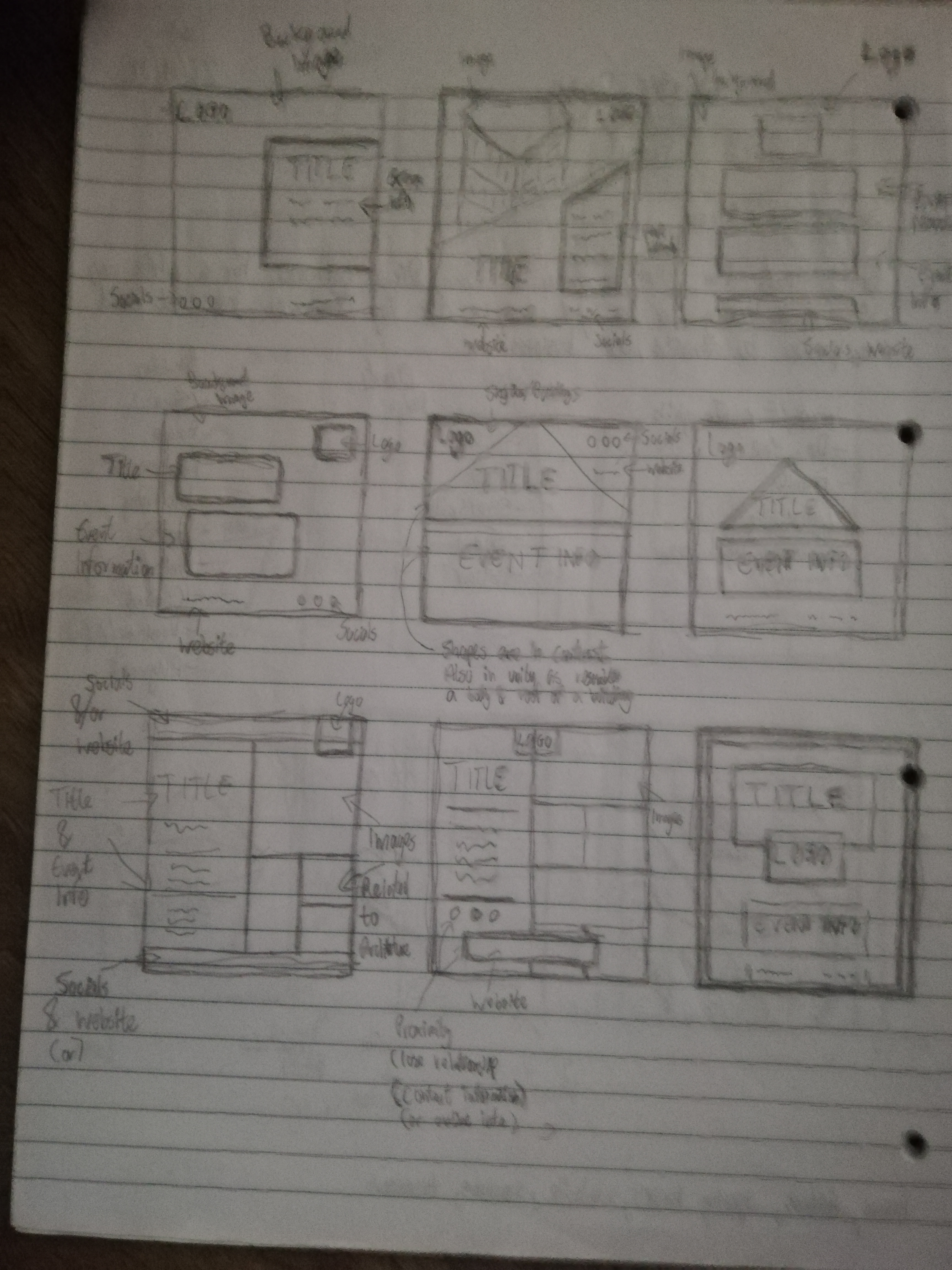
The first step was to note down my thoughts. Any thought that came to mind was noted down immediately. and this helped me generate ideas which you can see below.
The next step was to do some research and look at architecture flyers. I searched online for different types of architecture flyers and this gave me inspiration and ideas of how to design a layout for a flyer and also what details to implement. After this, I sketched out a few ideas in the form of thumbnails which you can see in the images above. I tried to incorporate the principles of design for each idea.
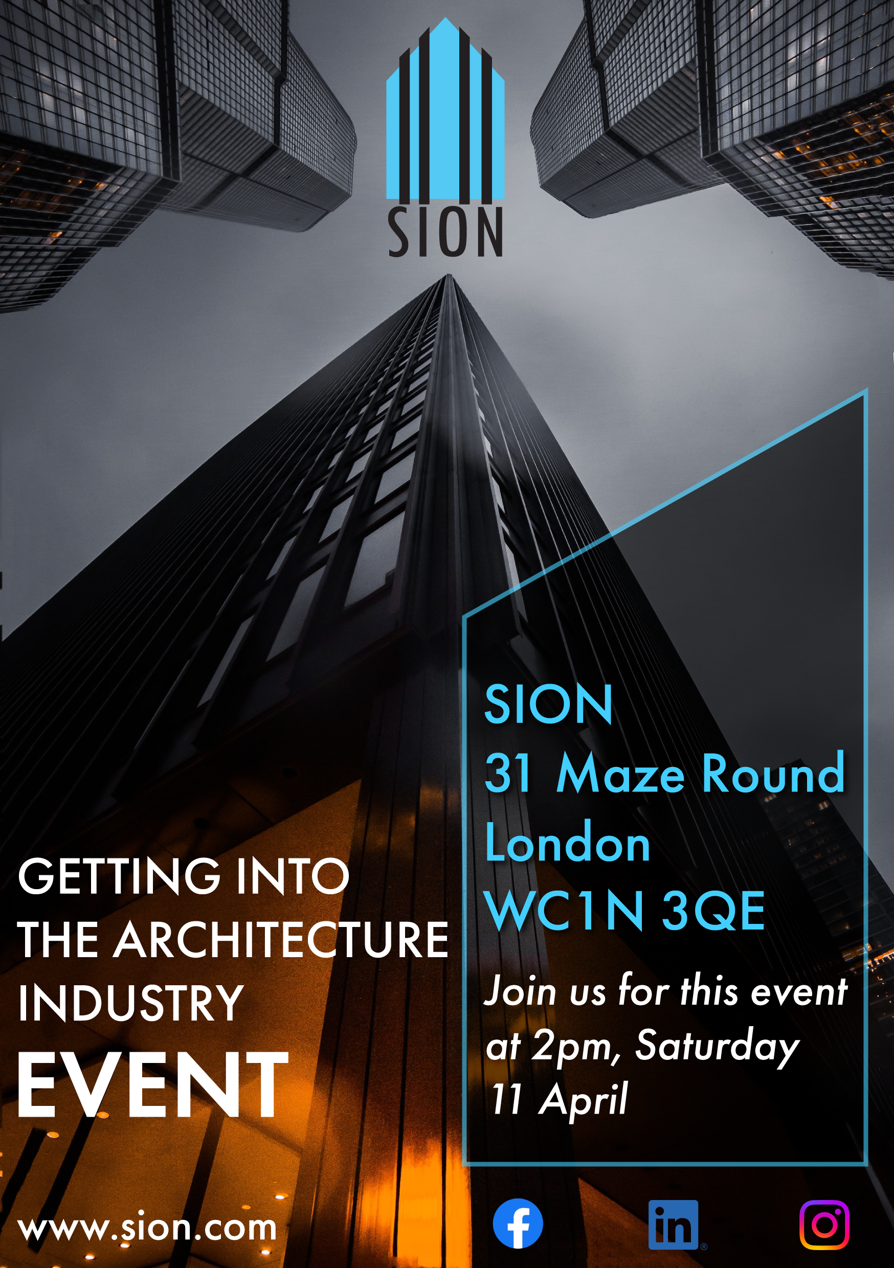
You can see the final design above. One of the words I noted down during the first step was cold colours and the other was buildings. So I made sure to incorporate the blue colour the client requested in some of the elements such as the text and logo design. I also chose a picture from pexels which had buildings. I thought that the image was really interesting and I liked the perspective it gave to the viewer. The logo design was created in Illustrator and is a combination of different size rectangles replicating the shape of a building. The black slanted thick lines were used for an added dimension and I chose a font style which was light and thin.
I placed the logo at the top in the centre because that is where the poster image provides a focal point. The contrast design principle was used to seperate the logo, text and icons through the use of colour i.e. light and dark colours. The placement of the text at the bottom also allows the logo and buildings to stand out further and instantly grabs the viewer’s attention. The principle of unity was used to create a strong relationship between the logo and the company information in the slanted box in the bottom right of the design. This was used by having the same colour. The text is wrapped around the rectangle to divide the information; one was the address and information about the schedule, the other was the purpose of the event. They are all linked by using the same font which I wanted to represent corporate modern architecture, straight clean lines in sans-serif form. The rectangle is slanted to make it interesting and also to replicate a building shape. The slightly transparent effect adds more dimension.
The largest word in the design is “Event” and this is to emphasis to the viewer what the flyer is about (perhaps I could have also emphasised the words “Architecture Industry” for specificity). I placed additional information about the company including the website underneath the event title and the social icons underneath the company information. Both sets of additional information are the smallest in terms of scale indicating to the viewer the lower level of importance compared to the other elements.
Conclusion
I created graphic designs responding to the creative brief for an architecture firm. It took a while to get going but I really enjoyed the journey. I also like creating these posts about my designs because it allows me to go through my thought processes and analyse the works.
To see other designs, feel free to check out my portfolio.
This post is about a graphic design I created for a pizza company.
I used a design brief generator to find a project to work on. The brief description is as follows:
We are a new business in the Houston, Texas area called “The Finest Houston Pizzas”. We need a simple flyer for an event.
Although the description is very short and, is not a real life creative brief, it gave me the opportunity to continue working on the principles of design.
The first step was to do some research and look at pizza flyers. I searched online for different types of pizza flyers and I also managed to look at several printed pizza flyers that I had received by post. This gave me inspiration and ideas of how to design a layout for a flyer and also what details to implement.
The next step was to sketch. I sketched out several design ideas as thumbnails and I took notes. The main aim was to keep the design simple and input the necessary elements.
Once the design was chosen, I had to figure out how I was going to make it come to life. I decided to use Photoshop as the software because of its’ variety compared to Illustrator. It is a great tool for designing posters and combining photos and graphic elements. You can see the designs below.
The Design
Because of the limited amount of information from the creative brief, I inputted some pseudo information. I came up with an address in Houston and created the flyer for a Launch party for the company’s business. Inspired from my research, I collected free stock images from sites like pexels that were related to pizza. There is a saying that “a picture is worth a 1000 words” which means it is often easier to show something with a picture than to describe it in words. This is especially important in graphic design as there is often not much time to communicate a message to an audience. This is why I decided to choose real photos as the main image rather than illustrations. The image of the pizza in the foreground and the table as the background sends an enticing message and also communicates an invitation to eat. The text enhances the meaning with event information.
For the first design on the left, I put the image at the bottom and I used the Gestalt closure principle which means I gave the viewer enough information to communicate that it is a pizza on a table, and it is as if they are sitting down on a chair with the pizza. It was important for the pizza image to stand out, so I got a background image which was blurred. The blurred image indicates an active busy environment (like a hall) where the event would be taking place.
I used contrast and solid colours for the company logo in the top left. In fact, I did not really create a logo but for the sake of the design, I simply put down the title of the company and surrounded it in the square element. I used a playful fun font to match the theme of an outdoor or fun daytime event. I also made sure that the colours matched the colours of a typical pizza (yellow and red for cheese and tomato). The unity principle was used to combine the image and the logo by using the same colours and the emphasis and contrast principles were used by placing the elements at the top and bottom, and making them stand out with solid bright colours.
The rest of the text were in neutral colours black and white because the level of importance was less than the logo and image. For the white text on the right, I used the circle elements as a background and coloured it black to make it legible. The circle was also used as the shape is similar to the pizza and this creates unity. The circle with the date information is more important than the one below it hence it is slightly bigger. Finally, for the text on the left I related the Launch Party information with the text on the right by using the same neutral colour: black. I used the line element to divide the title information and the rest of the event information and this made it stand out. All information text also had the same font style. The social media text is linked to the logo by using the same text colour and is aligned on top of the table, keeping the pizza image fully visible. The second design is exactly the same except I tried placing the pizza in the bottom right corner to make it dynamic. This creates a slightly different viewing experience. There’s a sense of motion and continuity on the right-hand side of the design, with the circle elements.
Conclusion
I created graphic designs responding to the creative brief for a pizza company. It was a great exercise and I got to put my design theory knowledge into practice, and experiment with design tools. It has been a great experience and I look forward to creating more posts about my designs.
To see other designs, feel free to check out my portfolio.
This post is about a web design I created for a teahouse company.
I used a design brief generator to find a project to work on. The brief description is as follows:
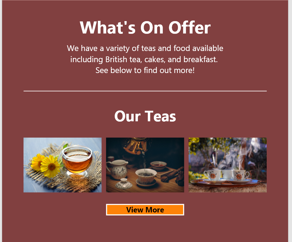
Hi, I’m Angela, creator of CNC Teahouse. For a while now, I’ve been looking for a good website for my Teahouse. I would like a simple landing page. We primarily use the colour red.
Although the description is very short, and, is not a real life creative brief, it gave me the opportunity to work on the principles of design. I have just started learning about the principles of design.
The first step was to write down some notes (below). I wrote down the principles and elements of design so that I could refer back to them from time to time during the design process. I also wrote down a list of things to include on the website.
The list contained things like buttons, navigation, images, links and more. This helped me start thinking about the form following function. In other words, creating designs based on what the elements are meant to do and what they mean, rather than purely for aesthetic purposes.
I browsed the internet to find inspiration from current websites related to tea houses. This was great because I got to see how they laid out information and to see what information is generally displayed on a landing and/or home page.
I noticed that the navigation and logo were generally placed at the top in the header section. The main body text and images were generally placed below making up the middle section, and the social media links and alternative navigation were generally placed at the bottom.
So, taking these notes on board I began to experiment by using design principles. I tried to create a sense of balance by creating alignment and equal distribution among elements. I also thought about the principle unity. I tried to unite elements that belong together. The closer the elements are in terms of proximity, the stronger the relationship. Other similarities such as size and colour can increase the strength of the relationship. This principle helps users see elements that are related, making things easier to understand. An example of this principle is the navigation; the links are next to each-other, have the same font and colour which indicates that they function the same way.
My favourite layout sketch was the website idea that replicated a house shape for a background with the surrounding elements. It’s fun and unconventional and represents the “house” in the teahouse name. The design can be seen below:
Software
Once I chose this idea, I started creating the basic layout digitally. I decided to use Adobe Xd as I used it for one of my projects at university. In Adobe Xd, you have the option of creating a variety of interfaces and layout designs including webpages, mobile screens and Instagram stories. I decided to bring my sketch designs to life through webpage and mobile page designs.
First Web Design
For the first web design layout (pictured below), I decided to replicate the basic shapes of a house (triangle and squares) and place content within them. So, I used the shape design element. I placed the company name, menu and address inside the top of the house (triangle shape). I used the principle of visual hierarchy to help me with the placement of elements. The company name, menu and address were the first things I wanted the viewer to see. It has a high level of importance, and, for this reason I placed them at the top. The company name is positioned at the top of the shape and the menu is positioned just underneath. It is highlighted to create contrast and to make it stand out. The font-style is also different from the rest of the text in the design. I aligned all the elements centrally.
The brief stated that the colour red is primarily used so I decided to use solid red for the heading area to make it stand out and yellow for contrast, but also for the type of mood I would want the viewer to be in: Happy. I used a background colour to make the company name further stand-out as I realised it drew the attention more with a background colour. The highlighted white border around the Home button is contrasted by the black background colour to make it stand out and communicate to the user as to where they are in the website. The other menu buttons have a slight transparency for the background colour black, and no border so that it does not stand out.
To complete the opening landing page, I created two rectangle shapes with content inside: One with an image and the other with text information. An image is a powerful tool and can explain to the user what they are experiencing. I chose an image of a tea holder and cup to communicate what we provide. The image was obtained by the website pexels. I balanced the image and text information to complete an overall house layout. The box with the text information also contains a button. I made the button a call-to-action by creating a white border, scaling the button to a big size and making the text bold. The text information box is the same colour as the company heading background to create unity. The company and the company information are tied together through the principle of unity. I also wanted to create a softer feel to the website. I did this by rounding the corners of the shapes. An arrow at the bottom indicates there is more to see if you scroll down.
Typography
I decided to use two sets of font faces. I have listened to several talks about typography design for the web and the general consensus is that two different font faces is usually enough. I used a sans-serif font titled Britannic for the header and company name. I wanted something elegant and that stood out without needing to be very big in size. The Ebrima font face was used for the rest of the text in the web design. This is also a sans-serif. I used bold and regular. I chose the font, because I felt that it was clear and easy to read without being distracting.
More on Colour
As stated previously, red and yellow were used. I also added a light creamy background colour for the opening landing page. I was going to go for white but I felt that the creamy light background gelled better with the darker brown background that helped divide the different sections on the webpage. White text created contrast and was used for legibility on the dark brown background.
More on principles of design
I used the principle of repetition and unity for the other buttons and images on the website. The buttons are all the same colour and have the same shape and border. This creates familiarity for the user. The balanced 3 image column creates an easy-on-the eye aesthetic. Last but not least I added the footer section at the bottom. It is separated with the colour black to show a real distinction from other sections in the design. The social icons on the left and menu text on the right. Repeating the same pattern as the top page with a combination of images and text alongside each-other. The icons are aligned with the logo at the top but I pushed the footer menu text slightly more inward to make it more dynamic.
Mobile Design
The same design but for a different screen size. A few things were slightly changed. The main menu is no longer visible, but instead the standard hamburger icon is in the top right. I also re-positioned some of the elements in order to communicate the same messages. The text information box is seen first as that is what I want the user to see and do first. Instead of the 3-column design, the layout has turned into a one-column layout. The arrow at the bottom indicates to the user that they can tap it to go immediately to the top.
Second Web Design
I decided to create a second design layout, because I was not satisfied with the first web design. I thought it was a little too flat in terms of the colours and could be further simplified for the user. It also did not feel very modern in my eyes.
Many websites have a “hero” section as part of their landing or home page. The hero usually consists of a large image that stretches across the width of the device’s screen and is placed at the top of the page. It is used to communicate what the site is about to the user. I decided to use an image of a tea and teacup on a table. I retrieved the image from pexels: A website with a variety of free photos.
The menu is slightly similar to the first design. As I was removing elements of the menu from the first design, I realised I liked how the title “CNC Teahouse” looked without the triangle shape as it’s background, and so I decided to keep it, and attach the menu options directly below it. This kept the “house” look. I used the balance principle of symmetry. I changed the title colour to red, and decreased the opacity to create some transparency. I did the same for the menu buttons but with the colour black. Then I used the contrast principle via colour to make the content readable.
Texture
I wanted the website to feel more dynamic and interesting, so I decided to use texture instead of flat colours. I downloaded a few textures from Texture King. To create harmony and familiarity, I chose colours that were related to tea and the client’s desired colour: red and brown. The brown was light and the red was dark. I really like the textures as they add a sense of dynamism and intrigue, making the foreground content stand out a bit more. It also helped divide the sections in terms of contrast.
I created harmony with the text, by making the text the same colour (white) and the same font (Avenir). Below is the mobile version of the web design.
Conclusion
I created two web designs responding to the creative brief. I enjoyed the process and believe that projects like this can help me improve on my design skills. I got to put my design theory knowledge into practice, and experiment with design tools. It has been a great experience and I look forward to creating more posts about my designs.
To see other designs, feel free to check out my portfolio.


 Michael's Monde